
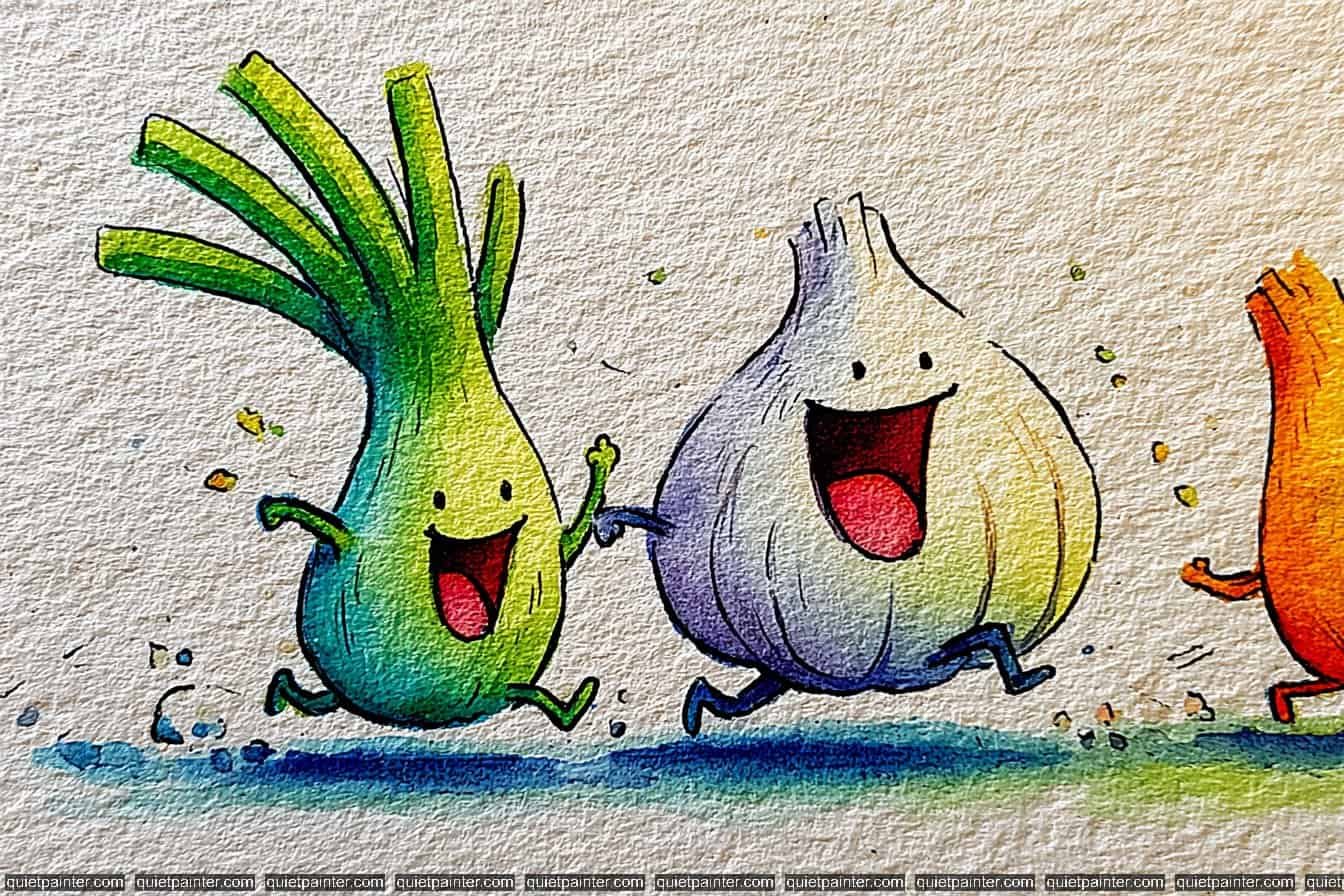
I believe there is something truly magical about the bond between nature’s most colorful characters, which is why I’ve curated these 30 watercolor prompts. This collection focuses on the “bestie” dynamic, pairing up fruits and vegetables in ways that are both fun to paint and easy on the eyes.
I have also transformed these illustrations into a printable coloring book PDF that you can download and use as a template. Let’s dive into these vibrant pairings and explore the joy of painting simple, happy subjects.
Contents
- 1 30 Fruits & Veggies Besties Watercolor Ideas
- 1.1 The Pensive Pear
- 1.2 The Playful Peas-in-a-Pod
- 1.3 The Intellectual Eggplant
- 1.4 The Scientific Cucumber
- 1.5 The Karate Broccoli
- 1.6 The Artichoke Adventurer
- 1.7 The Furious Bell Pepper
- 1.8 The Exhausted Avocado
- 1.9 The Traveling Pea Pods
- 1.10 The Arrogant Asparagus
- 1.11 The Grumpy Carrot
- 1.12 Super Grape
- 1.13 The Distinguished Potato
- 1.14 The Goal-Oriented Tomato
- 1.15 The Weightlifting Orange
- 1.16 The Tough Tomato
- 1.17 The Peaceful Pear
- 1.18 The Spa Day Lemon
- 1.19 The Fashionable Watermelon Slice
- 1.20 The Kind Kiwi
- 1.21 The Cheerful Cherry
- 1.22 The Studious Carrot
- 1.23 The Tropical Coconut
- 1.24 The Striding Chili
- 1.25 The Brainy Broccoli
- 1.26 The Cloud-Crowned Cauliflower
- 1.27 The Pronunciation Duel
- 1.28 The Banana Bedtime Besties
- 1.29 The Unimpressed Pineapple
- 1.30 The Cucumber Butler
- 2 Conclusion
30 Fruits & Veggies Besties Watercolor Ideas
The Pensive Pear
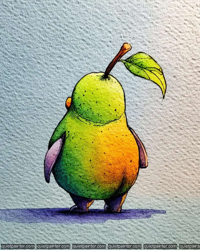
To capture this pear’s subtle posture, sketch the classic tapered shape with a focus on the weight at the bottom. Start with a variegated wash, dropping in a bright Lemon Yellow at the top right (your light source) and blending it into a vibrant Sap Green in the middle. On the right “cheek,” add a soft glow of Cadmium Orange to suggest ripeness. For the shadowed left side and the tiny legs, use a deep Dioxazine Violet or Indigo to create a strong, grounding contrast.
Once the base is dry, use a dry brush technique with Yellow Ochre to add those tiny, organic speckles (lenticels) across the skin. Use a fine-liner for the delicate veins in the leaf and the wood-grain texture on the stem. Finally, anchor the pear with a horizontal lavender and blue wash for the shadow, which helps the yellow and green tones pop against the textured paper.
Recommended Color Palette
To recreate these orchard-fresh tones, I suggest using these professional pigments:
- Lemon Yellow: For the primary, sun-kissed highlight on the pear’s “shoulder.”
- Sap Green: The essential base for the healthy, vibrant green body.
- Cadmium Orange: To add a warm, blushing glow to the side of the fruit.
- Burnt Sienna: For the earthy, rustic texture of the stem.
- Dioxazine Violet: Watered down for the deep shadows and the modern grounding shadow.
- Payne’s Gray: For the sharp illustrative outlines and the tiny textural spots.
If you’re feeling inspired to paint but want to skip the drawing phase, I’ve got you covered. Download my printable coloring pages PDF here to get all whimsical designs delivered straight to your inbox!
The Playful Peas-in-a-Pod
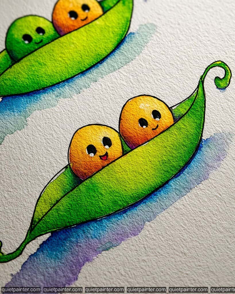
This illustration is the literal definition of “two peas in a pod!” These cheerful little characters floating in their emerald-green vessels are perfect for practicing spherical shading and vibrant color transitions. The contrast between the warm orange-yellow peas and the cool green pod makes the whole piece feel sunny and fresh.
To bring these duos to life, start with a simple almond-shaped sketch for the pod and two perfect circles for the peas. For the peas, use a variegated wash, blending Lemon Yellow at the top right for a highlight into a warm Cadmium Orange at the bottom left. This creates that glowing, 3D effect. For the pod, apply a wet-on-wet technique, dropping in a bright Sap Green and allowing it to bleed into a deeper Phthalo Green along the spine and the curly vine tip.
Once dry, use a fine 0.1 technical pen for the “chibi-style” eyes and tiny smiles. Don’t forget the tiny white “sparkle” in the eyes—you can use a white gel pen for this if you accidentally painted over it. Finally, anchor the pods with a loose, horizontal gradient wash of cobalt blue and violet to suggest they are floating on water or air.
Recommended Color Palette
To capture these bright, garden-fresh tones, I suggest using these professional pigments:
- Lemon Yellow: For the glowing highlights on the peas’ “foreheads.”
- Cadmium Orange: The essential mid-tone for the cheerful, ripe peas.
- Sap Green: To provide the healthy, vibrant green for the outer pod.
- Phthalo Green: Mixed with blue for the deep shadows inside the pod where the peas sit.
- Dioxazine Violet: Diluted heavily for the soft, modern grounding shadow.
- Payne’s Gray: For the sharp, expressive eyes and the delicate textural outlines.
If you’re feeling inspired to paint but want to skip the drawing phase, I’ve got you covered. Download my printable coloring pages PDF here to get all whimsical designs delivered straight to your inbox!
The Intellectual Eggplant
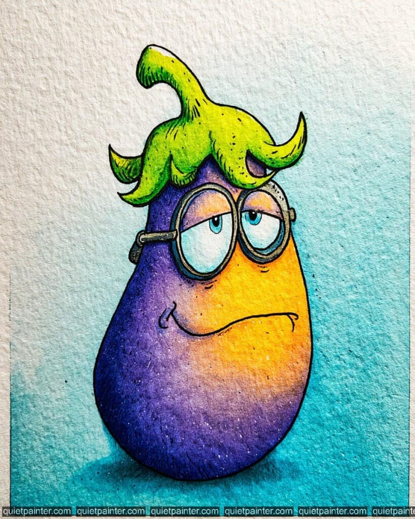
This sophisticated vegetable looks like it’s mid-contemplation, perhaps pondering a complex botanical theory. With its heavy-lidded eyes, thick spectacles, and a subtle, knowing smirk, it’s a wonderful study in using high-contrast, complementary colors—purple and yellow—to create a character that really vibrates on the page.
To bring this brainy eggplant to life, start with a plump, pear-shaped sketch on cold-press watercolor paper. Use a variegated wash for the body, blending a bright Cadmium Yellow and Orange on the right side into a deep, saturated Dioxazine Violet on the left. This established a strong, dramatic light source. For the background, apply a soft gradient wash of teal, keeping it watery and light to let the character’s rich purple skin remain the focal point.
Once the initial layers are dry, focus on the details using a glazing technique. Use a fine-liner pen to add the dense stippling and cross-hatching along the left side to provide weight and texture. For the leafy “hat,” apply a variegated wash of lime green and Sap Green, using the pen to add the vertical veins once dry. Finally, use a very pale blue for the eyes and a dark indigo for the thick, scholarly glasses to complete the intellectual look.
Recommended Color Palette
To capture the vibrant and sophisticated tones of this illustration, I suggest these professional pigments:
- Dioxazine Violet: The essential base for the rich, classic purple of the eggplant skin.
- Cadmium Yellow: For the bright, glowing highlights on the right side of the body.
- Sap Green: To provide the healthy, vibrant green for the leafy crown and stem.
- Cobalt Turquoise: Diluted for the refreshing, atmospheric background wash.
- Payne’s Gray: For the sharp illustrative outlines and the thick frames of the spectacles.
- Quinacridone Gold: Mixed with yellow for the warm, sun-kissed mid-tones on the face.
If you’re feeling inspired to paint but want to skip the drawing phase, I’ve got you covered. Download my printable coloring pages PDF here to get all whimsical designs delivered straight to your inbox!
The Scientific Cucumber
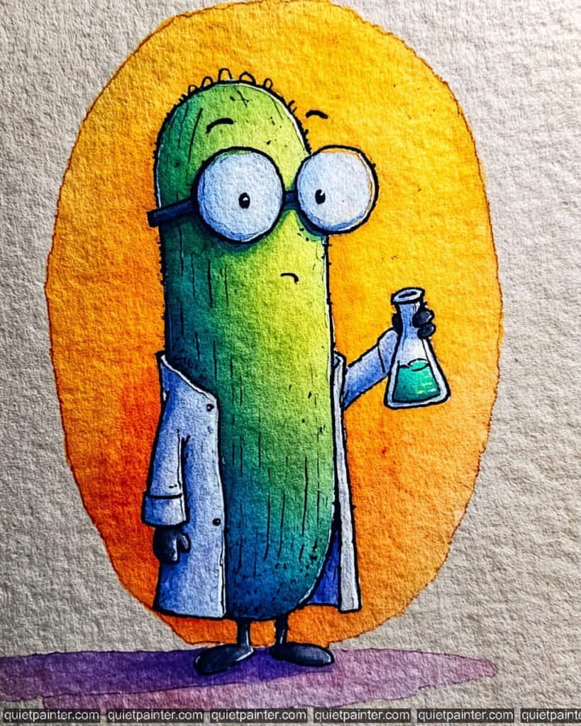
This scholarly stalk looks like he’s on the verge of a major botanical breakthrough! Wearing a crisp lab coat and oversized spectacles, this cucumber (or perhaps a very studious pickle) is a fantastic example of using high-contrast background colors to make a character “pop.”
To bring this scientist to life, start with a tall, rounded sketch on cold-press paper. For the background, apply a bold variegated wash, blending a bright Hansa Yellow at the top into a deep, warm Cadmium Orange at the bottom. For the cucumber, use a wet-on-wet technique, dropping in a bright lime green at the top and bleeding it into a deep Phthalo Green or Indigo at the base to establish a strong light source.
Once dry, focus on the lab gear. Use a very diluted Cobalt Blue for the shadows in the white lab coat, leaving most of the paper white for a sterile look. For the flask, use a saturated Emerald Green for the liquid, making sure to leave a tiny white highlight on the “glass.” Use a fine 0.1 technical pen for the vertical skin texture and the thick, scholarly glasses. Finally, anchor the character with a soft, horizontal lavender wash at the feet.
Recommended Color Palette
To capture the bright and intellectual tones of this piece, I recommend the following professional pigments:
- Sap Green: The essential base for the healthy, vibrant green of the cucumber body.
- Hansa Yellow: For the glowing upper background and the bright highlights on the fruit.
- Cadmium Orange: To provide the rich, warm tones for the lower background.
- Emerald Green: For the vibrant, mysterious chemical liquid in the flask.
- Cobalt Blue: Diluted heavily for the crisp shadows in the white lab coat.
- Payne’s Gray: For the sharp, expressive eyes and the thick frames of the glasses.
If you’re feeling inspired to paint but want to skip the drawing phase, I’ve got you covered. Download my printable coloring pages PDF here to get all whimsical designs delivered straight to your inbox!
The Karate Broccoli
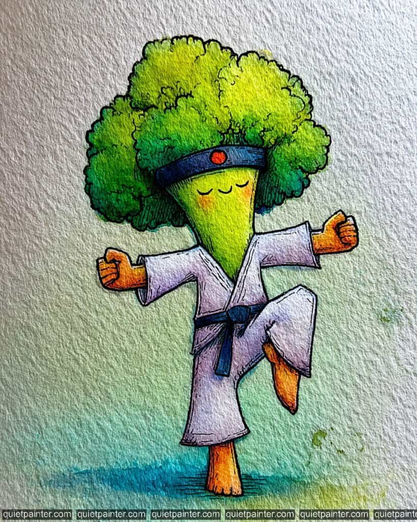
This little warrior is the perfect blend of discipline and greens! With a focused crane stance, a black belt, and a traditional headband, he’s a fantastic example of using a character’s “fluffy” head texture to contrast with the sharp, geometric lines of a martial arts gi.
To bring this master to life, start by sketching the puffy broccoli head and the dynamic one-legged pose on cold-press paper. For the florets, use a variegated wash, blending a sunny Lemon Yellow at the top right into a fresh Sap Green and a deep Phthalo Green in the lower shadows. For the white gi, use a very diluted Ultramarine Blue or violet for the shadows in the folds, leaving the majority of the paper white to suggest a crisp, clean uniform.
Once the base layers are bone dry, focus on the illustrative details. Use a concentrated Cobalt Blue for the belt and headband, adding a tiny red dot for the sun emblem. Use a fine-liner pen to add the dense stippling on the florets and the “wood-grain” texture on the hands and feet. Finally, anchor the karate master with a soft, circular teal wash at the base, which grounds his balance and completes the peaceful, zen-like composition.
Recommended Color Palette
To capture the vibrant and disciplined tones of this piece, I suggest the following professional pigments:
- Sap Green: The essential base for the healthy, vibrant green of the broccoli head.
- Lemon Yellow: For the bright, glowing highlights at the top of the florets.
- Phthalo Green: Mixed with blue for the deep, cool shadows within the “trees.”
- Ultramarine Blue: Diluted heavily for the crisp shadows in the white karate uniform.
- Cobalt Blue: For the bold, scholarly blue of the black belt and headband.
- Payne’s Gray: For the sharp, peaceful eyes and the detailed textural outlines.
If you’re feeling inspired to paint but want to skip the drawing phase, I’ve got you covered. Download my printable coloring pages PDF here to get all whimsical designs delivered straight to your inbox!
The Artichoke Adventurer
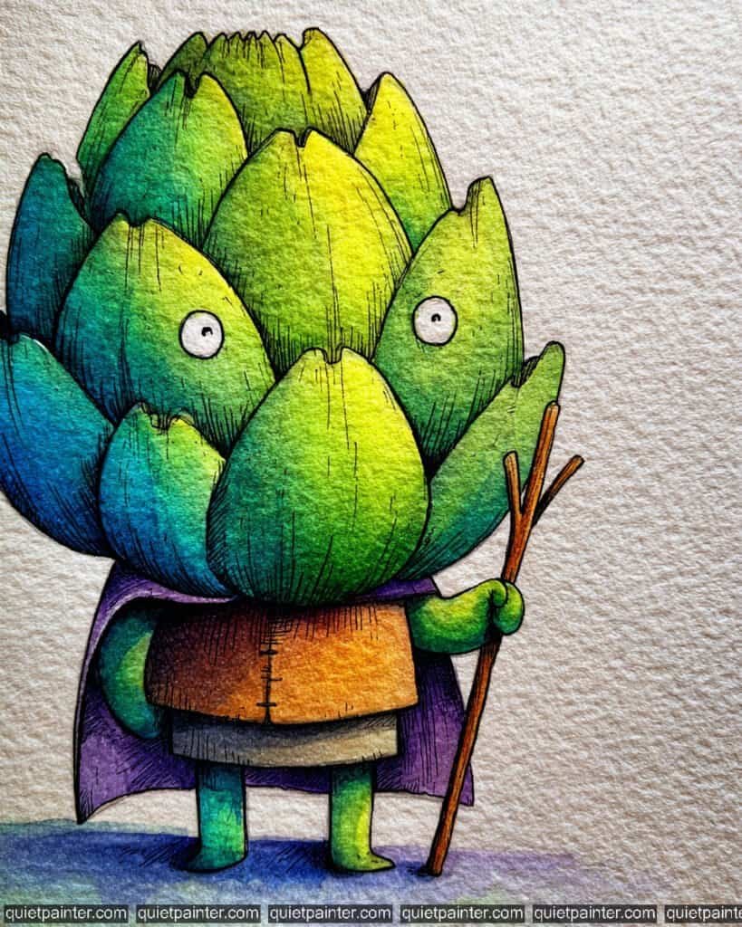
This brave little character looks ready for a quest! With his layered bracts acting like a suit of armor and a sturdy wooden staff in hand, he is a wonderful example of using natural vegetable geometry to create a fantasy “warrior” or “wizard” aesthetic.
To bring this adventurer to life, start by sketching the overlapping triangular leaves and the small, robed body on cold-press watercolor paper. For the head, use a variegated wash on each individual leaf, blending a bright Lemon Yellow at the tips into a fresh Sap Green and a deep Cobalt Turquoise at the base. This creates a shimmering, multi-faceted look. For his tunic, apply a warm variegated wash of Yellow Ochre and Burnt Sienna, and use a deep Dioxazine Violet for the flowing cape.
Once the base layers are dry, focus on the illustrative textures. Use a fine 0.1 technical pen to add the vertical “grain” lines on each artichoke leaf and the rough, wooden texture of the staff. Use a white gel pen to add the tiny, wide-eyed highlights that give him his surprised, “on-watch” expression. Finally, anchor him with a textured blue and violet wash at his feet to suggest a magical or moonlit path.
Recommended Color Palette
To capture the earthy yet mystical tones of this character, I suggest the following professional pigments:
- Sap Green: The primary base for the healthy, vibrant green of the artichoke leaves.
- Lemon Yellow: For the bright, glowing highlights at the top of the head.
- Cobalt Turquoise: To provide the cool, deep tones for the shadowed sides of the bracts.
- Burnt Sienna: For the rustic, leathery texture of the tunic and the wooden staff.
- Dioxazine Violet: For the bold, adventurous cape and the deep grounding shadows.
- Payne’s Gray: For the sharp illustrative outlines and the tiny, watchful eyes.
If you’re feeling inspired to paint but want to skip the drawing phase, I’ve got you covered. Download my printable coloring pages PDF here to get all whimsical designs delivered straight to your inbox!
The Furious Bell Pepper
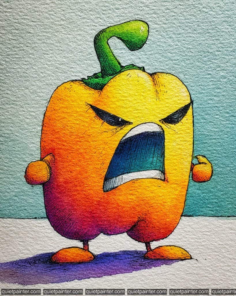
This bell pepper has officially reached its boiling point! With its wide-open mouth, clenched fists, and sharp, slanting eyes, it’s a masterclass in using warm, fiery colors to match a character’s heated personality.
To paint this aggressive all-star, begin with a stout, lobed sketch on cold-press paper. Use a variegated wash for the body, blending a bright Lemon Yellow on the right side into a fiery Cadmium Orange in the center, and a deep Quinacridone Magenta at the bottom left. This spectrum perfectly visualizes the “heat” of the character. For the background, apply a cool flat wash of Cobalt Turquoise, which creates a high-contrast backdrop that makes the warm tones of the pepper vibrate.
Once dry, focus on the expressive mouth and stem. Use a glazing technique for the mouth, layering a deep teal over a dark blue to suggest a cavernous, echoing yell. Use a fine-liner pen for the heavy cross-hatching along the left side and the bottom lobes to add weight and intensity. Finally, anchor the character with a bold, horizontal lavender wash for the shadow, which helps ground the pepper and reinforces the modern, illustrative style.
Recommended Color Palette
To capture the high-energy and high-contrast tones of this piece, I recommend these professional pigments:
- Lemon Yellow: For the bright, glowing highlights on the “calmer” side of the fruit.
- Cadmium Orange: The essential mid-tone for a vibrant, healthy bell pepper.
- Quinacridone Magenta: For the deep, saturated shadows on the lower left curve.
- Cobalt Turquoise: To provide the refreshing, atmospheric background wash.
- Dioxazine Violet: Diluted for the intense, modern grounding shadow.
- Payne’s Gray: For the sharp, expressive eyes and the bold, shouting mouth lines.
If you’re feeling inspired to paint but want to skip the drawing phase, I’ve got you covered. Download my printable coloring pages PDF here to get all whimsical designs delivered straight to your inbox!
The Exhausted Avocado
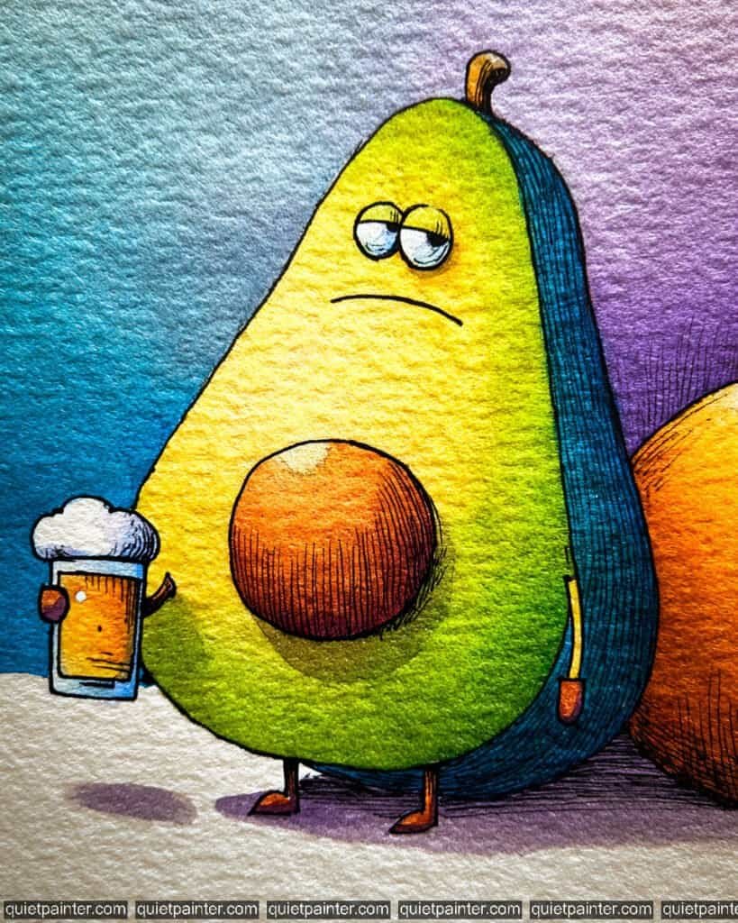
This weary avocado perfectly captures that “long week” feeling. With heavy eyelids and a cold drink in hand, he’s a fantastic study in texture—from the smooth, creamy interior to the rough, dark skin and the perfectly round pit.
To paint this relatable character, start with a light sketch of the halved avocado shape and the large pit on cold-press paper. For the interior, use a variegated wash, blending a bright Lemon Yellow at the top into a fresh Sap Green at the base. For the dark outer skin, apply a deep Phthalo Blue or Indigo, using a dry brush technique along the edge to suggest that signature bumpy texture.
Once the base is dry, use a glazing technique for the pit, layering a warm Burnt Sienna and adding fine, curved cross-hatching with a 0.1 technical pen to give it weight and roundness. For the drink, keep the foam white (the paper’s natural color) and use a sunny Gold for the liquid. Finally, anchor the scene with a soft lavender wash for the shadow, which complements the greens and blues of the character beautifully.
Recommended Color Palette
To capture the rich and moody tones of this illustration, I suggest these professional pigments:
- Sap Green: The essential base for the healthy, creamy avocado interior.
- Lemon Yellow: For the bright, glowing highlights near the top of the fruit.
- Phthalo Blue: Mixed with black or violet for the deep, textured outer rind.
- Burnt Sienna: To provide the rich, organic brown of the central pit.
- Hansa Yellow Deep: For the refreshing, golden glow of the beer.
- Payne’s Gray: For the heavy, expressive eyelids and the detailed textural lines.
If you’re feeling inspired to paint but want to skip the drawing phase, I’ve got you covered. Download my printable coloring pages PDF here to get all whimsical designs delivered straight to your inbox!
The Traveling Pea Pods
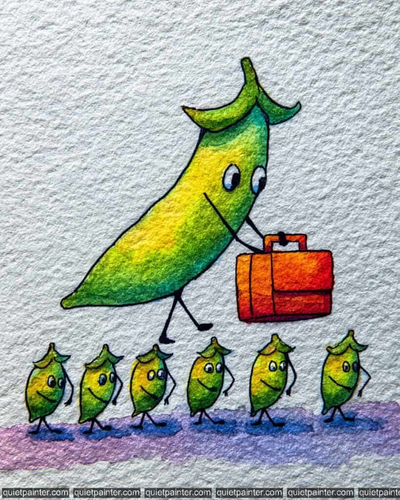
This charming illustration of a “business” pea pod leading a group of tiny, enthusiastic pods is a wonderful study in repetition and scale. With its vibrant orange briefcase and determined stride, it’s a perfect example of storytelling through simple vegetable characters.
To capture this group on the move, begin with a sketch of the main, large pod and the line of smaller pods following behind on cold-press watercolor paper. Use a variegated wash for all the pods, blending a sunny Lemon Yellow in the center into a fresh Sap Green at the edges to give them a plump, rounded look. For the briefcase, apply a saturated flat wash of Cadmium Orange, dropping in a touch of Alizarin Crimson at the bottom for a strong sense of weight and shadow.
Once the initial layers are dry, focus on the details. Use a fine-liner or 0.1 technical pen for the simple, expressive eyes and the spindly legs of the entire group. Add the dark, illustrative outlines to the briefcase and the “caps” on each pod. Finally, anchor the entire parade with a soft, horizontal lavender wash at the base, letting the pigment settle into the paper’s texture to ground the characters.
Recommended Color Palette
To capture the fresh and energetic tones of this illustration, I recommend the following professional pigments:
- Sap Green: The essential base for the healthy, vibrant green of the pea pods.
- Hansa Yellow: To provide the bright, glowing highlights in the center of each pod.
- Cadmium Orange: For the bold, punchy color of the leader’s briefcase.
- Alizarin Crimson: To add deep, rich shadows to the briefcase and pod tips.
- Dioxazine Violet: Diluted heavily for the soft, modern grounding shadow.
- Payne’s Gray: For the sharp, expressive eyes and the delicate textural outlines.
If you’re feeling inspired to paint but want to skip the drawing phase, I’ve got you covered. Download my printable coloring pages PDF here to get all whimsical designs delivered straight to your inbox!
The Arrogant Asparagus
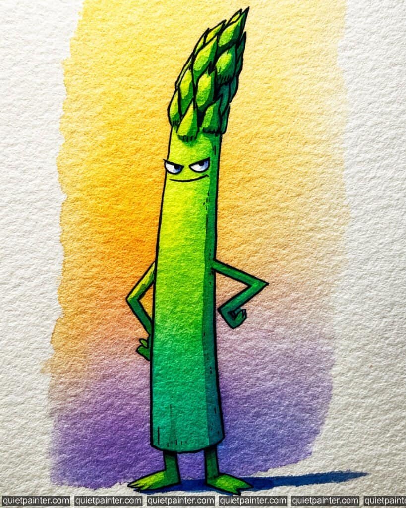
This tall, slender stalk exudes pure confidence! With his smirk and hands-on-hips stance, he clearly knows he’s the “star” of the side-dish world. The contrast between his cool green tones and the warm sunset background makes for a striking composition.
To capture this haughty character, start by sketching the long, straight body and the intricate, layered scales of the spear tip on cold-press paper. For the background, apply a bold variegated wash, blending a bright Hansa Yellow at the top into a warm Orange and a deep Dioxazine Violet at the base. For the asparagus body, use a wet-on-wet technique, dropping in a bright lime green highlight along the left side and bleeding it into a deep Phthalo Green on the right for a cylindrical 3D effect.
Once the base layers are dry, focus on the details with a glazing technique. Use a fine detail brush to add darker green shadows between the scales of the tip. Use a fine-liner pen for the sharp, skeptical eyes and the smug little mouth. Finally, anchor the stalk with a deep Cobalt Blue horizontal flat wash shadow, which provides a modern, high-contrast anchor for the character.
Recommended Color Palette
To capture the vibrant and sophisticated tones of this illustration, I recommend these professional pigments:
- Sap Green: The essential base for the healthy, vibrant green of the asparagus stalk.
- Hansa Yellow: For the glowing background highlight and the bright green spear tips.
- Phthalo Green: Mixed with blue for the cool, deep shadows on the shadowed side of the body.
- Dioxazine Violet: To provide the moody, atmospheric tone at the base of the background.
- Cobalt Blue: For the sharp, stylized grounding shadow and subtle eye details.
- Payne’s Gray: For the sharp, expressive smile and the bold illustrative outlines.
If you’re feeling inspired to paint but want to skip the drawing phase, I’ve got you covered. Download my printable coloring pages PDF here to get all whimsical designs delivered straight to your inbox!
The Grumpy Carrot
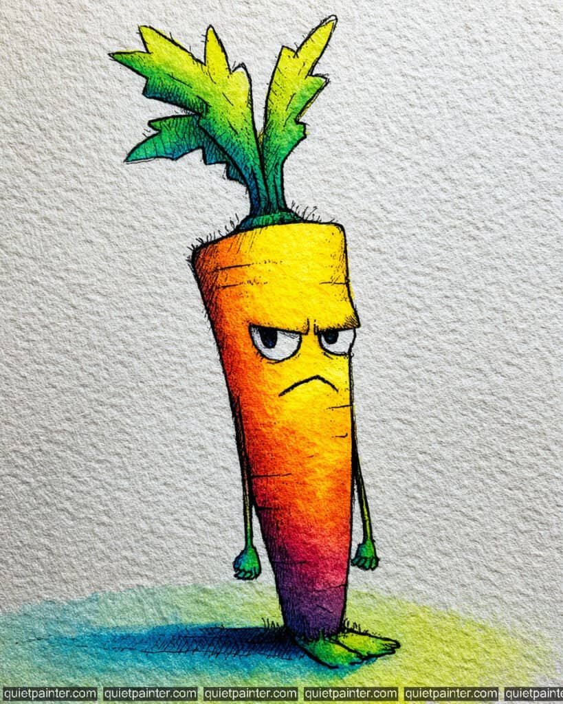
This long, skinny character is the perfect example of “waking up on the wrong side of the garden bed.” With his furrowed brow, downturned mouth, and clenched green fists, he’s a wonderful study in translating human emotion into vegetable forms.
To bring this moody root to life, begin with a tall, tapered sketch on cold-press paper. Use a variegated wash for the main body, blending a bright Lemon Yellow at the top into a fiery Cadmium Orange, then a deep Alizarin Crimson, and finally a dark Dioxazine Violet at the very tip. This vertical gradient gives the character an intense, high-contrast look. For the leafy top, apply a wet-on-dry wash of lime green, then drop in a touch of Phthalo Blue at the base for depth.
Once the base is dry, use a fine 0.1 technical pen for the heavy illustrative cross-hatching along the left side, which adds weight and “grittiness” to his personality. Finally, anchor him with a bold, two-toned horizontal wash for the shadow—teal on the left and bright yellow-green on the right—to make the character stand out against the neutral paper.
Recommended Color Palette
To capture the vibrant and moody tones of this illustration, I suggest these professional pigments:
- Hansa Yellow Light: For the bright, glowing highlights at the top of the carrot.
- Cadmium Orange: The essential mid-tone for a classic, healthy carrot hue.
- Alizarin Crimson: To provide the deep, punchy red transition in the lower half.
- Dioxazine Violet: For the dark, intense tip and the heavy cross-hatched shadows.
- Sap Green: Perfect for the healthy, vibrant green of the leafy crown and hands.
- Payne’s Gray: For the sharp, expressive eyes and the bold, grumpy facial lines.
If you’re feeling inspired to paint but want to skip the drawing phase, I’ve got you covered. Download my printable coloring pages PDF here to get all whimsical designs delivered straight to your inbox!
Super Grape
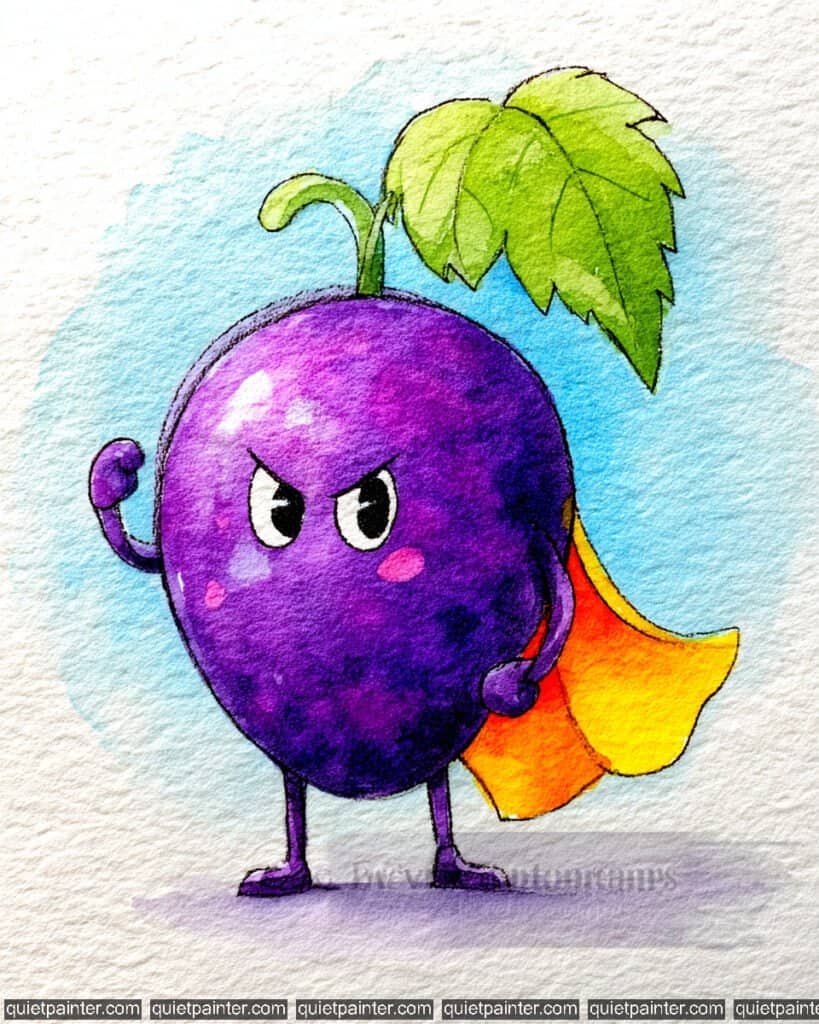
This little hero is ready to save the day! With a flowing yellow cape and a determined “superhero” pose, this grape (or perhaps a very bold plum) is bursting with personality. The high-contrast purple and yellow palette makes for an incredibly dynamic illustration.
To bring this hero to life, start with a light sketch of the round body, the tiny flexing arms, and the large, serrated leaf on cold-press watercolor paper. For the main body, use a wet-on-wet technique, dropping in a bright Quinacridone Magenta at the top left and allowing it to bleed into a deep, saturated Dioxazine Violet on the right side. This creates a powerful spherical volume. For the background, apply a loose, airy variegated wash of light sky blue, keeping it watery to let the warm purple tones pop.
Once the body is dry, focus on the accessories. Use a bright Cadmium Yellow for the cape, adding a touch of Orange in the shadows of the folds to suggest movement. For the large leaf, apply a variegated wash of lime green, then use a fine-liner or a 0.1 technical pen once dry to add the intricate veins. Finally, use a deep black or indigo for the “angry” eyes and anchor the character with a soft lavender cast shadow at the base.
Recommended Color Palette
To capture the heroic and high-contrast tones of this piece, I suggest the following professional pigments:
- Dioxazine Violet: The essential base for the rich, classic purple of the hero’s body.
- Quinacridone Magenta: For the bright, glowing highlights on the upper left curve.
- Cadmium Yellow: To provide the bold, “super” energy of the flowing cape.
- Sap Green: Perfect for the healthy, vibrant green of the stem and large leaf.
- Cobalt Blue: Diluted for the soft, atmospheric circular background.
- Payne’s Gray: For the sharp, expressive eyes and the bold illustrative outlines.
If you’re feeling inspired to paint but want to skip the drawing phase, I’ve got you covered. Download my printable coloring pages PDF here to get all whimsical designs delivered straight to your inbox!
The Distinguished Potato
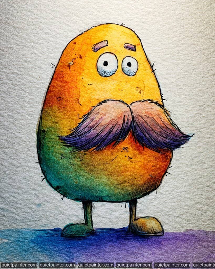
To bring this rustic, mustachioed gentleman to life, start with a simple egg-shaped sketch for the potato’s body and a large, flowing mustache. Use a wet-on-wet technique for the skin, blending a warm Yellow Ochre at the top into a vibrant Cadmium Orange and a deep Burnt Sienna at the base. Drop in a touch of Phthalo Green on the left side while the paint is still damp to suggest an earthy, unwashed texture that adds to his rustic charm.
Once the base is dry, focus on the facial features. Use a variegated wash for the mustache, transitioning from a soft rose pink at the top to a deep, saturated Dioxazine Violet at the ends. This gives the hair a stylized, magical feel. Use a fine-liner pen or a 0.1 technical pen to add the “potato eyes” (tiny dots), the thin hairs along the skin, and the detailed lines in the mustache. Finally, anchor him with a bold, two-toned flat wash for the shadow—blue on the left and violet on the right—to create a modern, high-contrast finish.
Recommended Color Palette
To capture the earthy and eccentric tones of this character, I suggest the following professional pigments:
- Yellow Ochre: The perfect base for a natural, rustic potato skin.
- Cadmium Orange: To add warm, glowing mid-tones to the body.
- Burnt Sienna: For the deep, earthy shadows and textural spots.
- Dioxazine Violet: For the bold mustache ends and the modern grounding shadow.
- Phthalo Green: Mixed with ochre for the subtle “unwashed” skin tones.
- Payne’s Gray: For the sharp, expressive eyes and the delicate illustrative lines.
If you’re feeling inspired to paint but want to skip the drawing phase, I’ve got you covered. Download my printable coloring pages PDF here to get all whimsical designs delivered straight to your inbox!
The Goal-Oriented Tomato
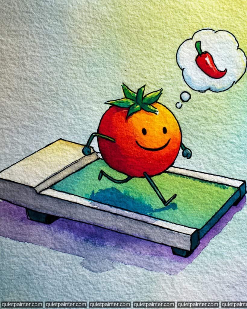
This determined little tomato is putting in the miles on the treadmill, dreaming of becoming as “hot” as a chili pepper! It’s a wonderful example of using a thought bubble to add narrative and humor to a character study.
To paint this active scene, start by sketching the tomato in a mid-stride running pose on its treadmill. Use a wet-on-wet technique for the tomato’s body, blending a bright Cadmium Orange on the right side into a deep, punchy Cadmium Red on the left. For the treadmill belt, apply a variegated wash of teal and spring green, letting the colors mix loosely to suggest movement and shadow.
Once the initial layers are dry, focus on the details. Use a fine-liner pen to render the spindly, energetic legs and the simple, happy smile. For the thought bubble, keep the “cloud” very pale with just a hint of a blue-grey wash for depth, then paint the tiny chili pepper with a saturated Alizarin Crimson. Finally, anchor the treadmill with a soft, horizontal lavender wash at the base, which grounds the machine and emphasizes the beautiful texture of the watercolor paper.
Recommended Color Palette
To capture the vibrant and motivational tones of this illustration, I suggest the following professional pigments:
- Cadmium Red Medium: The essential base for the rich, healthy color of the tomato.
- Cadmium Orange: For the bright, sun-kissed highlight on the leading side of the fruit.
- Sap Green: To provide the healthy, vibrant green for the leafy crown and treadmill belt.
- Cobalt Turquoise: Diluted for the atmospheric background and the treadmill highlights.
- Dioxazine Violet: Watered down for the modern, stylized grounding shadow.
- Payne’s Gray: For the sharp illustrative outlines and the thin, expressive limbs.
If you’re feeling inspired to paint but want to skip the drawing phase, I’ve got you covered. Download my printable coloring pages PDF here to get all whimsical designs delivered straight to your inbox!
The Weightlifting Orange
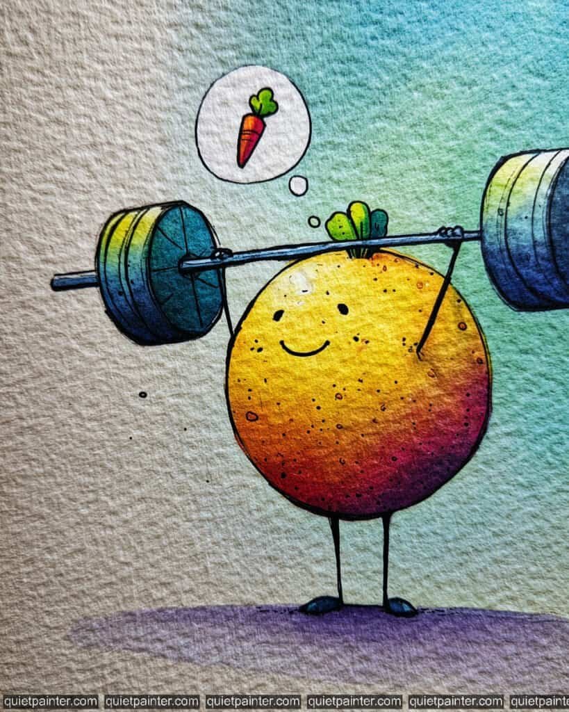
This spirited little citrus is clearly dreaming of big gains! With a barbell overhead and a carrot in its thought bubble, it seems this orange believes that eating its veggies is the secret to superhuman strength.
To capture this energetic scene, start with a circular sketch for the orange and the thin, dynamic lines for the barbell. For the orange’s body, use a variegated wash, blending a bright Lemon Yellow at the top into a warm Orange and a deep Magenta at the bottom. The rough texture of the paper is your best friend here—allow the pigment to settle into the dips to mimic the “pitted” texture of citrus skin. For the background, apply a soft, vertical gradient wash of teal, keeping it light to ensure the character remains the focal point.
Once dry, focus on the barbell and the thought bubble using a layering technique. Use a mix of Cobalt Blue and yellow for the metallic weights, adding dark shadows on the underside to give them weight. Use a fine 0.1 technical pen for the simple, happy facial features and the spindly limbs. Finally, anchor the athlete with a soft lavender wash at the base for a modern, grounded shadow.
Recommended Color Palette
To recreate the vibrant and motivational tones of this piece, I suggest these professional pigments:
- Hansa Yellow: For the bright, glowing highlights on the top of the orange and weights.
- Pyrrol Orange: The essential mid-tone for the healthy, vibrant orange body.
- Quinacridone Magenta: For the deep, saturated shadows on the lower half of the fruit.
- Cobalt Turquoise: Diluted for the refreshing, atmospheric background wash.
- Dioxazine Violet: Watered down for the soft grounding shadow and deep accents.
- Payne’s Gray: For the sharp, expressive eyes and the illustrative outlines of the barbell.
If you’re feeling inspired to paint but want to skip the drawing phase, I’ve got you covered. Download my printable coloring pages PDF here to get all whimsical designs delivered straight to your inbox!
The Tough Tomato
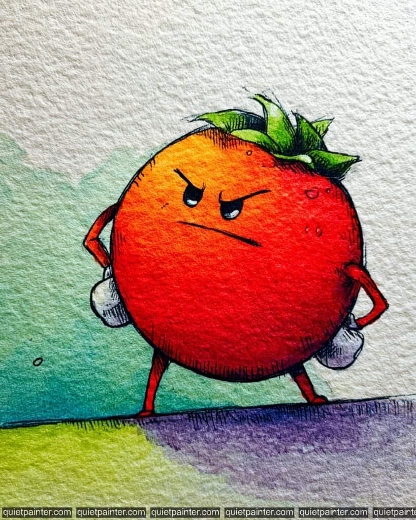
To capture the “don’t mess with me” energy of this character, start with a bold circular sketch on textured cold-press paper. Use a wet-on-wet technique for the body, dropping in a bright Cadmium Orange at the upper left and allowing it to bleed into a saturated, deep Cadmium Red in the center. At the bottom right, add a touch of Alizarin Crimson or Quinacridone Violet to create a heavy, spherical shadow that makes him feel solid and formidable.
Once the base is bone dry, focus on the leafy crown using a glazing technique—layering a vibrant Sap Green and adding a touch of Phthalo Blue to the deepest crevices for high contrast. Use a fine-liner or 0.1 technical pen to render those intense, furrowed brows and the defiant “hands-on-hips” pose. Finally, anchor him with a textured dry brush stroke of deep violet for the ground, which really emphasizes his grounded, ready-for-anything stance.
Recommended Color Palette
To capture the bold and defiant tones of this illustration, I suggest the following professional pigments:
- Cadmium Red Medium: The essential base for the rich, classic red of the tomato.
- Cadmium Orange: For the bright, sun-kissed highlight on the upper curve.
- Sap Green: For the healthy, vibrant green of the sprawling leafy top.
- Alizarin Crimson: To add juicy, deep shadows to the body of the fruit.
- Dioxazine Violet: Diluted for the intense, modern grounding shadow.
- Payne’s Gray: For the sharp, expressive eyes and the bold facial lines.
If you’re feeling inspired to paint but want to skip the drawing phase, I’ve got you covered. Download my printable coloring pages PDF here to get all whimsical designs delivered straight to your inbox!
The Peaceful Pear
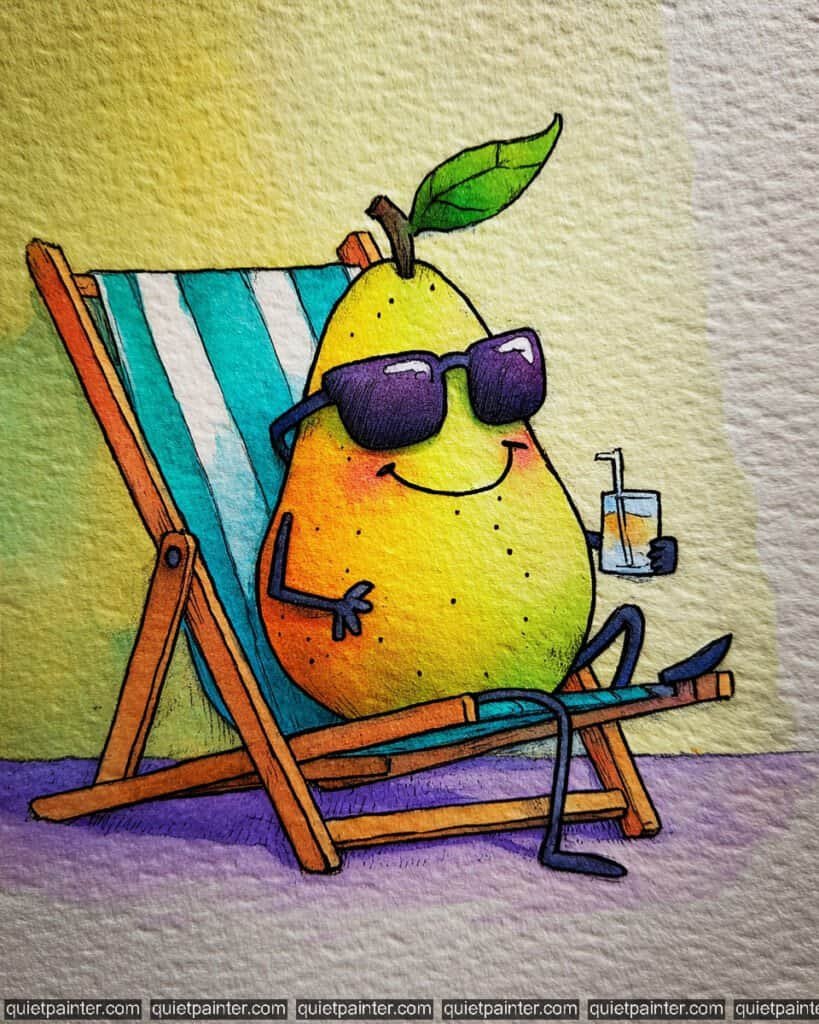
To capture the serene, sun-drenched energy of this character, start by sketching the classic teardrop shape and the delicate leaf on cold-press watercolor paper. Begin with a wet-on-wet technique for the body, dropping in a bright Hansa Yellow at the center and allowing it to bleed into a vibrant Sap Green along the outer edges. This creates that soft, glowing “lit from within” effect that makes the pear look perfectly ripe.
Once the base is dry, use a dry brush technique with a touch of Yellow Ochre or Raw Sienna to add those tiny, organic speckles (lenticels) onto the skin, giving it a realistic pear texture. Use a fine-liner for the peaceful, closed eyes and the tiny smile. Finally, anchor the pear with a soft, horizontal lavender wash for the shadow, which complements the yellow-green tones beautifully without making the piece feel “heavy.”
Recommended Color Palette
To capture these fresh, orchard-inspired tones, I suggest using these professional pigments:
- Hansa Yellow Light: For the luminous, primary highlight on the pear’s “belly.”
- Sap Green: The essential base for the healthy, vibrant green gradients.
- Phthalo Green: Diluted for the deeper, cooler shadows on the right side of the fruit.
- Raw Sienna: For the delicate stem and the tiny textural spots on the skin.
- Dioxazine Violet: Watered down for the soft, modern grounding shadow.
- Payne’s Gray: For the crisp, minimalist facial features.
If you’re feeling inspired to paint but want to skip the drawing phase, I’ve got you covered. Download my printable coloring pages PDF here to get all whimsical designs delivered straight to your inbox!
The Spa Day Lemon
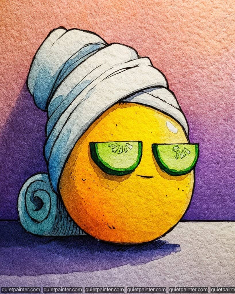
To capture the ultimate relaxation of this citrus character, start by sketching the round lemon body and the large, coiled towel turban on cold-press watercolor paper. For the background, apply a striking variegated wash, blending a soft peach-pink at the top into a deep, regal violet at the bottom to create a moody, spa-like atmosphere. For the lemon itself, use a wet-on-wet technique, dropping in a bright lemon yellow in the center and allowing it to bleed into a warm orange at the bottom left to establish a strong light source.
Once the initial washes have dried, focus on the towel and cucumber slices using a layering technique. Use a very diluted blue-grey for the towel’s shadows, following the curves of the folds to give it weight. For the cucumber eye masks, apply a flat wash of vibrant lime green, adding tiny stippled seeds with a fine-liner once dry. Finally, use a fine 0.1 technical pen to add the “lemon skin” texture and anchor the character with a deep, horizontal cast shadow in violet to match the background’s intensity.
Recommended Color Palette
To recreate the warm and atmospheric tones of this piece, I recommend the following professional pigments:
- Lemon Yellow: The essential base for the bright, glowing center of the lemon.
- Pyrrol Orange: To provide the warm, saturated shadows on the lower half of the fruit.
- Quinacridone Rose: Mixed with orange for the soft, warm upper background glow.
- Dioxazine Violet: For the deep, moody background and the modern grounding shadow.
- Sap Green: Perfect for the fresh, healthy cucumber slices over the eyes.
- Ultramarine Blue: Diluted heavily for the cool, crisp shadows in the white towel folds.
If you’re feeling inspired to paint but want to skip the drawing phase, I’ve got you covered. Download my printable coloring pages PDF here to get all whimsical designs delivered straight to your inbox!
The Fashionable Watermelon Slice
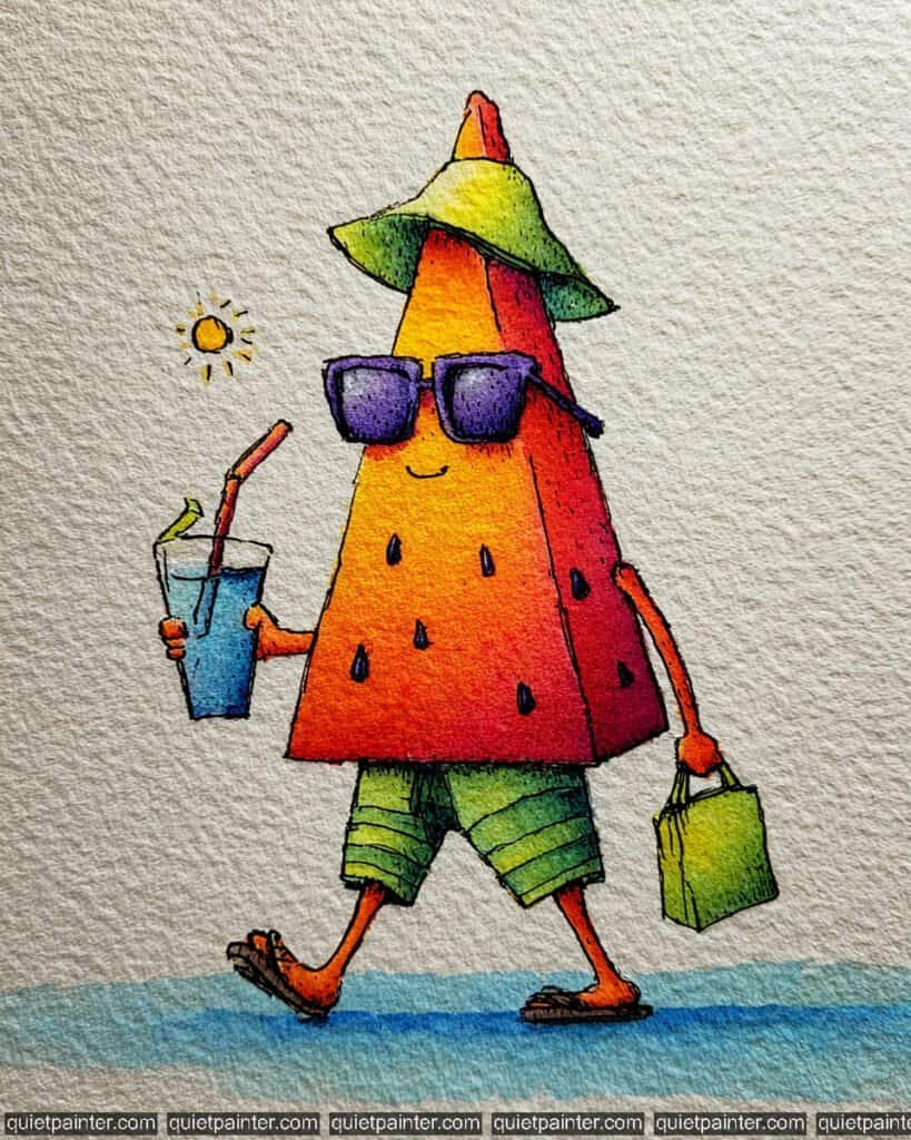
To bring this vacation-ready slice to life, start by sketching the sharp, triangular wedge and its assortment of summer accessories—sunglasses, a sun hat, and a shopping bag—on cold-press paper. Use a variegated wash for the main body, blending a bright lemon yellow at the top “point” into a warm orange and finally a deep, saturated crimson at the base. For the rind-inspired shorts and hat, apply a fresh flat wash of lime green, leaving a few horizontal white lines for the “pinstripe” pattern to keep the look crisp and modern.
Once the initial layers have dried, focus on the details using a layering technique. Use a concentrated violet for the chunky sunglasses and a bright cobalt blue for the refreshing drink, making sure to leave tiny white “glint” reflections on both to suggest glass and liquid. With a fine-liner pen or a technical pen, render the teardrop-shaped seeds and the delicate stippling along the edges to provide weight and texture. Finally, anchor the fashionable traveler with a soft blue-grey horizontal wash for the shadow, reinforcing the sunny, beachside atmosphere.
Recommended Color Palette
To capture the high-chroma, sun-drenched tones of this character, I recommend these professional pigments:
- Cadmium Red Deep: The essential base for the rich, juicy core of the watermelon.
- Hansa Yellow: To create the bright, glowing highlights on the tip and sun hat.
- Sap Green: Perfect for the healthy, vibrant rind-colored shorts and shopping bag.
- Cobalt Blue: For the refreshing iced drink and the atmospheric grounding shadow.
- Dioxazine Violet: To add bold, trendy tones to the sunglasses and deep shadows.
- Payne’s Gray: For the sharp, expressive smile and the detailed seed outlines.
If you’re feeling inspired to paint but want to skip the drawing phase, I’ve got you covered. Download my printable coloring pages PDF here to get all whimsical designs delivered straight to your inbox!
The Kind Kiwi
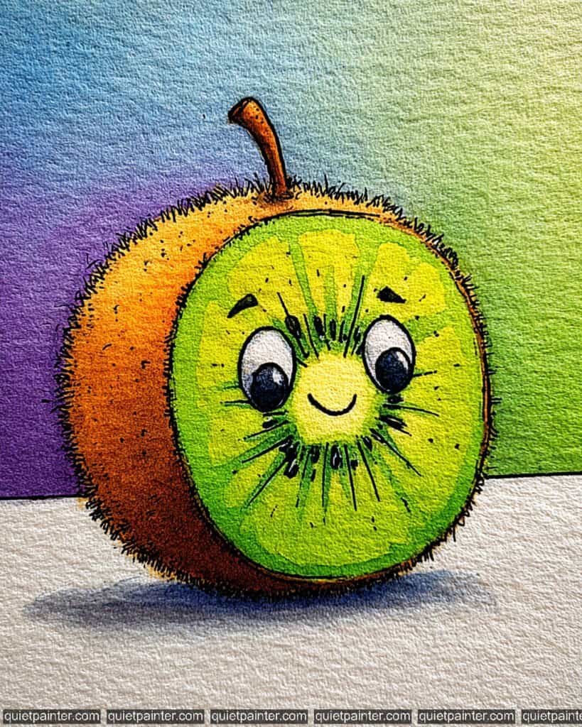
To recreate this charming cross-section of a kiwi, begin with a circular sketch for the face and a fuzzy, rounded outer “skin” on cold-press paper. Use a wet-on-wet technique for the internal fruit, blending a bright lemon yellow in the center into a vibrant lime green at the edges to suggest a fresh, juicy core. For the background, apply a soft variegated wash, transitioning from a deep violet on the left to a fresh spring green on the right, keeping the colors airy to let the high-chroma fruit pop.
Once the base layers are bone dry, focus on the unique textures. Use a fine-liner or a 0.1 technical pen to add the tiny “fuzz” hairs along the outer skin and the radiating seed lines in the center. Use a concentrated black or deep indigo to add the tiny seeds around the eyes, being careful to leave a few small white highlights to give them a glossy look. Finally, anchor the kiwi with a soft, horizontal flat wash shadow using a diluted blue-grey, which helps ground the character and emphasizes the beautiful texture of the watercolor paper.
Recommended Color Palette
To capture the fresh and earthy tones of this kiwi, I recommend using the following professional pigments:
- Sap Green: The essential base for the healthy, vibrant green of the kiwi fruit.
- Hansa Yellow Light: For the bright, glowing core and the leading edges of the fruit.
- Yellow Ochre: To provide the soft, natural base for the fuzzy outer skin.
- Burnt Sienna: To add depth and organic texture to the brown “hairy” skin.
- Dioxazine Violet: Diluted for the atmospheric background wash on the left.
- Payne’s Gray: For the sharp, expressive eyes and the delicate textural outlines.
If you’re feeling inspired to paint but want to skip the drawing phase, I’ve got you covered. Download my printable coloring pages PDF here to get all whimsical designs delivered straight to your inbox!
The Cheerful Cherry
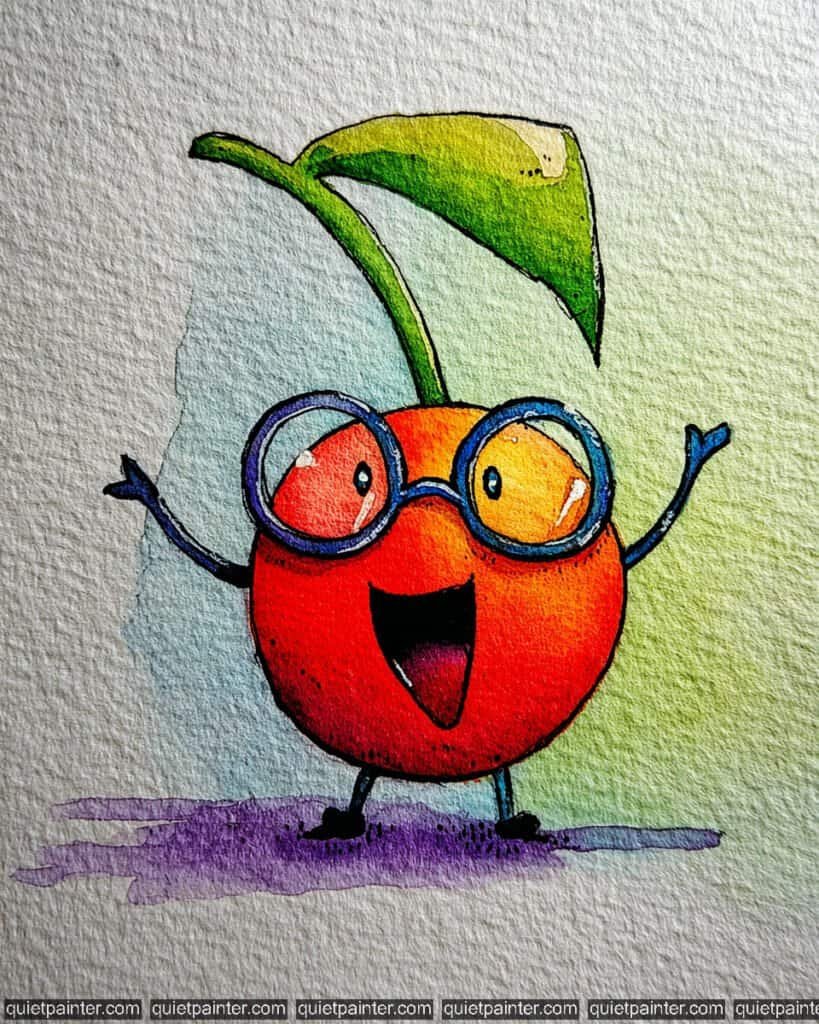
To bring this exuberant cherry to life, start with a circular sketch for the body and a tall, arching stem with a large leaf on cold-press paper. For the body, use a wet-on-wet technique, dropping in a bright yellow highlight on the upper right and bleeding it into a saturated scarlet and deep crimson on the left to create a bold, spherical volume. For the background, apply a soft variegated wash, transitioning from a light sky blue on the left to a fresh spring green on the right, keeping the colors airy to let the character shine.
Once the base layers are bone dry, focus on the details. Use a concentrated cobalt blue for the thick, round spectacles, leaving two tiny white “glints” on the lenses to suggest light reflection. Use a fine-liner or 0.1 technical pen to add the stippled texture along the shadows and the enthusiastic, open-mouthed expression. Finally, use a glazing technique for the leaf, moving from lime green to a deep forest green at the edges, and anchor the figure with a vibrant violet flat wash shadow for a modern, colorful finish.
Recommended Color Palette
To capture the high-energy and jewel-like tones of this cherry, I recommend these professional pigments:
- Cadmium Red Medium: The essential base for the rich, classic red of the cherry body.
- Hansa Yellow: To create the bright, glowing highlights on the fruit and leaf.
- Alizarin Crimson: For the deep, juicy shadows on the left side of the cherry.
- Sap Green: Perfect for the healthy, vibrant stem and leaf sections.
- Cobalt Blue: For the scholarly frames of the spectacles and the left background.
- Dioxazine Violet: Diluted for the bold, modern grounding shadow.
If you’re feeling inspired to paint but want to skip the drawing phase, I’ve got you covered. Download my printable coloring pages PDF here to get all whimsical designs delivered straight to your inbox!
The Studious Carrot
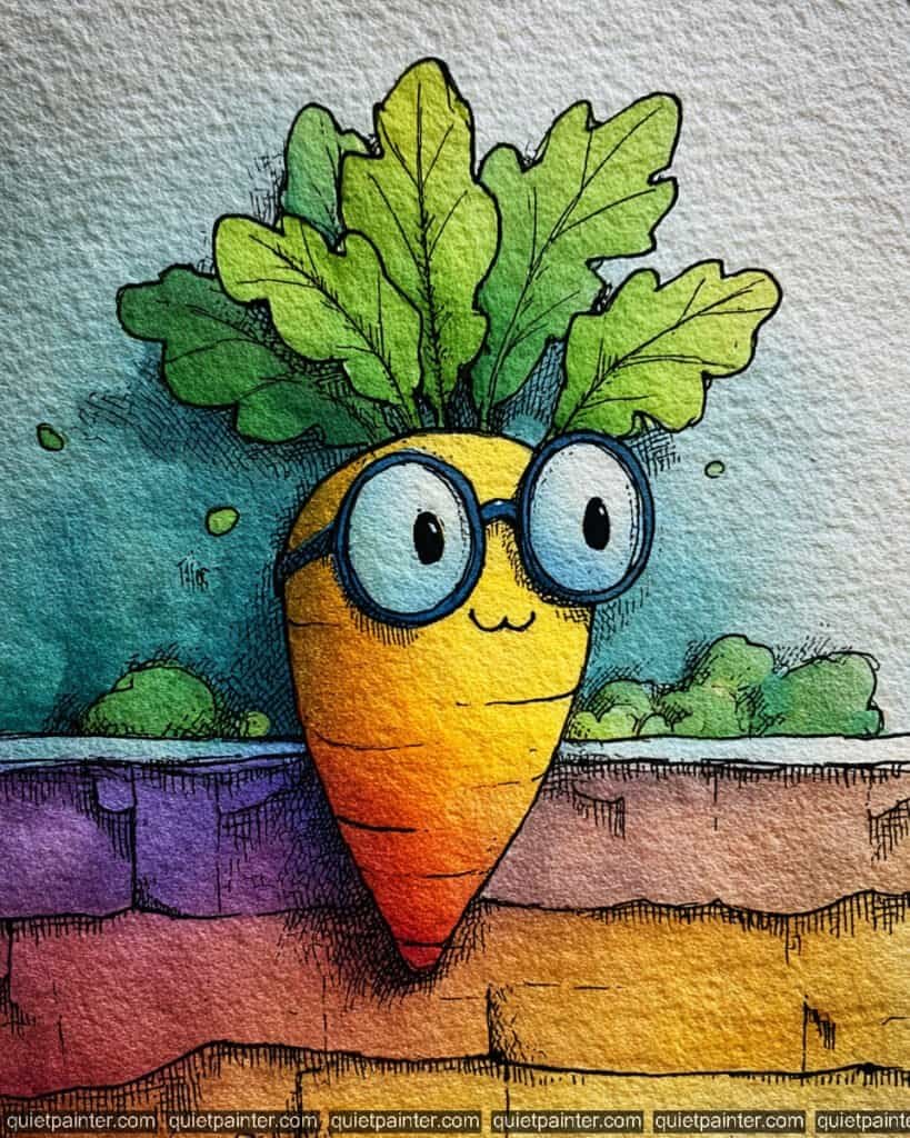
To bring this brainy root vegetable to life, start by sketching the plump carrot body nestled into a colorful stone wall on cold-press paper. Use a variegated wash for the carrot, blending a bright lemon yellow at the “face” into a warm orange and finally a deep crimson at the pointed tip. For the background sky, apply a soft flat wash of teal, keeping it airy to make the bright warm tones of the carrot pop.
Once the initial layers are dry, focus on the wall using a wet-on-dry technique to create distinct blocks of color—violet, magenta, and ochre. Use a fine-liner pen to add the dense cross-hatching that defines the stones and the carrot’s “skin” lines. Apply a glazing technique for the leafy greens, moving from a bright lime to a deep forest green. Finally, render the thick blue spectacles with a saturated navy wash, making sure to keep the “lenses” a pale, watery blue to suggest transparency.
Recommended Color Palette
To capture the vibrant and high-contrast tones of this illustration, I recommend the following professional pigments:
- Hansa Yellow Deep: For the bright, glowing core of the carrot face.
- Pyrrol Orange: To provide the saturated transition on the carrot body.
- Sap Green: The essential base for the healthy, vibrant leafy greens.
- Dioxazine Violet: Perfect for the moody stones in the wall and deep shadows.
- Cobalt Blue: For the scholarly frames of the spectacles.
- Payne’s Gray: For the sharp, expressive eyes and detailed illustrative outlines.
If you’re feeling inspired to paint but want to skip the drawing phase, I’ve got you covered. Download my printable coloring pages PDF here to get all whimsical designs delivered straight to your inbox!
The Tropical Coconut
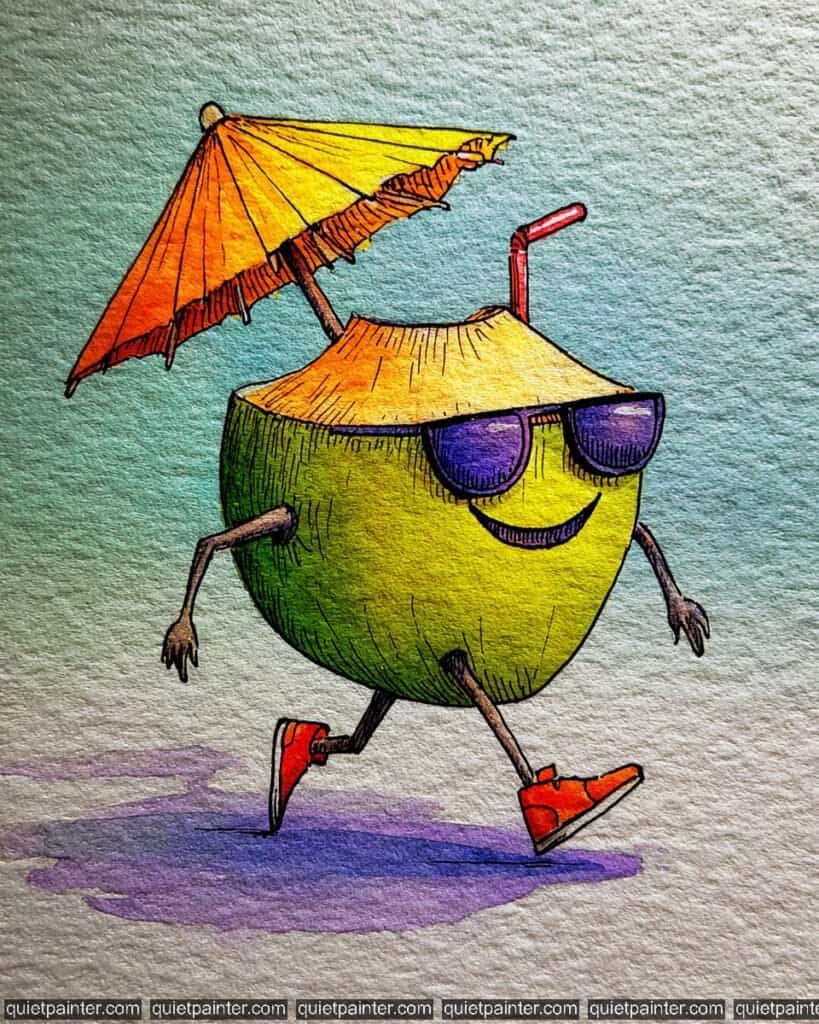
To capture the “vacation mode” vibes of this cool coconut, start by sketching the open shell, the jaunty umbrella, and the jogging pose on cold-press paper. For the main body, use a variegated wash that transitions from a sun-kissed yellow in the center to a lush sap green on the left side. For the background, apply a soft, horizontal flat wash of mint green, letting it fade toward the edges to keep the focus on the character’s energetic movement.
Once the initial fruit layers are dry, focus on the accessories using saturated washes. Use a bright orange and yellow for the umbrella, and a deep, royal violet for the sunglasses, making sure to leave tiny white “glint” reflections on the lenses. Use a fine-liner or 0.1 technical pen to add the vertical texture lines on the husk and the fine ribs of the umbrella. Finally, anchor the runner with a bold, purple wet-on-dry shadow beneath the feet to give him a modern, stylized look.
Recommended Color Palette
To capture the tropical and high-contrast tones of this piece, I suggest the following professional pigments:
- Sap Green: The primary color for the healthy, vibrant coconut husk.
- Hansa Yellow Deep: For the bright highlights on the husk and the sunny umbrella sections.
- Pyrrol Orange: To provide the punchy, energetic color for the umbrella and sneakers.
- Dioxazine Violet: For the cool, dark sunglasses and the atmospheric grounding shadow.
- Cobalt Turquoise: Diluted for the soft, refreshing background wash.
- Payne’s Gray: For the sharp illustrative outlines and the thin, expressive limbs.
If you’re feeling inspired to paint but want to skip the drawing phase, I’ve got you covered. Download my printable coloring pages PDF here to get all whimsical designs delivered straight to your inbox!
The Striding Chili
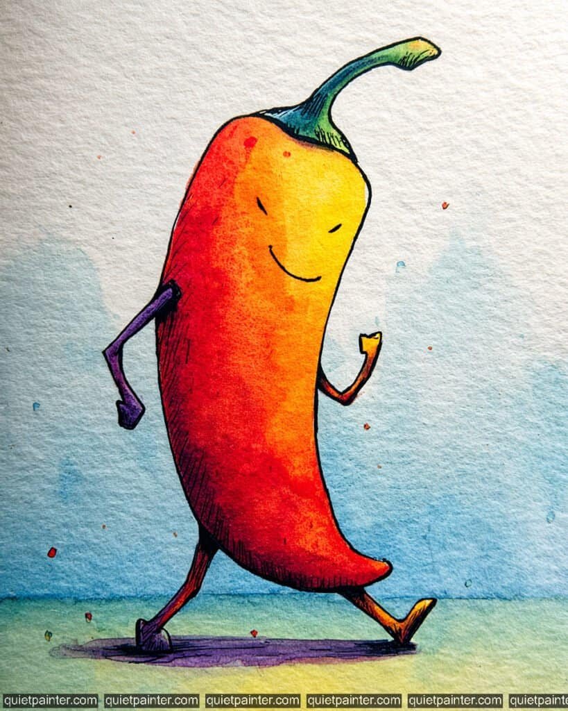
To capture the confident energy of this spicy character, start by sketching the long, curved body and the dynamic walking pose on cold-press paper. Use a variegated wash for the chili’s skin, blending a bright lemon yellow at the “face” into a warm orange and finally a deep, saturated scarlet red at the base. This transition creates a natural “heat” gradient that perfectly suits the character. For the background, apply a loose, airy flat wash of sky blue, keeping it watery to let the warm tones of the chili pop as the focal point.
Once the initial washes are dry, use a fine detail brush or a 0.1 technical pen to render the dense cross-hatching on the left side of the body, which adds weight and illustrative depth. Use a glazing technique for the stem, moving from a deep teal to a bright lime green at the tip. Finally, anchor the figure with a bold purple dry brush shadow beneath the feet and add a few playful red and orange splatters around the chili to represent its fiery personality.
Recommended Color Palette
To capture the vivid and bold energy of this striding chili, I suggest the following professional pigments:
- Azo Yellow: For the bright, glowing highlights on the face and leading leg.
- Pyrrol Orange: To provide the saturated transition between the yellow and red.
- Cadmium Red Medium: For the rich, deep red of the main chili body.
- Cobalt Turquoise: Mixed with green for the cool, stylized stem.
- Dioxazine Violet: Diluted for the intense, modern grounding shadow.
- Payne’s Gray: For the sharp, expressive eyes and the detailed illustrative outlines.
If you’re feeling inspired to paint but want to skip the drawing phase, I’ve got you covered. Download my printable coloring pages PDF here to get all whimsical designs delivered straight to your inbox!
The Brainy Broccoli
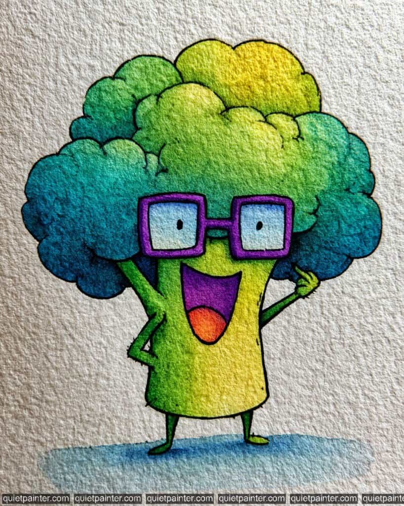
To bring this smart and enthusiastic vegetable to life, begin by sketching the puffy, cloud-like head and the rectangular purple glasses on cold-press paper. Start with a variegated wash for the florets, blending a sunny yellow-green at the top right into a deep, cool teal and navy blue at the bottom left. This creates a wonderful sense of light and volume. For the stem, apply a flat wash of lime green, then drop in a touch of yellow while it’s still wet to highlight the center.
Once the base is dry, focus on the expressive details. Use a concentrated violet for the chunky glasses, making sure to leave the “lenses” a very pale, watery blue to suggest glass. Use a fine-liner pen or a tiny detail brush to render the stippled texture on the florets and the thin, joyful arms. Finally, use a vibrant orange for the tongue and anchor the character with a soft blue-grey horizontal wash for the shadow, which helps the character feel grounded and ready to share some knowledge!
Recommended Color Palette
To capture the bright and intellectual energy of this character, I suggest the following professional pigments:
- Sap Green: The essential base for the healthy, vibrant broccoli florets and stem.
- Cobalt Turquoise: To provide the cool, deep tones for the shadowed side of the head.
- Azo Yellow: For the bright, glowing highlights at the top of the florets and center stem.
- Dioxazine Violet: For the bold, scholarly purple frames of the glasses.
- Pyrrol Orange: For the punchy, energetic color of the tongue.
- Payne’s Gray: For the sharp, expressive lines and the grounding shadow.
If you’re feeling inspired to paint but want to skip the drawing phase, I’ve got you covered. Download my printable coloring pages PDF here to get all whimsical designs delivered straight to your inbox!
The Cloud-Crowned Cauliflower
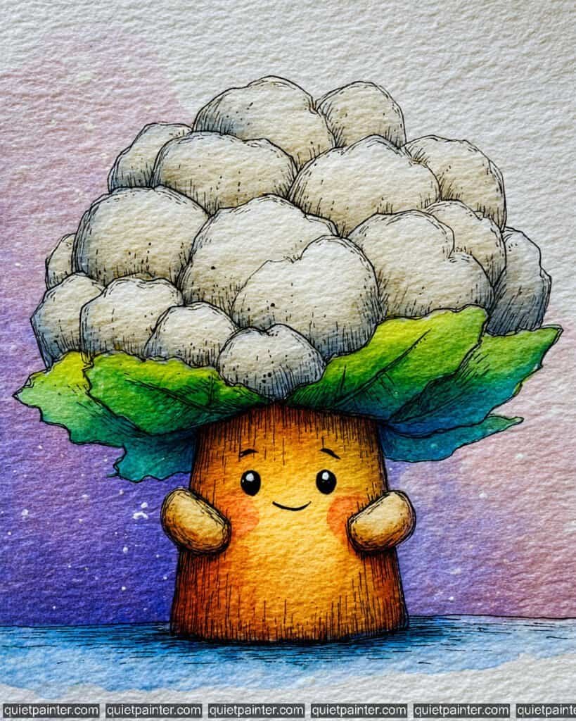
To paint this adorable, tree-like cauliflower, begin by sketching the puffy florets and the sturdy, textured trunk on high-quality cold-press paper. For the cauliflower head, use a wet-on-wet technique with a very pale mix of yellow ochre and grey, allowing the pigments to settle into the paper’s texture to mimic the vegetable’s natural bumpy surface. For the trunk, apply a variegated wash of warm honey-gold and burnt sienna, keeping the center light to suggest a rounded, 3D form.
Once the base layers are dry, use a glazing technique for the leaves, layering bright lime green over a cool teal at the base for maximum vibrancy. Use a fine-liner pen to add the vertical “bark” lines on the trunk and the delicate stippling on the florets to define their volume. Finally, anchor the character against the dreamy, starry background by blending a deep violet and royal blue flat wash, and use a white gel pen or opaque watercolor for the “confetti” highlights and the sparkle in those big, friendly eyes.
Recommended Color Palette
To capture the earthy and atmospheric tones of this piece, I recommend the following professional pigments:
- Yellow Ochre: Diluted for the creamy, soft highlights on the cauliflower florets.
- Quinacridone Gold: For the warm, glowing core of the trunk.
- Sap Green: To provide the healthy, vibrant green for the leafy collar.
- Cobalt Turquoise: To add cool, shadowy depth to the underside of the leaves.
- Dioxazine Violet: Mixed with blue for the rich, cosmic background wash.
- Payne’s Gray: For the sharp, expressive eyes and the detailed illustrative texture.
If you’re feeling inspired to paint but want to skip the drawing phase, I’ve got you covered. Download my printable coloring pages PDF here to get all whimsical designs delivered straight to your inbox!
The Pronunciation Duel
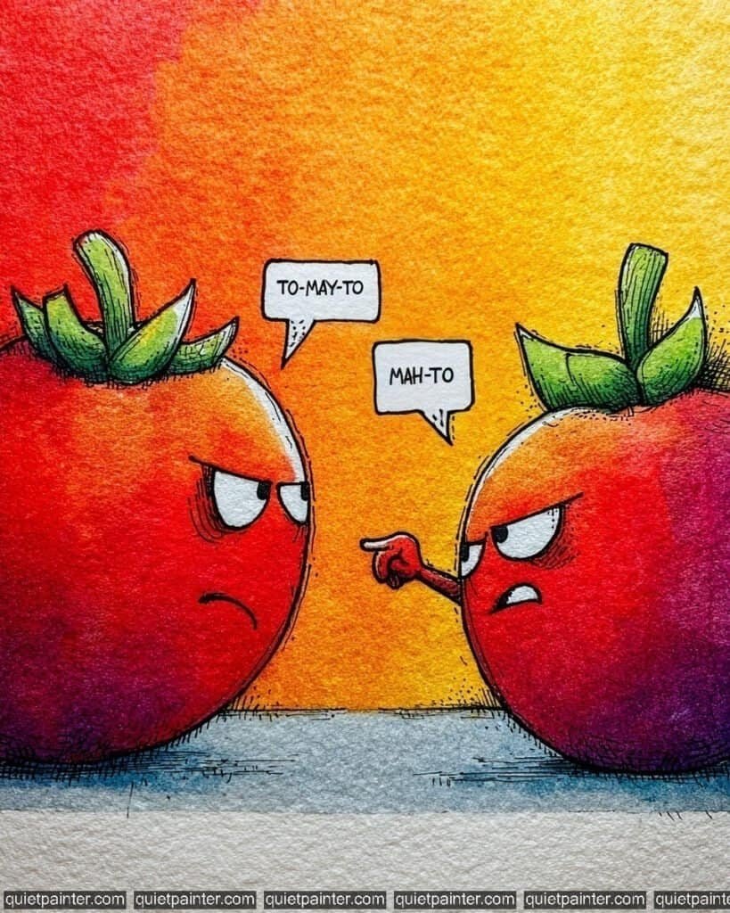
To capture the intense “To-may-to / To-mah-to” rivalry of these fiery fruit, start by sketching two round, slightly flattened tomatoes facing off on cold-press watercolor paper. For the background, apply a bold variegated wash, blending a vibrant lemon yellow at the top right into a deep, punchy orange and finally a saturated scarlet red on the left. While the background is still slightly damp, use a wet-on-wet technique for the tomatoes themselves, dropping in a rich magenta and violet on their lower halves to create a heavy, rounded volume.
Once the primary washes are bone dry, use a fine-liner pen or a 0.1 technical pen to render the angry, furrowed brows and the pointing finger. Employ a glazing technique for the green stems, starting with a base of lime green and adding a touch of deep forest green and violet to the leaf segments for a sharp, illustrative contrast. Finally, anchor the duel with a cool blue-grey flat wash at the base, and use a white gel pen or opaque white watercolor to add sharp highlights to the tops of the tomatoes to emphasize their glossiness.
Recommended Color Palette
To capture the intense heat and personality of this scene, I recommend these professional pigments:
- Cadmium Red Deep: For the rich, classic red of the debating tomatoes.
- Hansa Yellow: To create the bright, glowing upper section of the background.
- Quinacridone Magenta: For the juicy, vibrant mid-tones on the tomato bodies.
- Imperial Purple: Diluted for the deep, dramatic shadows on the fruit and ground.
- Sap Green: To define the sturdy, healthy green crowns.
- Payne’s Gray: For the sharp, expressive facial lines and the bold text.
If you’re feeling inspired to paint but want to skip the drawing phase, I’ve got you covered. Download my printable coloring pages PDF here to get all whimsical designs delivered straight to your inbox!
The Banana Bedtime Besties
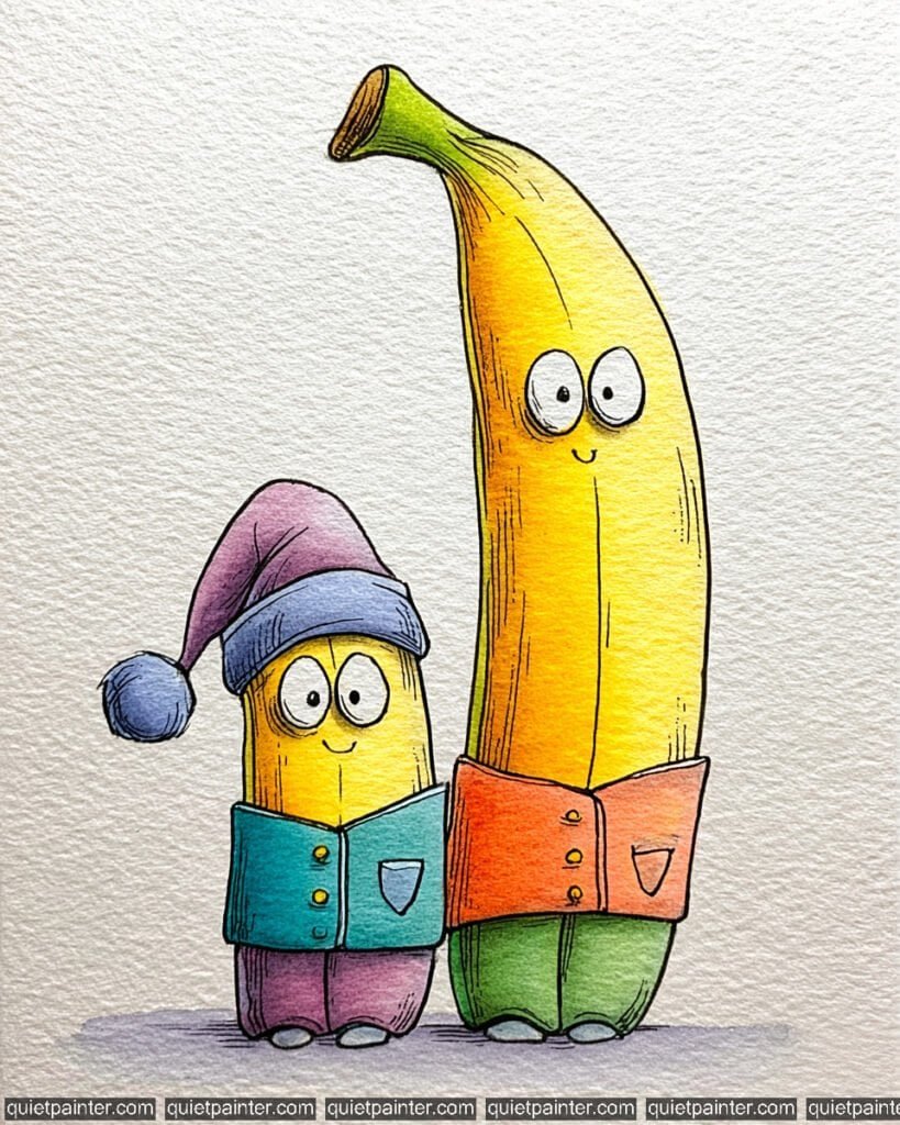
To capture the cozy, whimsical charm of these banana buddies, start by sketching their tall, curved forms and adorable pajamas on cold-press watercolor paper. For the bananas themselves, use a wet-on-wet technique, blending a vibrant lemon yellow with a soft lime green at the stem to suggest a perfect level of ripeness. Ensure you leave the large, circular eyes white to make their friendly expressions pop against the bright fruit.
Once the initial fruit layers are dry, focus on the pajamas using a flat wash for the distinct blocks of color: teal, coral, violet, and spring green. Use a fine 0.1 technical pen or a very steady detail brush to add the vertical texture lines on the banana peels and the delicate cross-hatching on the sleeping cap. Finally, anchor the pair with a soft, horizontal gradient wash of lavender at their feet, which creates a gentle, dream-like shadow that complements the overall bedtime theme.
Recommended Color Palette
To capture the bright and comforting tones of this illustration, I suggest using these professional pigments:
- Azo Yellow: For the primary, sun-kissed color of the banana bodies.
- Sap Green: To define the healthy green stems and the tall banana’s pants.
- Cobalt Turquoise: Perfect for the small banana’s cozy pajama jacket.
- Pyrrol Orange: To provide the warm, saturated tone for the tall banana’s shirt.
- Dioxazine Violet: Diluted for the sleeping cap and the modern grounding shadow.
- Payne’s Gray: For the sharp, expressive outlines and the tiny button details.
If you’re feeling inspired to paint but want to skip the drawing phase, I’ve got you covered. Download my printable coloring pages PDF here to get all whimsical designs delivered straight to your inbox!
The Unimpressed Pineapple
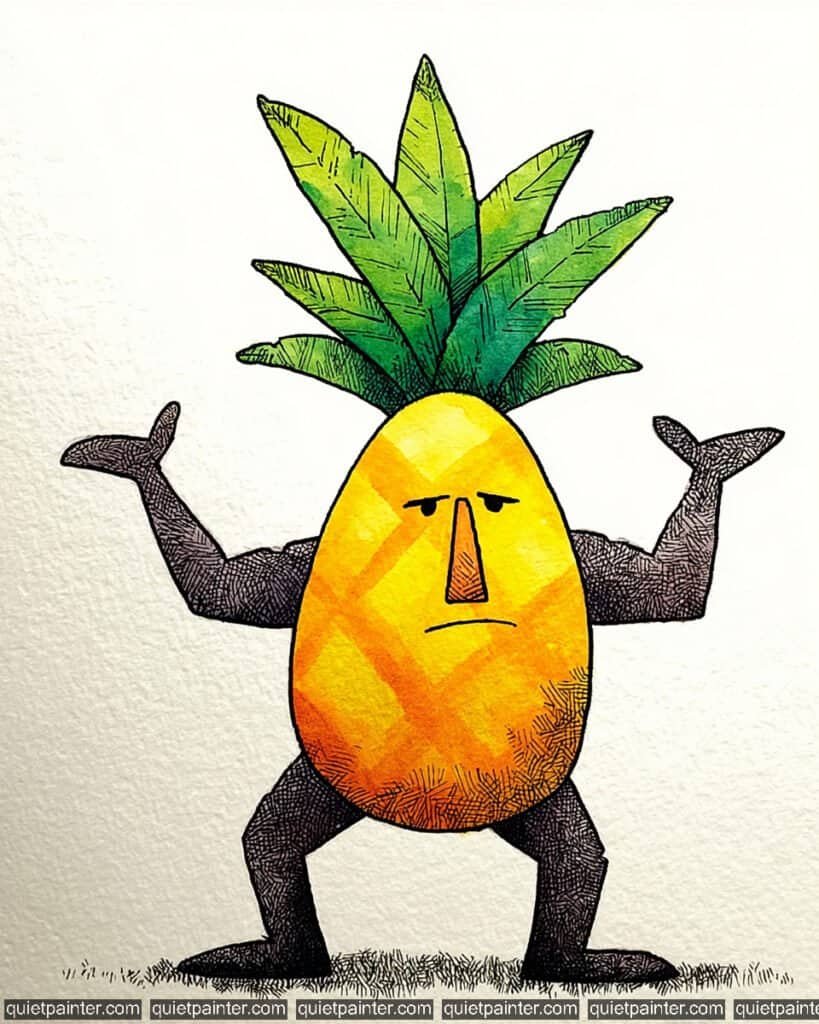
To capture the stoic, muscular presence of this tropical character, start by sketching the egg-shaped body and the broad, flexed limbs on cold-press watercolor paper. Use a wet-on-dry technique for the torso, layering a bright lemon yellow over a warm orange. While the paint is still slightly damp, introduce the diagonal “pineapple skin” pattern with a more concentrated orange pigment to suggest the fruit’s natural texture without losing the overall roundness.
For the limbs and face, focus on stippling and dense cross-hatching with a fine-liner pen or a technical pen. This creates a striking contrast between the smooth, colorful fruit and the dark, textured muscles. Apply a variegated wash to the leafy crown, blending spring green with hints of teal to create depth. Finally, use a steady hand for the minimalist facial features—those heavy eyelids are the key to his “unimpressed” personality.
Recommended Color Palette
To capture the vibrant yellow and contrasting dark tones of this piece, I suggest the following professional pigments:
- Hansa Yellow Deep: For the luminous, primary color of the pineapple body.
- Pyrrol Orange: To define the warm shadows and the diagonal skin pattern.
- Sap Green: The essential base for the healthy, upright leaves.
- Cobalt Turquoise: To add cool, shadowy depth to the leafy crown.
- Payne’s Gray: For the intense, detailed cross-hatching on the arms and legs.
- Burnt Sienna: A touch on the nose and base for earthy, organic warmth.
If you’re feeling inspired to paint but want to skip the drawing phase, I’ve got you covered. Download my printable coloring pages PDF here to get all whimsical designs delivered straight to your inbox!
The Cucumber Butler
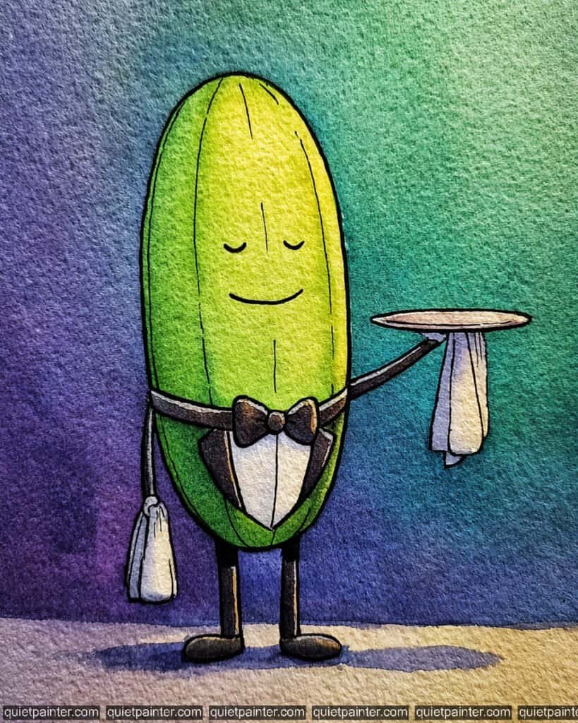
To capture the poised elegance of this character, start by sketching the long oval body and his formal attire on cold-press watercolor paper. Begin with a variegated wash for the background, blending a deep violet on the far left into a vibrant teal and finally a bright spring green on the right. For the cucumber’s body, use a wet-on-wet technique, dropping in a bright lime green in the center and allowing it to bleed into a darker forest green at the edges to create a rounded, cylindrical volume.
Once the initial layers are dry, focus on the formal details by applying a saturated black or deep indigo flat wash for the bow tie and jacket. Use a fine-liner pen or a tiny detail brush to render the serene closed eyes, the gentle smile, and the subtle vertical texture lines on the skin. Finally, anchor the figure with a soft, horizontal cast shadow using a diluted purple, and keep the “white” of the towels and shirt crisp to maintain his clean, professional look.
Recommended Color Palette
To capture the sophisticated and cool tones of this piece, I suggest the following professional pigments:
- Sap Green: The essential base for the healthy, vibrant green of the cucumber.
- Phthalo Green: To add deep, cool shadows to the sides of the vegetable body.
- Azo Yellow: Diluted heavily for the bright, sun-kissed highlight on the face.
- Dioxazine Violet: For the moody background transition and the elegant grounding shadow.
- Cobalt Turquoise: To provide the smooth, atmospheric mid-tones in the background.
- Payne’s Gray: For the sharp, formal lines of the tuxedo and the tray.
If you’re feeling inspired to paint but want to skip the drawing phase, I’ve got you covered. Download my printable coloring pages PDF here to get all whimsical designs delivered straight to your inbox!
Conclusion
Painting these little duos has been such a source of joy for me, and I can’t wait to see how you interpret them. Download the PDF today and let your watercolors turn these sketches into something spectacular.