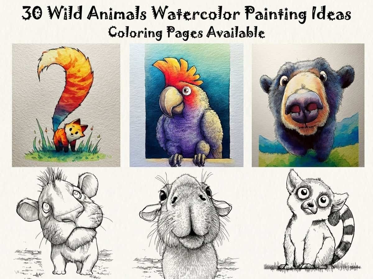
I believe there is something truly meditative about capturing the spirit of a wild creature through the fluid motion of watercolors. In this guide, I’ve put together 30 diverse prompts ranging from the quiet forest floor to the vast, open savannah.
These ideas are meant to help you experiment with textures, layers, and the natural “bloom” of the paint. Let’s set aside some time to reconnect with nature and fill your sketchbook with life.
Contents
- 1 30 Wild Animals Watercolor Painting Ideas
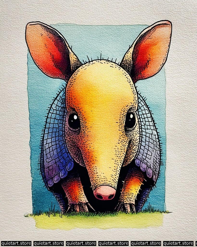
- 1.1 Aardvark
- 1.2 Antelope
- 1.3 Baboon
- 1.4 Black Panther
- 1.5 Camel
- 1.6 Cape Buffalo
- 1.7 Elephant
- 1.8 Giraffe
- 1.9 Hyena
- 1.10 Kangaroo
- 1.11 Koala
- 1.12 Lemur
- 1.13 Leopard
- 1.14 Meerkat
- 1.15 Orangutan
- 1.16 Pangolin
- 1.17 Penguin
- 1.18 Raccoon
- 1.19 Rhino
- 1.20 Sloth
- 1.21 Snake
- 1.22 Squirrel
- 1.23 Tarsier
- 1.24 Tiger
- 1.25 Toucan
- 1.26 Walrus
- 1.27 Warthog
- 1.28 Zebra backside
- 1.29 Zebra portrait
- 1.30 Vulture
- 2 Conclusion
30 Wild Animals Watercolor Painting Ideas
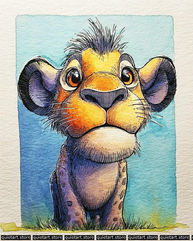
Aardvark
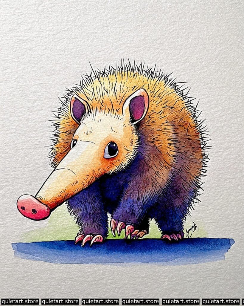
To achieve the dense, radiating bristles, you’ve used a wet-on-dry layering process. Start with a graduated wash of pale yellow on the head, transitioning into a warm ochre and then a deep violet on the legs. Once this “base skin” is bone-dry, use a fine-liner (0.1 or 0.3) for the radial hatching. Start from the center of the body and “flick” your strokes outward toward the edges. By overlapping these lines with varying lengths, you create that “hedgehog-like” texture that gives the aardvark its protective, bristly appearance.
The muzzle and ears utilize a wet-on-wet “charging” technique. For the ears and the tip of the nose, lay down a light pink wash and immediately drop in a more concentrated magenta or burnt sienna while the paper is still wet. This creates that “subsurface scattering” look where the skin appears thin and filled with blood. For the ground, use a flat wash of cobalt blue, but keep it minimal to ensure the character remains the focal point. The sharp, white highlights in the eyes are the final “pop” that brings the whole character to life.
Professional Palette
This palette uses a “split-complementary” scheme of yellows, oranges, and purples to create maximum visual interest:
| Feature | Recommended Pigment | Why It Works |
| Top Bristles | Hansa Yellow Deep | A sunny, transparent yellow that provides a high-key light source. |
| Lower Body | Ultramarine Violet | A granulating purple that mimics the heavy shadow on dense fur. |
| Snout & Ears | Quinacridone Rose | Provides a delicate, glowing pink for the sensitive skin areas. |
| Claws & Lines | Neutral Tint | Offers a very dark, transparent value for the sharp, technical details. |
| Shadow Ground | Cobalt Blue | A clean, stable blue that grounds the character without getting “muddy.” |
Our 60 Wild Animals Watercolor Coloring Pages (PDF Download) are made for pure enjoyment. Ready to let your creativity run wild? Download, print, and start today.
Antelope
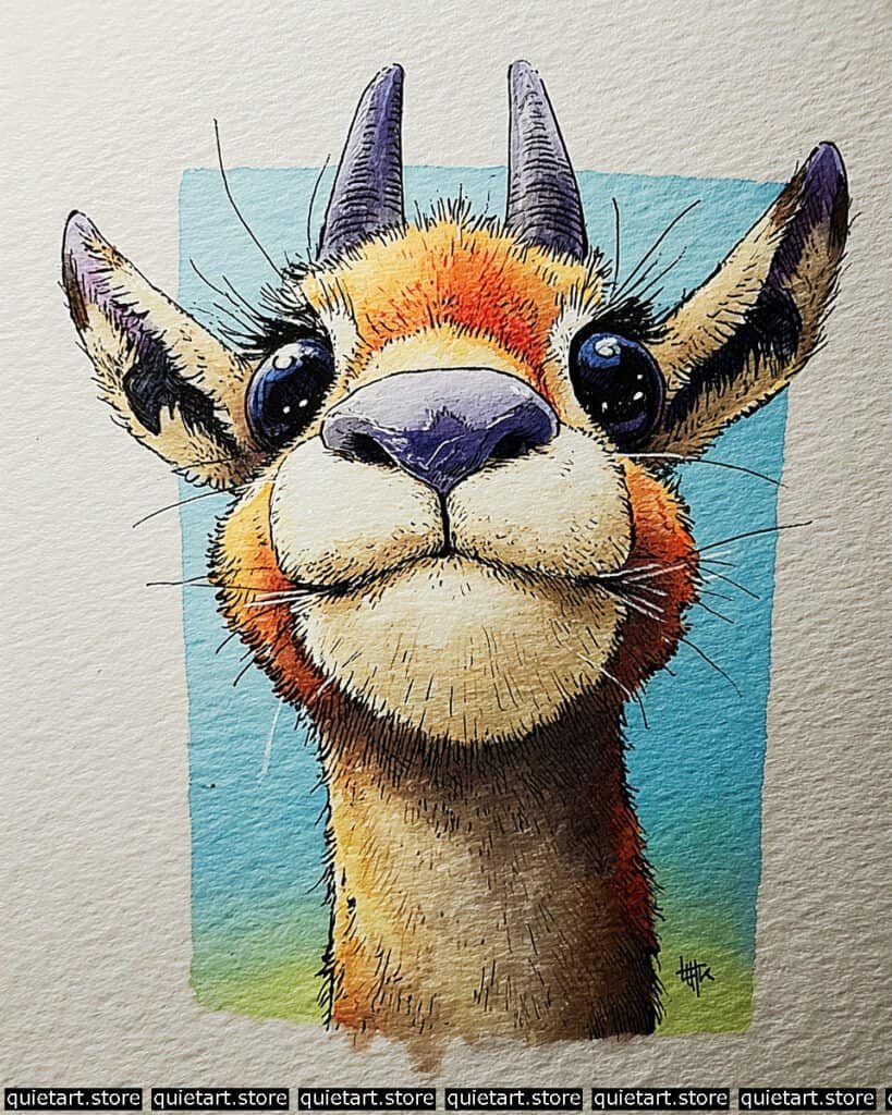
To create the sense of “glow” on the forehead, you’ve used a saturated charging technique. Start with a light wash of yellow ochre across the face. While the pigment is still mobile, “charge” the area between the eyes with a highly concentrated orange. This mimics the way sunlight filters through short, fine fur. For the muzzle, notice how the shadow transitions into a soft purple—this is a damp-on-damp blend, where the cool shadow is introduced just as the warm base wash is beginning to dry, preventing a muddy mix.
The structural details are what give this antelope its character. Use a 0.03 technical pen for the stippled texture on the muzzle and the delicate, long eyelashes. To make the eyes look liquid and deep, use a multi-layered glazing technique: paint a base of deep blue, let it dry, and then add a darker “crescent” shadow at the top. The final touch—those sharp, white specular highlights—should be added with white gouache or a gel pen to simulate the reflection of a bright sky.
Professional Palette
This selection balances the high-intensity face with a calming, atmospheric background:
| Feature | Recommended Pigment | Why It Works |
| Forehead & Cheeks | Pyrrol Orange | A vibrant, transparent orange that glows when layered over yellow. |
| Horns & Shadows | Ultramarine Violet | A granulating purple that naturally adds “bony” texture to the horns. |
| Lower Neck | Burnt Sienna | Provides an earthy, stable warmth to ground the character. |
| The Muzzle | Neutral Tint | Diluted heavily, it creates a soft, leathery grey for the nose. |
| Sky Vignette | Cerulean Blue | A classic sky blue that frames the warm tones perfectly. |
Our 60 Wild Animals Watercolor Coloring Pages (PDF Download) are made for pure enjoyment. Ready to let your creativity run wild? Download, print, and start today.
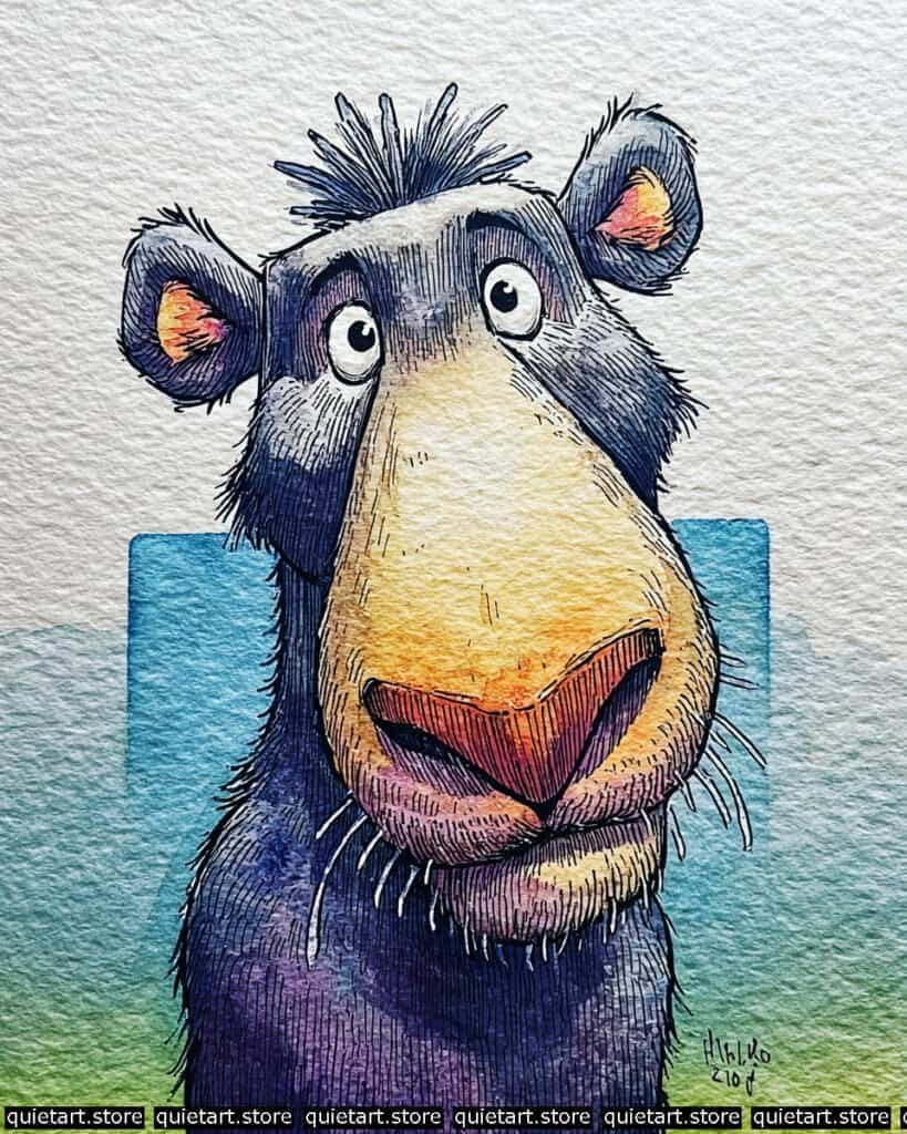
Baboon
To achieve the “halo” effect on the mane, you’ve used a vignette wash with lifting. Start with a light yellow-ochre wash in the center of the body. While the paper is damp, use a thirsty brush (clean and slightly damp) to “wick” away the pigment along the outer edges of the fur. This leaves a bright, sun-lit perimeter that makes the character look like it’s being hit by a strong backlight.
For the vibrant skin tones on the face and tail, you’ve employed a wet-on-wet charging technique. Lay down a base of bright orange, and while it’s still juicy, drop in a concentrated magenta or alizarin crimson at the bottom of the muzzle and the base of the tail. This creates a natural, fleshy gradient that looks much more organic than a flat red. The “scruffy” texture is finalized with short-stroke hatching using a fine-liner, mimicking the coarse, wiry hair characteristic of baboons.
Professional Palette
This selection balances high-chroma “hot” spots with deep, receding “cool” spots:
| Feature | Recommended Pigment | Why It Works |
| Main Mane | Yellow Ochre | A classic, granulating earth tone that provides a natural, woolly base. |
| Muzzle & Legs | Pyrrol Red | A punchy, staining red that holds its vibrance even when diluted. |
| Underbelly | Ultramarine Blue | Provides a cool, receding shadow that adds “weight” to the fluff. |
| Tail & Face Details | Quinacridone Magenta | Adds a realistic, “blood-filled” skin glow to the sensitive areas. |
| The Ground | Phthalo Blue (RS) | A strong, stable blue that anchors the character firmly to the floor. |
Our 60 Wild Animals Watercolor Coloring Pages (PDF Download) are made for pure enjoyment. Ready to let your creativity run wild? Download, print, and start today.
Black Panther
To paint a “black” subject without losing the underlying form, you’ve mastered the selective glazing process. Start with a warm, pale yellow under-wash on the top of the nose and forehead to establish your light source. Once dry, apply a very diluted wash of cool violet across the entire character. Gradually build up your darks by layering thin, transparent glazes of indigo and neutral tint into the shadows, such as the jowls and the base of the neck. By leaving the bridge of the nose with fewer layers, you preserve that original “glow,” giving the face a rounded, tactile feel.
The textural detail is achieved through contour-following cross-hatching. Once your washes are bone-dry, use a 0.05 technical pen to draw the fur. Instead of straight lines, use short, curved strokes that follow the “bulge” of the muzzle and the “slope” of the brow. For the whiskers and ear tufts, use a rigger brush or a gel pen to pull sharp, white lines over the dark paint. This high-contrast detail makes the fur look soft and backlit against the vibrant blue vignette background.
Professional Palette
To keep your darks looking “alive” and vibrant, I recommend this selection of staining and granulating pigments:
| Feature | Recommended Pigment | Why It Works |
| Glow Muzzle | Yellow Ochre | Provides a natural, earthy warmth that doesn’t overwhelm the dark fur. |
| Main Body Fur | Indanthrone Blue | A deep, non-granulating blue that creates a “leathery” dark depth. |
| Shadow Accents | Ultramarine Violet | A granulating purple that mimics the soft shadow on dense, short fur. |
| Ear Inner Glow | Pyrrol Orange | A punchy orange that suggests blood-filled skin catching the light. |
| Sky Vignette | Phthalo Blue (GS) | A crisp, clean blue that frames the character and pushes it forward. |
Our 60 Wild Animals Watercolor Coloring Pages (PDF Download) are made for pure enjoyment. Ready to let your creativity run wild? Download, print, and start today.
Camel
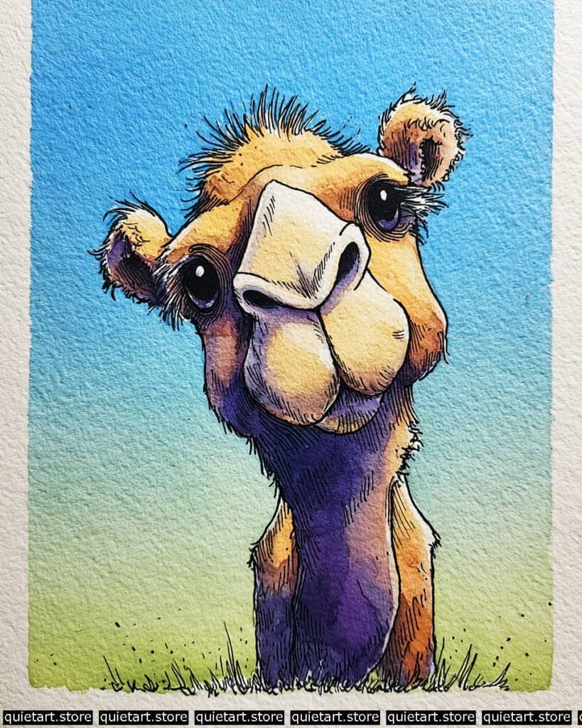
To achieve the velvety texture of the camel’s snout and the “glow” on its forehead, you’ve used a variegated wash with high-key highlights. Start with a very pale, almost white yellow on the top of the nose bridge and the “eyebrows.” While damp, charge the surrounding areas with a warm ochre, and eventually a deep sienna. By leaving those high-key areas with very little pigment, you create a “bleached” look that perfectly mimics the harsh sun of the desert.
The structural definition is handled through rhythmic contour hatching. Once your base colors are dry, use a 0.05 technical pen to follow the curves of the “puffy” cheeks and the long, sloping bridge of the nose. For the eyelashes and the scruffy tufts of hair on the ears and crown, use a dry-brush flick—this is where you use a brush with very little moisture to create “scratchy” lines that look like coarse, sun-dried hair. The background vignette, moving from a saturated blue to a pale lime green, provides a clean contrast that makes the warm oranges of the camel “sing.”
Professional Palette
This palette focuses on earthy warmth contrasted with a cool, atmospheric shadow:
| Feature | Recommended Pigment | Why It Works |
| Forehead & Humps | Yellow Ochre | Provides a natural, sandy base that granulates beautifully on the paper. |
| Shadowed Neck | Ultramarine Violet | A granulating purple that creates a deep, vibrant shadow without lookng muddy. |
| Muzzle Accents | Quinacridone Sienna | A transparent, glowing brown that adds depth to the skin folds. |
| Sky Vignette | Cerulean Blue | A classic desert sky blue that recedes perfectly into the distance. |
| Grass & Base | Green Gold | A bright, translucent green that reflects light back up onto the chin. |
Our 60 Wild Animals Watercolor Coloring Pages (PDF Download) are made for pure enjoyment. Ready to let your creativity run wild? Download, print, and start today.
Cape Buffalo
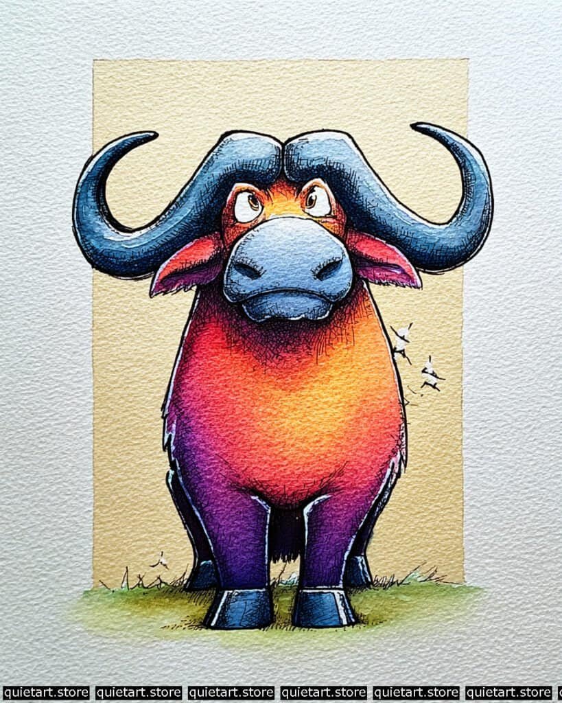
To achieve the intense, radiating glow on the chest, you’ve used a saturated charging technique. Start with a bright yellow circle in the center of the torso. While the paper is still very wet, “charge” the surrounding area with a fiery orange, then a deep red, and finally a concentrated purple toward the legs. This creates a natural vignette effect within the animal’s body, making it appear as though it’s standing directly in front of a low, powerful sun.
The horns and muzzle require a cool-tone glazing technique. Since these are the “harder” surfaces of the buffalo, use a less diluted mix of Cerulean and Indigo. By layering these cool tones over a dry, light base, you create a leathery, matte texture that feels distinctly different from the “fuzzy” warmth of the body. The small white birds (oxpeckers) on the buffalo’s side are a fantastic touch—to keep them sharp, you likely used negative painting, carefully painting the orange body around the bird shapes, or added them at the end with a dab of opaque white gouache.
Professional Palette
This palette uses a bold “temperature split” to create three-dimensional mass:
| Feature | Recommended Pigment | Why It Works |
| Glow Core | Azo Yellow | A transparent yellow that acts as the “light bulb” for the chest. |
| Mid-Body | Pyrrol Red | A powerful red that bridges the gap between the yellow and purple. |
| Legs & Shadows | Carbazole Violet | Provides the deepest “cool” value to ground the heavy frame. |
| Horns & Hooves | Indanthrone Blue | A deep, moody blue that mimics weathered horn and keratin. |
| Background | Yellow Ochre | A muted, sandy yellow that frames the character without competing for intensity. |
Our 60 Wild Animals Watercolor Coloring Pages (PDF Download) are made for pure enjoyment. Ready to let your creativity run wild? Download, print, and start today.
Elephant
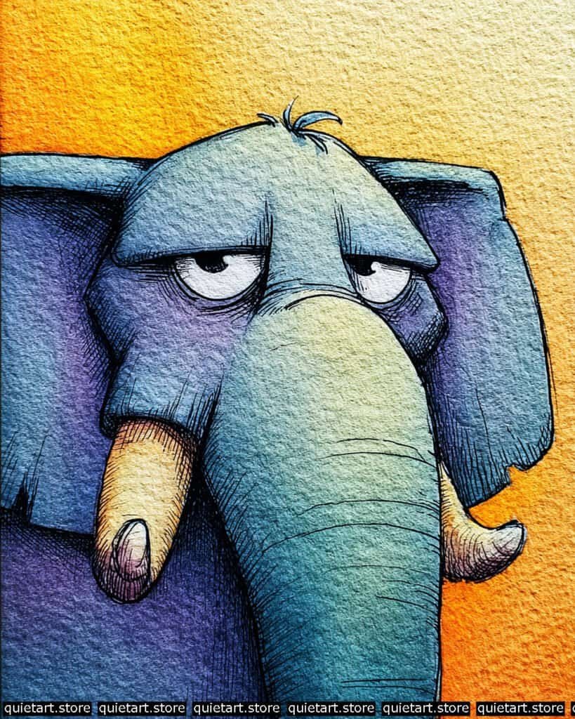
To capture the thick, leathery texture of elephant skin, you’ve used a granulating variegated wash. Start with a base of Cobalt Teal. While the paper is still damp, “charge” the shadow areas—like under the brow and the sides of the head—with a deep Ultramarine Violet. Because these pigments have larger particles, they naturally settle into the “valleys” of your cold-pressed paper, mimicking the natural wrinkles and folds of the skin without requiring painstaking detail.
The structural weight is achieved through contour-hatching. Once the watercolor layers are bone-dry, use a 0.05 technical pen to add rhythmic, horizontal lines across the trunk and brow. These lines should follow the “wrap” of the form, acting like topographical markers that emphasize the roundness of the trunk and the depth of the eye sockets. For the tusks, use a glazing technique: apply a thin layer of Raw Sienna on the underside, leaving the top edge as pure paper white to simulate the hard, reflective surface of ivory.
Professional Palette
This selection of pigments focuses on high-contrast temperature shifts to keep the “gray” skin looking vibrant and alive:
| Feature | Recommended Pigment | Why It Works |
| Main Skin | Cobalt Teal Blue | A granulating, opaque blue that perfectly mimics thick, dusty skin. |
| Deep Shadows | Ultramarine Violet | Provides a rich, transparent purple that adds “weight” to the folds. |
| The Tusks | Raw Sienna | A natural earth tone that gives ivory a realistic, aged warmth. |
| Background | Pyrrol Orange | An intense, staining orange that makes the teal skin “vibrate.” |
| Eye Sockets | Neutral Tint | Used sparingly to push the eyes deep into the “worried” brow. |
Our 60 Wild Animals Watercolor Coloring Pages (PDF Download) are made for pure enjoyment. Ready to let your creativity run wild? Download, print, and start today.
Giraffe
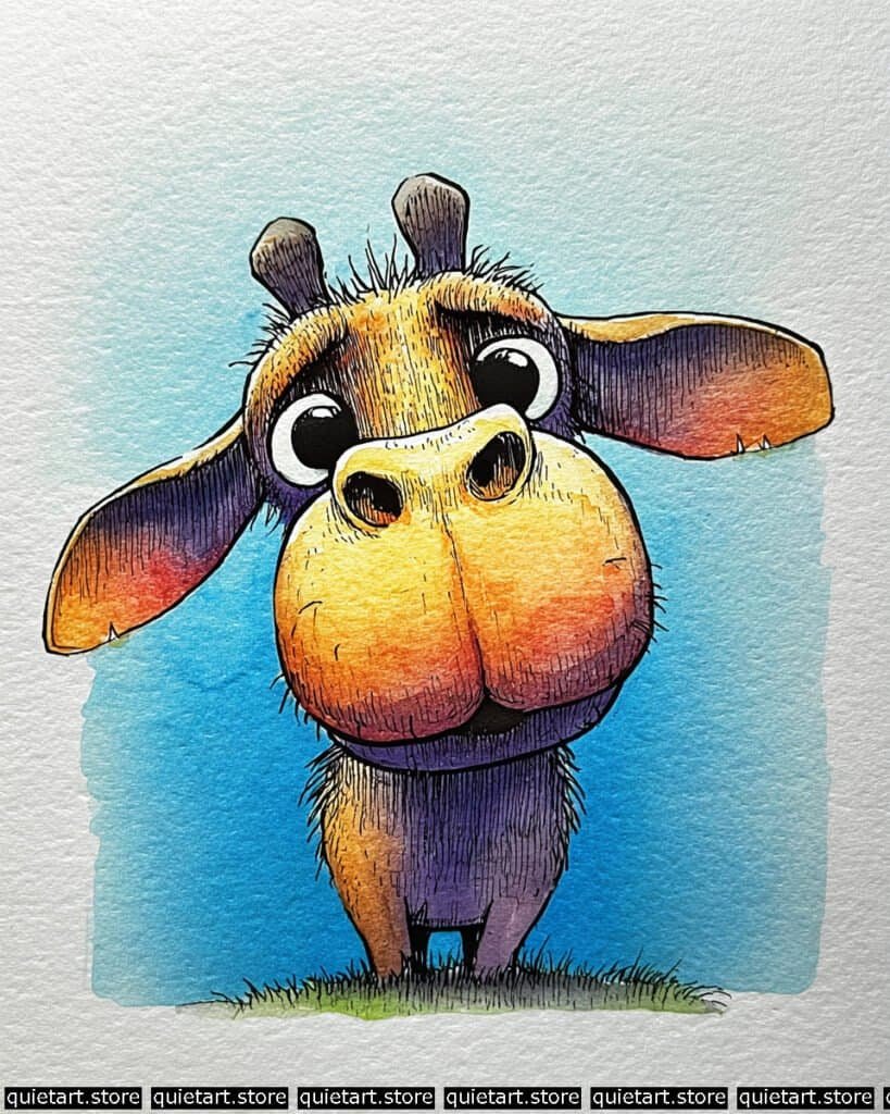
To achieve the rounded, bulbous volume of the muzzle, you’ve employed a radial variegated wash. Start by pre-wetting the central bridge of the nose. Drop in a pale yellow, then “charge” the damp area with a warm orange and eventually a deep magenta toward the chin. This allows the pigments to mingle on the paper without harsh interior edges, creating a sense of soft, 3D form. For the neck, notice the hard-edged shadow—this is a wet-on-dry glaze, where you wait for the base fur color to dry completely before painting the purple shadow shape over it to suggest strong, overhead sunlight.
The textural details are achieved through a combination of pen work and scumbling. Use a fine-liner for the rhythmic hatching on the neck and muzzle, following the contour of the animal’s body to emphasize its shape. For the ossicones (horns) and the inner ears, use a dry-brush technique with a dark violet pigment. By dragging a brush with very little moisture across the tooth of the paper, you create a “scratchy” texture that mimics weathered bone or short, coarse hair.
Professional Palette
This selection of pigments focuses on high-contrast temperature shifts to make the “warm” giraffe pop against the “cool” sky:
| Feature | Recommended Pigment | Why It Works |
| Muzzle & Forehead | Hansa Yellow Deep | A transparent, sunny yellow that glows when layered with orange. |
| Lower Face & Ears | Pyrrol Orange | A punchy orange that adds life and vibrancy to the “sunlit” areas. |
| Shadowed Neck | Ultramarine Violet | A granulating purple that naturally adds a “fur-like” texture to shadows. |
| Ossicones (Horns) | Raw Umber | A cool, earthy brown that provides a realistic, “hard” texture. |
| Sky Frame | Cerulean Blue | A classic sky blue that provides a crisp, calm background. |
Our 60 Wild Animals Watercolor Coloring Pages (PDF Download) are made for pure enjoyment. Ready to let your creativity run wild? Download, print, and start today.
Hyena
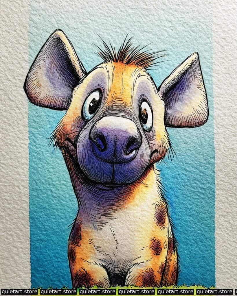
To manage the complex transitions on the snout and neck, you’ve used a multi-directional variegated wash. Start by wetting the center of the muzzle and the bridge of the nose. While damp, “charge” the lower jaw and the left side of the neck with a concentrated Ultramarine Violet. This allows the shadow to feel luminous rather than flat. For the “glow” on the forehead and the right side of the chest, drop in a warm Yellow Ochre, letting it bleed into the damp purple areas to create those soft, natural transitions.
The iconic spots and fur are achieved through wet-on-dry layering. Once your base body wash is bone-dry, use a brush with a fairly thick “tea-like” consistency of Burnt Umber to dab on the spots. By doing this on dry paper, you keep the edges of the spots crisp. For the bristles on the top of the head and the whiskers, use a rigger brush or a 0.05 technical pen. The hatching on the muzzle follows the rounded contour of the snout, which reinforces the “fisheye” effect you’ve established with the initial sketch.
Professional Palette
This palette uses a “complementary vibration” between the warm orange-yellows and the cool blue-violets:
| Feature | Recommended Pigment | Why It Works |
| Glow Areas | New Gamboge | A warm, transparent yellow that provides a sunny base for the head. |
| Shadowed Neck | Ultramarine Violet | A granulating purple that mimics the coarse texture of hyena fur. |
| Spots | Burnt Umber | A grounded, earthy brown that provides high contrast against the yellow. |
| The Muzzle | Payne’s Gray | Diluted heavily, it creates a soft, leathery gray for the nose. |
| Sky Vignette | Phthalo Blue (GS) | A crisp, clean blue that frames the character and pushes it forward. |
Our 60 Wild Animals Watercolor Coloring Pages (PDF Download) are made for pure enjoyment. Ready to let your creativity run wild? Download, print, and start today.
Kangaroo
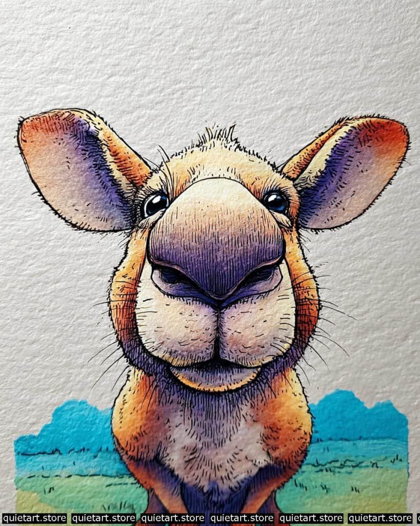
To capture the soft, rounded volume of the kangaroo’s muzzle, you’ve employed a sophisticated radial variegated wash. Start by pre-wetting the central bridge of the nose. While the paper is damp, “charge” the lower portion with a concentrated mix of Ultramarine Violet and Indigo. This allows the pigments to flow naturally into the “valleys” of your cold-pressed paper, creating that smooth, leathery look without harsh edges.
The structural definition is achieved through contour-following pen work. Once your washes are bone-dry, use a fine-liner (0.05 or 0.1) to draw the fur. Instead of straight lines, use short, curved strokes that follow the “bulge” of the cheeks and the “slope” of the nose. This reinforces the 3D form you established with your colors. For the ears, notice the subsurface scattering effect—the way the light seems to glow through the thin skin. This is done by using a saturated orange at the tips and fading it into a cooler purple toward the center.
Professional Palette
This selection of pigments focuses on high-contrast temperature shifts to keep the character looking vibrant and dimensional:
| Feature | Recommended Pigment | Why It Works |
| Main Fur | Quinacridone Gold | A vibrant, transparent yellow-orange that glows beautifully in the sun. |
| Shadowed Snout | Ultramarine Violet | A granulating purple that naturally adds a “skin-like” texture to the muzzle. |
| Ear Tips | Pyrrol Orange | A punchy red-orange that mimics thin skin catching a backlight. |
| Soulful Eyes | Indigo | Provides a deep, near-black that makes the specular highlights pop. |
| Savanna Horizon | Cobalt Teal Blue | A soft, receding blue that frames the warm tones perfectly. |
Our 60 Wild Animals Watercolor Coloring Pages (PDF Download) are made for pure enjoyment. Ready to let your creativity run wild? Download, print, and start today.
Koala
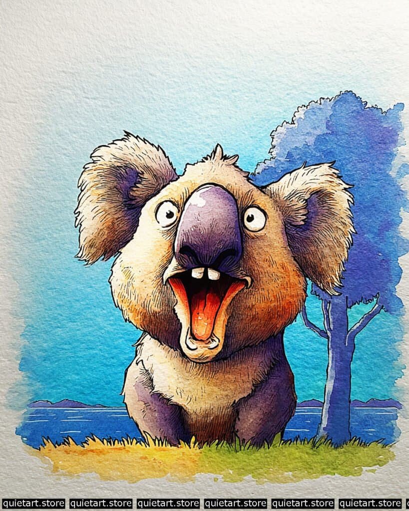
To capture the rounded, leathery texture of the nose, you’ve used a multi-stage glazing process. Start with a pale lavender base. Once dry, apply a darker violet glaze to the sides, leaving a “specular highlight” of the original pale color at the top. This high-contrast reflection makes the nose look wet and hard. For the yawning mouth, you employed a saturated wet-on-wet charging technique, dropping a fiery orange-red into the throat area while the initial wash was still damp to create that “inner glow.”
The fluffy ear texture is achieved through scumbling and dry-brushing. After laying down a soft, variegated wash of ochre and purple, use a brush with very little moisture to “drag” darker pigment along the outer edges of the ears. This catches the tooth of the paper and creates the illusion of fine, fuzzy hair. The background uses a layered atmospheric wash, where the distant tree and mountains are kept in cool, desaturated blues to push them back, while the grass uses a warmer, vibrant green to ground the koala in the foreground.
Professional Palette
This palette balances the high-energy “hot” colors of the mouth with the “cool” shadows of the fur:
| Feature | Recommended Pigment | Why It Works |
| Main Fur | Yellow Ochre | A soft, natural earth tone that provides the “sunlit” base for the face. |
| Big Nose | Dioxazine Purple | A deep, transparent purple that mimics leathery skin without looking flat. |
| Open Mouth | Pyrrol Red | A punchy, staining red that provides an intense focal point. |
| Lower Body | Ultramarine Violet | A granulating purple that adds heavy, textured weight to the shadows. |
| Eucalyptus Tree | Cobalt Blue | A classic, receding blue that keeps the background from distracting. |
Our 60 Wild Animals Watercolor Coloring Pages (PDF Download) are made for pure enjoyment. Ready to let your creativity run wild? Download, print, and start today.
Lemur
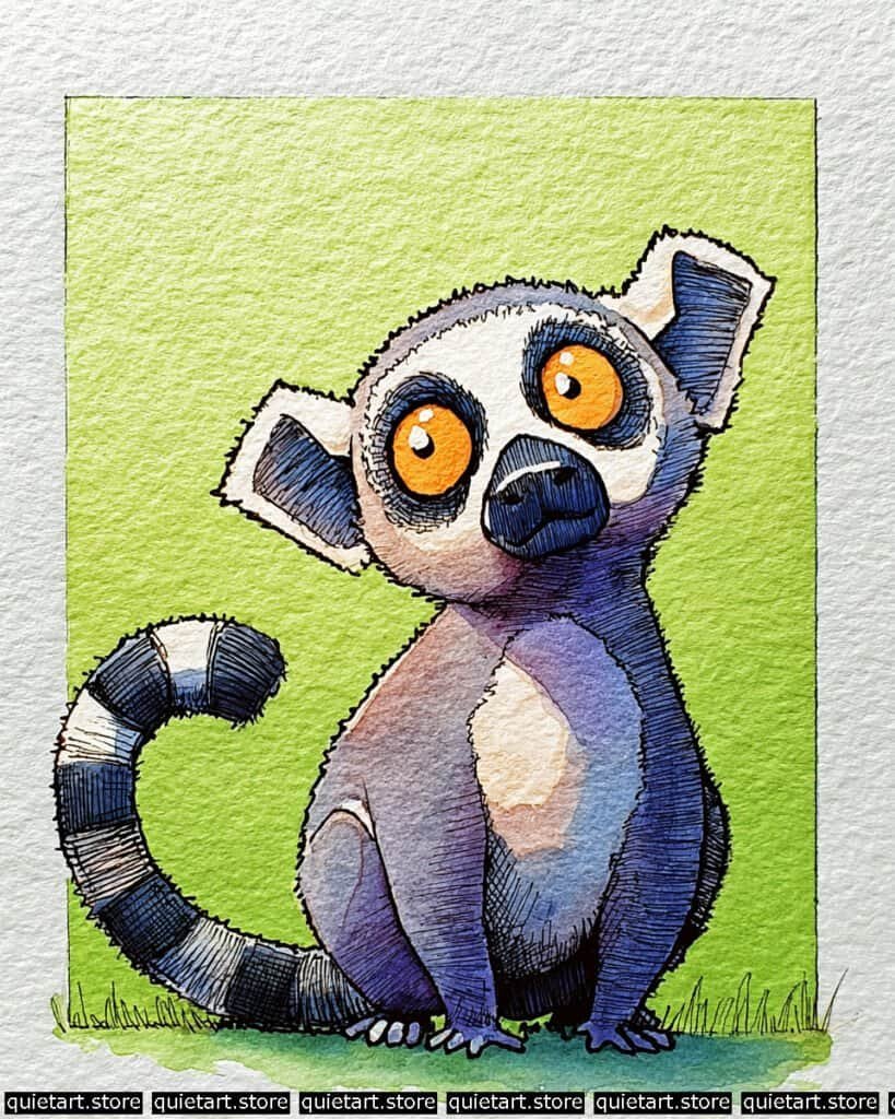
To make the eyes truly hypnotic, you’ve used a high-chroma charging technique. Start with a base of pure yellow in the irises. While wet, drop a concentrated orange around the outer edge of the circle, letting it bleed inward toward the pupil. This creates a “glowing” effect. For the fur, you’ve mastered the variegated wash—mixing purple, indigo, and a touch of gray directly on the paper. By letting these pigments mingle while wet, you avoid a “flat” look and give the fur a soft, shaded quality.
The iconic tail and facial masks are defined by rhythmic hatching. Once your washes are dry, use a fine-liner (0.05 or 0.1) for the dense, parallel lines. Notice how the hatching on the tail follows the curve of each segment—this is crucial for making the tail look cylindrical rather than flat. For the white patches on the chest and ears, you’ve used negative space painting, where you carefully paint the darker background and fur up to the edge of the white area, preserving the pure white of the paper to suggest sunlight.
Professional Palette
This selection balances the intense, “hot” focal points with a calming, atmospheric background:
| Feature | Recommended Pigment | Why It Works |
| Glow Eyes | Pyrrol Orange | Provides a punchy, high-contrast focal point against the cool fur. |
| Main Body Fur | Dioxazine Purple | A deep, transparent purple that keeps the “gray” areas looking vibrant. |
| Tail Stripes | Indanthrone Blue | A dark, moody blue that acts as a richer alternative to plain black. |
| Chest Glow | Yellow Ochre | Diluted heavily, it adds a soft warmth to the “white” fur patches. |
| Background | Sap Green + Azo Yellow | A fresh, vibrant green that makes the purple lemur “pop.” |
Our 60 Wild Animals Watercolor Coloring Pages (PDF Download) are made for pure enjoyment. Ready to let your creativity run wild? Download, print, and start today.
Leopard
To achieve the soft, rounded volume of the muzzle, you’ve employed a radial variegated wash. Start by pre-wetting the central bridge of the nose. Drop in a pale yellow, then “charge” the damp area with a warm orange and eventually a deep violet toward the chin. This allows the pigments to mingle on the paper without harsh interior edges, creating a sense of soft, 3D form.
The iconic leopard rosettes are achieved through wet-on-dry layering. Once your base body wash is bone-dry, use a brush with a fairly thick “tea-like” consistency of Burnt Umber to dab on the spots. By doing this on dry paper, you keep the edges of the rosettes crisp. The “scruffy” texture on the top of the head and the whiskers is finalized with short-stroke hatching using a fine-liner, mimicking the fine, soft hair characteristic of a cub.
Professional Palette
This selection balances the high-intensity focal points with a calming, atmospheric background:
| Feature | Recommended Pigment | Why It Works |
| Glow Muzzle | New Gamboge | A warm, transparent yellow that provides a sunny base for the head. |
| Main Body Fur | Ultramarine Violet | A granulating purple that naturally adds a “fur-like” texture to shadows. |
| Rosettes | Burnt Umber | A grounded, earthy brown that provides high contrast against the yellow. |
| Lower Chin | Buff Titanium | An opaque, creamy white that mimics the soft, pale fur of the underbelly. |
| Sky Vignette | Cerulean Blue | A classic, granulating blue that frames the character and pushes it forward. |
Our 60 Wild Animals Watercolor Coloring Pages (PDF Download) are made for pure enjoyment. Ready to let your creativity run wild? Download, print, and start today.
Meerkat
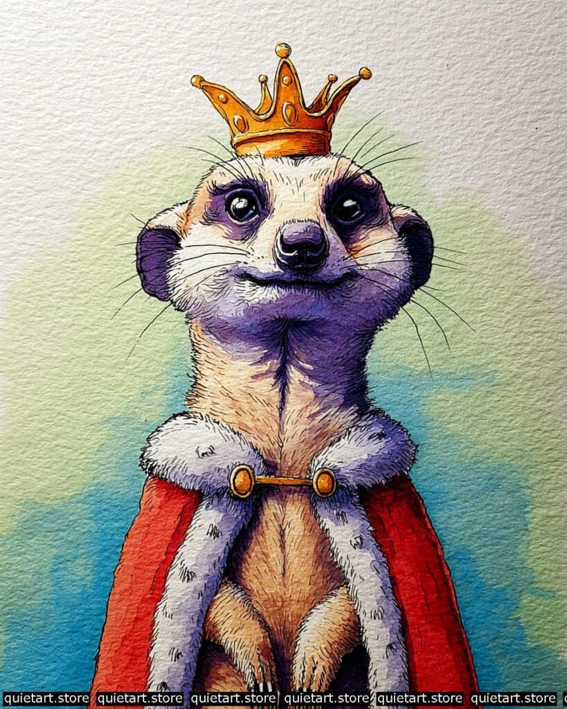
The crowning glory here is the metallic gold effect. To make the crown look reflective and “hard,” you’ve used a high-contrast glazing technique. Start with a base of pale yellow. While wet, drop in a saturated orange at the bottom edges of the peaks. Once dry, add sharp, tiny dots of Burnt Umber for the deepest shadows and a sliver of pure paper white for the highlights. This sudden jump in value—from very dark to very bright—is what tricks the eye into seeing polished metal.
For the fur and fabric textures, you’ve employed textural cross-hatching. The ermine trim on the cape is kept very soft, likely using a pale violet wash with tiny, sporadic pen “flicks” to suggest fluffiness. In contrast, the meerkat’s belly fur uses dense, vertical hatching to emphasize its sleekness. The cape itself utilizes a saturated flat wash of red; notice how you’ve kept the color very “flat” to make the textured fur of the animal and the trim pop even more by comparison.
Professional Palette
This palette is fit for royalty, balancing rich primaries with sophisticated shadow tones:
| Feature | Recommended Pigment | Why It Works |
| The Crown | Quinacridone Gold | A luminous, glowing gold that provides the perfect metallic base. |
| Royal Cape | Pyrrol Red | A bold, opaque red that commands attention without losing its punch. |
| Cool Shadows | Dioxazine Purple | A regal shadow color that provides deep value under the chin and on the ears. |
| Face & Belly | Yellow Ochre | A natural, earthy yellow that grounds the character in its desert origins. |
| Sky Vignette | Phthalo Blue (GS) | A crisp, clean blue that makes the red cape and gold crown “sing.” |
Our 60 Wild Animals Watercolor Coloring Pages (PDF Download) are made for pure enjoyment. Ready to let your creativity run wild? Download, print, and start today.
Orangutan
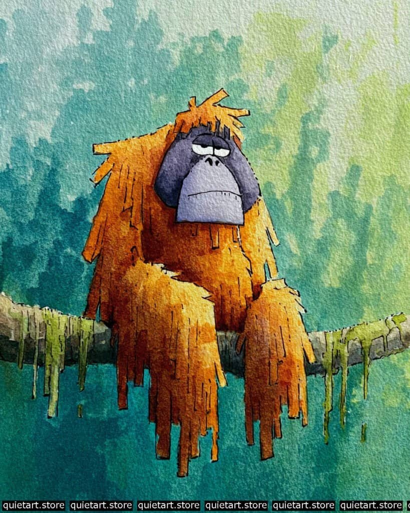
To achieve the “shaggy” look of the fur without losing the overall form, you’ve used a negative space edge technique. Instead of painting individual hairs, you painted the background greens into the silhouette of the orangutan, creating those jagged, downward-pointing “teeth” along the arms and back. For the face, you employed a flat-wash glazing technique; by using a cool, desaturated violet for the face-mask, you make the warm oranges of the fur feel even more intense and sun-baked.
The tree branch and moss are handled with a textured “dry-on-damp” technique. Start with a light gray for the wood, and while it’s still slightly moist, dab in a vibrant green for the moss. This allows the green to spread just enough to look organic but keeps it from turning into a blurry mess. The vertical “moss drips” hanging from the branch provide a lovely rhythmic echo to the long fur of the orangutan, tying the character and the environment together beautifully.
Professional Palette
This palette focuses on the “warm vs. cool” tension found in deep jungle light:
| Feature | Recommended Pigment | Why It Works |
| Main Fur | Quinacridone Gold | Provides a glowing, honey-like base that looks like sunlight hitting hair. |
| Deep Fur Shadows | Burnt Sienna | A rich earth tone that adds weight and depth to the lower shaggy layers. |
| Face Mask | Cobalt Violet | A granulating, cool purple that recedes and makes the face look leathery. |
| Moss & Drips | Sap Green | A natural, leafy green that looks fresh and organic against the wood. |
| Deep Jungle | Phthalo Blue + Green | Creates a dark, atmospheric depth that pushes the character forward. |
Our 60 Wild Animals Watercolor Coloring Pages (PDF Download) are made for pure enjoyment. Ready to let your creativity run wild? Download, print, and start today.
Pangolin
To achieve the “glowing” effect on the face, you’ve used a concentric wet-on-wet wash. Start with a bright yellow in the center of the forehead and muzzle. While damp, “charge” the outer edges with a saturated orange and red, allowing it to bleed softly inward. This creates a natural light source that feels like it’s emanating from the character itself. For the ears, notice the subsurface scattering—the deep red at the base suggests light passing through thin, blood-filled tissue.
The armored scales are handled with a repetitive glazing and hatching process. First, lay down a soft violet wash. Once dry, use a fine-liner (0.1) to draw the grid of the scales. To give them a 3D “plate” look, add a darker indigo glaze to the bottom edge of each row. This creates a tiny shadow that suggests each plate is overlapping the one below it. The background uses a flat vignette wash, where the clean teal rectangle acts as a frame, making the warm head and ears “break the frame” and pop forward.
Professional Palette
This palette thrives on the high-contrast “temperature clash” between the inner and outer parts of the character:
| Feature | Recommended Pigment | Why It Works |
| Face & Crown | Hansa Yellow Deep | A transparent, sunny yellow that provides a high-key light source. |
| Ear Inner Glow | Pyrrol Red | An intense red that mimics light passing through thin skin. |
| Armored Scales | Ultramarine Violet | A granulating purple that adds a “stony” or “keratin” texture to the plates. |
| Deepest Shadows | Indanthrone Blue | A dark, moody blue that creates depth in the scales without using black. |
| Sky Frame | Cobalt Teal Blue | A soft, stable teal that provides the perfect complementary backdrop. |
Our 60 Wild Animals Watercolor Coloring Pages (PDF Download) are made for pure enjoyment. Ready to let your creativity run wild? Download, print, and start today.
Penguin
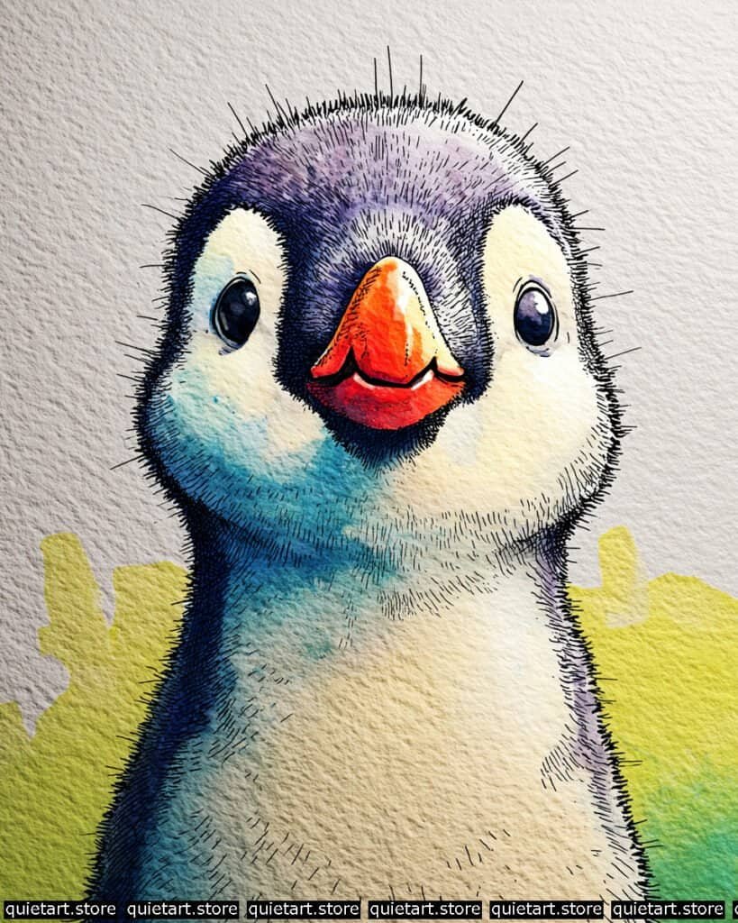
To capture that “downy” chick texture, you’ve employed a wet-on-wet granulating wash. Start by pre-wetting the top of the head. While damp, “charge” the area with a mix of Ultramarine Blue and a touch of Rose Madder. Because these pigments are granulating, they settle into the texture of your cold-pressed paper, naturally mimicking the look of soft, individual feathers without you having to paint a single one.
The beak’s glossy finish is achieved through high-contrast glazing. Notice the sharp, white sliver on the top of the beak; this is pure paper white. By painting a highly saturated orange-red right up against that white edge, you create a specular highlight that suggests a hard, polished surface—a perfect textural contrast to the soft head. The “scruffy” silhouette is finalized with flicking pen strokes using a fine-liner. Instead of a solid outline, you’ve pulled short, vertical lines outward into the white space, which “breaks” the paint edge and makes the penguin look truly fuzzy.
Professional Palette
This selection of lightfast pigments helps maintain the “frosty” feel of the character while allowing the beak to pop:
| Feature | Recommended Pigment | Why It Works |
| Head & Shadows | Ultramarine Blue | A classic granulating blue that creates natural “downy” texture. |
| Soft Purples | Permanent Rose | Mixed thinly with blue, it creates the lovely lavender transitions on the crown. |
| The Beak | Cadmium Orange | An opaque, punchy orange that stands out against the transparent blues. |
| Eye Depth | Payne’s Gray | Provides a soft, cool black for the pupils that doesn’t look flat. |
| Background Glow | Azo Yellow | A bright, cool yellow that provides a sunlit contrast to the blue penguin. |
Our 60 Wild Animals Watercolor Coloring Pages (PDF Download) are made for pure enjoyment. Ready to let your creativity run wild? Download, print, and start today.
Raccoon
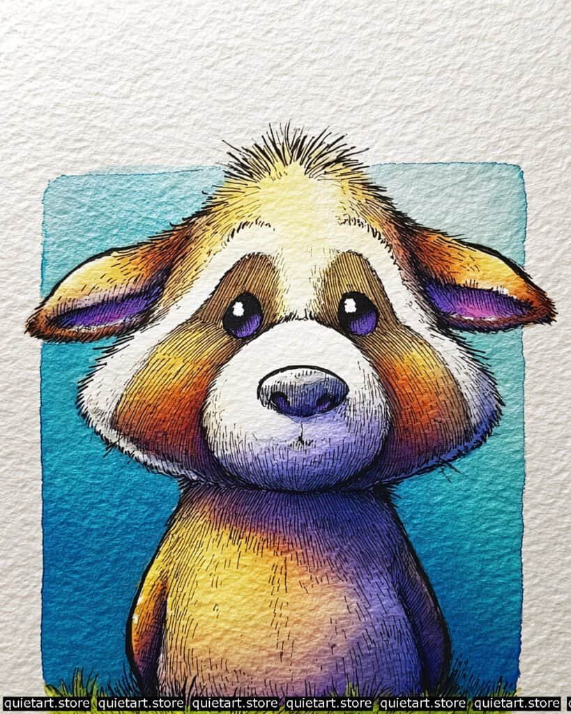
To capture the soft, rounded volume of the head, you’ve employed a multi-directional variegated wash. Start by pre-wetting the central bridge of the nose and the white muzzle. While damp, “charge” the outer cheeks and the forehead with a concentrated Pyrrol Orange, letting it bleed softly into the white areas. This creates a natural 3D “glow” that suggests a light source hitting the center of the face.
The iconic facial markings and fur texture are achieved through contour-following pen work. Once your washes are dry, use a fine-liner (0.05) to add rhythmic, downward-sloping lines. Notice how the lines on the muzzle are very thin and sparse, while the lines on the “mask” areas are much denser—this line-density hierarchy is what creates value and depth without needing darker paint. For the eyes, you’ve used a multi-layered glazing technique, starting with a purple base and adding a black pupil, capped off with those sharp, white specular highlights that bring the character to life.
Professional Palette
This selection of pigments focuses on high-chroma “hot” spots balanced by deep, receding “cool” spots:
| Feature | Recommended Pigment | Why It Works |
| Main Fur Mask | Pyrrol Orange | A vibrant, staining orange that provides a powerful focal point. |
| Shadowed Body | Ultramarine Violet | A granulating purple that adds heavy, textured weight to the shadows. |
| Glow Forehead | Aureolin Yellow | A cool, transparent yellow that creates a “sunlit” look when glazed over. |
| Muzzle Shadows | Cerulean Blue | Diluted heavily, it creates a soft, cool gray for the white fur folds. |
| Sky Vignette | Phthalo Blue (GS) | A crisp, clean blue that frames the warm tones perfectly. |
Our 60 Wild Animals Watercolor Coloring Pages (PDF Download) are made for pure enjoyment. Ready to let your creativity run wild? Download, print, and start today.
Rhino
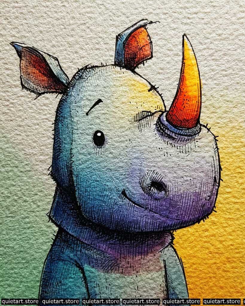
To capture the rounded, leathery weight of the head, you’ve used a variegated wash with high-key lighting. Start with a pale yellow at the “crown” of the head. While the paper is damp, charge the muzzle and the lower neck with a mix of Cobalt Teal and Ultramarine Violet. This allows the pigment to settle into the grain of the paper, naturally mimicking the look of thick, creased skin without requiring painstaking rendering.
The glowing horn is achieved through a saturated vertical gradient. Lay down a base of bright yellow at the tip, transitioning into a fiery orange and then a deep red at the base (the “boss”). Once dry, use a 0.05 technical pen for the cross-hatching. Follow the curve of the horn with your lines to reinforce its conical shape. The subtle “fuzz” along the jawline and the back of the neck is the final touch—short, rhythmic pen flicks that break the paint edge and add a sense of life to the sturdy silhouette.
Professional Palette
This palette focuses on the “warm vs. cool” contrast to make the “gray” rhino look luminous:
| Feature | Recommended Pigment | Why It Works |
| The Horn | Azo Yellow + Pyrrol Red | Creates a high-intensity “glow” that acts as the primary focal point. |
| Main Skin | Cobalt Teal Blue | A granulating blue that perfectly mimics the look of thick, dusty hide. |
| Shadows | Ultramarine Violet | A deep, transparent purple that adds weight to the folds of the neck. |
| Ear Inner Glow | Quinacridone Sienna | A warm, earthy orange that suggests thin skin catching the light. |
| Background | Green Gold + Sap Green | A fresh, atmospheric green that grounds the character in a lush environment. |
Our 60 Wild Animals Watercolor Coloring Pages (PDF Download) are made for pure enjoyment. Ready to let your creativity run wild? Download, print, and start today.
Sloth
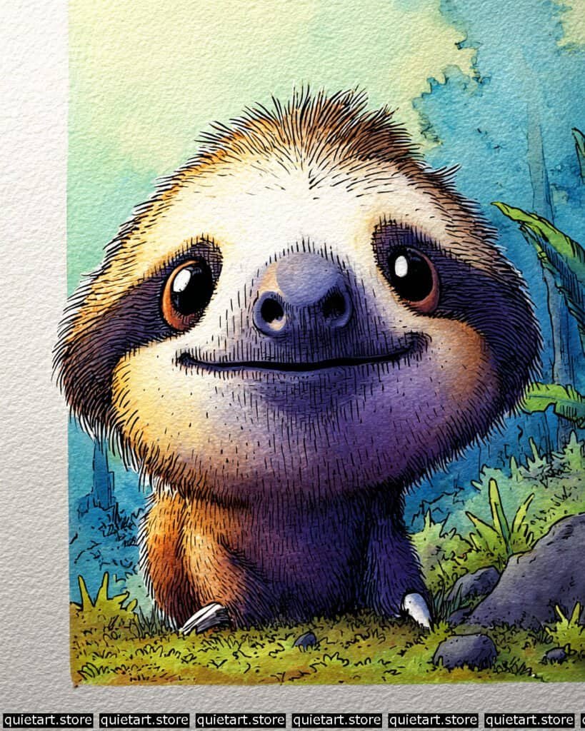
To achieve the soft, rounded volume of the sloth’s head, you’ve employed a radial variegated wash. Start by pre-wetting the central “mask” of the face. Drop in a pale cream or yellow-ochre. While damp, “charge” the outer edges of the head and the body with a concentrated Pyrrol Orange on the left and a deep Ultramarine Violet on the right. This creates a natural light source, making the character look like it’s being hit by a warm ray of jungle sun while its other side recedes into the leafy shade.
The coarse hair texture is achieved through rhythmic vertical hatching. Once your washes are bone-dry, use a fine-liner (0.05 or 0.1) to add short, downward strokes. Notice how these lines are denser in the shadow areas (the neck and lower face) and more sparse on the sunlit forehead—this variation in line density creates 3D form without needing more paint. For the eyes, you’ve used a multi-layered glazing technique, building up to a deep indigo and finishing with those sharp, white specular highlights that make the sloth look truly conscious and alive.
Professional Palette
This palette balances the high-energy “hot” colors of the fur with the “cool” shadows of the jungle:
| Feature | Recommended Pigment | Why It Works |
| Main Fur (Light) | Quinacridone Gold | A vibrant, transparent yellow-brown that mimics sunlit hair. |
| Main Fur (Shadow) | Dioxazine Purple | A deep, transparent purple that provides high-contrast shadows. |
| Face Mask | Yellow Ochre | A soft, natural earth tone that keeps the face looking friendly and warm. |
| Nose & Pupils | Indigo | A dark, moody blue that acts as a softer, richer alternative to black. |
| Jungle Backdrop | Sap Green + Cobalt Blue | Provides a lush, atmospheric frame that recedes beautifully. |
Our 60 Wild Animals Watercolor Coloring Pages (PDF Download) are made for pure enjoyment. Ready to let your creativity run wild? Download, print, and start today.
Snake
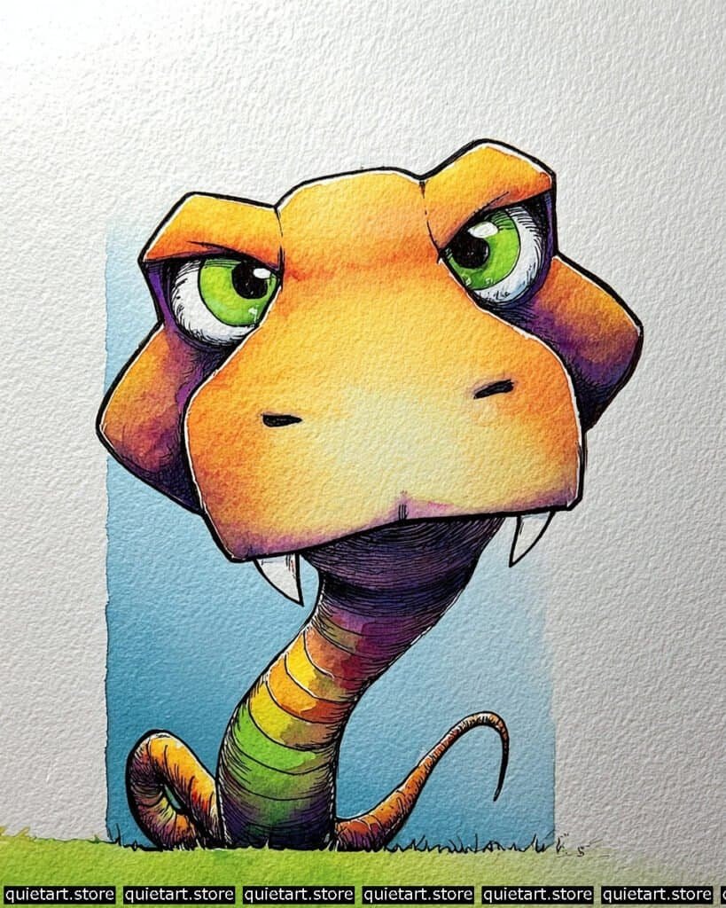
To capture the iridescent glow of the snake’s skin, you’ve used a sequential variegated wash. Start with a bright yellow at the bridge of the nose, charging orange and red outward. For the neck, use a “wet-into-wet” technique where you drop in lime green, followed by orange, then purple, allowing the colors to bleed naturally at the segment lines. This mimics the light-refracting quality of reptilian scales without needing to paint each individual scale.
The structural menace is achieved through rhythmic contour hatching. Once the base washes are dry, use a 0.05 technical pen to follow the wrap of the snake’s cylindrical body. Notice how the lines are closer together on the underside of the neck and the “cheeks” of the head; this creates a deep, violet shadow that adds massive 3D weight. For the fangs, use negative space painting—keep them as pure paper white, painting the dark purple of the inner mouth right up to the edge to make them look sharp and ivory-like.
Professional Palette
This palette utilizes a full spectrum to create a sense of exotic, dangerous beauty:
| Feature | Recommended Pigment | Why It Works |
| Glow Snout | Hansa Yellow Deep | A transparent yellow that keeps the face looking sunlit and “hot.” |
| Snake Eyes | Phthalo Green (YS) | An intense, staining green that pops brilliantly against the orange. |
| Shadows & Gills | Dioxazine Purple | A deep, royal purple that provides high-contrast depth under the jaw. |
| Rainbow Neck | Pyrrol Orange + Sap Green | These high-chroma pigments create the “venomous” iridescent look. |
| Sky Vignette | Phthalo Blue (GS) | A crisp, clean blue that frames the warm head and makes it pop forward. |
Our 60 Wild Animals Watercolor Coloring Pages (PDF Download) are made for pure enjoyment. Ready to let your creativity run wild? Download, print, and start today.
Squirrel
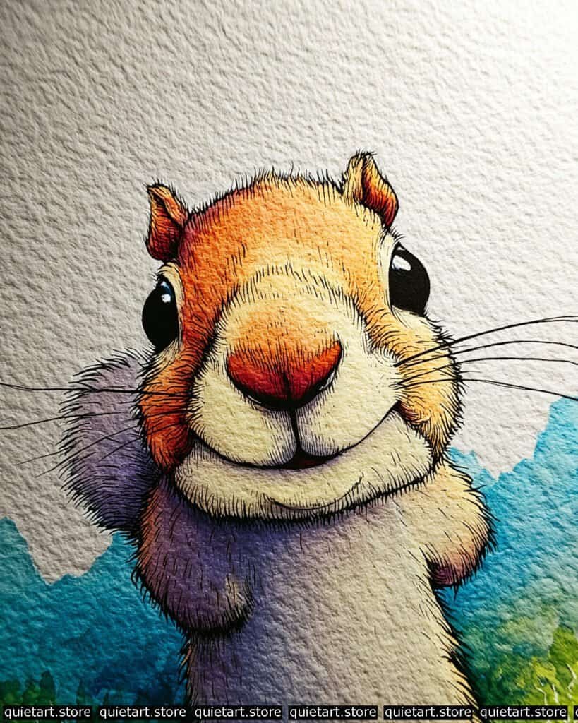
To achieve the soft, rounded volume of the muzzle, you’ve employed a radial variegated wash. Start by pre-wetting the central bridge of the nose. Drop in a pale cream or yellow-ochre. While damp, “charge” the outer edges with a concentrated Pyrrol Orange and eventually a deep Alizarin Crimson for the nose tip. This allows the pigments to mingle on the paper without harsh interior edges, creating a sense of soft, 3D form.
The fine fur texture is achieved through meticulous contour-hatching. Once your washes are bone-dry, use a 0.03 or 0.05 technical pen. Follow the outward “burst” of the fur from the center of the face. Notice how the lines on the muzzle are very short and light, while the lines on the “cheeks” and ears are longer and more rhythmic—this change in stroke length mimics the different fur types on a real squirrel. For the whiskers, use a single, confident stroke with a rigger brush or a very fine-liner to ensure they look sharp and delicate.
Professional Palette
This palette focuses on high-contrast temperature shifts to keep the “warm” squirrel looking vibrant against the “cool” background:
| Feature | Recommended Pigment | Why It Works |
| Glow Forehead | New Gamboge | A warm, transparent yellow that provides a sunny base for the head. |
| Cheeks & Ears | Quinacridone Sienna | A glowing, earthy orange that adds depth without looking muddy. |
| Cool Shadows | Ultramarine Violet | A granulating purple that mimics the soft shadow on dense, short fur. |
| Nose Tip | Quinacridone Rose | Provides a delicate, glowing pink for the sensitive skin area. |
| The Meadow | Cobalt Teal + Sap Green | A fresh, vibrant backdrop that pushes the warm squirrel forward. |
Our 60 Wild Animals Watercolor Coloring Pages (PDF Download) are made for pure enjoyment. Ready to let your creativity run wild? Download, print, and start today.
Tarsier
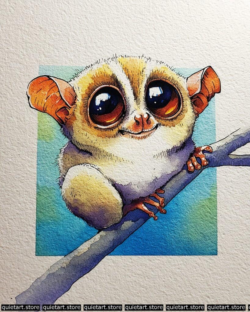
To create those hypnotic, liquid eyes, you’ve used a multi-stage glazing and charging technique. Start with a base wash of deep amber-orange in the lower half of the eye. While damp, “charge” the top half with a concentrated Indigo or Neutral Tint. Once dry, add a final dark glaze over the top to define the pupil. The massive, complex specular highlights (the white reflections) are left as negative paper white, which is what gives the eyes that realistic, glossy “camera lens” look.
The ears and fingers demonstrate subsurface scattering. By using a saturated Pyrrol Orange and allowing it to fade into a cooler purple in the shadows, you simulate the way light passes through thin, fleshy tissue. The fur is rendered with a granulating wash of Yellow Ochre and Ultramarine Violet, which settles into the paper’s tooth to create a soft, woolly texture. The final structure is anchored with fine-point hatching, specifically following the roundness of the tarsier’s “knees” and forehead to reinforce its spherical, compact form.
Professional Palette
This palette emphasizes the warm, glowing focal points against a cool, atmospheric night-time background:
| Feature | Recommended Pigment | Why It Works |
| Glow in Eyes | Indian Yellow | A transparent, deep yellow that provides an inner “fire” to the irises. |
| Ears & Fingers | Pyrrol Orange | High-chroma orange that mimics light through thin skin. |
| Body Shadows | Dioxazine Purple | A royal purple that creates deep, receding shadows on the fluff. |
| Tree Branch | Cobalt Blue + Burnt Sienna | Creates a sophisticated, neutralized gray that doesn’t compete with the animal. |
| Sky Vignette | Phthalo Blue (GS) | A crisp, clean blue that provides a luminous, moonlit backdrop. |
Our 60 Wild Animals Watercolor Coloring Pages (PDF Download) are made for pure enjoyment. Ready to let your creativity run wild? Download, print, and start today.
Tiger
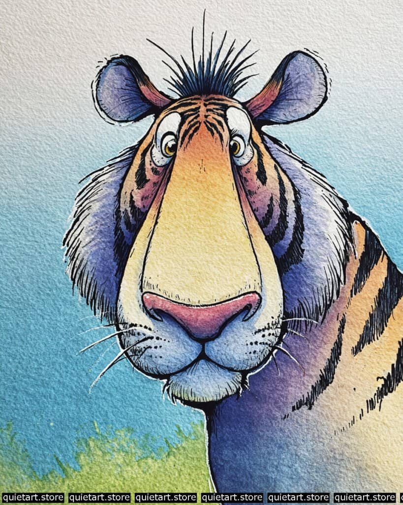
To manage the complex markings of the tiger, you’ve used a staged glazing technique. Start with a soft, variegated wash of yellow ochre and pale orange across the face. While this is still damp, “charge” the areas around the eyes and ears with a vibrant magenta or pink. Once this base is completely dry, you can begin the negative space inking. Instead of painting the stripes, you’ve used a fine-liner to “outline” them with dense hatching, which allows the orange fur color to act as the stripe itself in some areas, or you’ve filled them with a deep indigo glaze to create that “black stripe” look without losing the watercolor luminosity.
The muzzle and whiskers utilize a pointillism and rigger-brush combo. The tiny black dots on the whisker pads (the “mystacial pads”) add a great level of detail. For the white whiskers themselves, you likely used white gouache or a gel pen over the dark blue background. The transition from the bright forehead to the dark, indigo-tinted neck is a perfect wet-on-wet gradient, where the cool blue was introduced just as the warm orange was setting, preventing a muddy green mix.
Professional Palette
This palette balances the high-chroma orange with deep, atmospheric blues to create maximum 3D “punch”:
| Feature | Recommended Pigment | Why It Works |
| Main Face Glow | Quinacridone Gold | A transparent, glowing gold that mimics sunlit fur beautifully. |
| Shadowed Neck | Indanthrone Blue | A deep, non-granulating blue that provides intense depth in shadows. |
| Ear Accents | Alizarin Crimson | Adds a realistic, “blood-filled” skin tone to the inner ears. |
| Nose & Mouth | Potter’s Pink | A granulating, earthy pink that gives the nose a soft, leathery feel. |
| Background Sky | Cerulean Blue | Provides a crisp, calm contrast that makes the warm tiger pop forward. |
Our 60 Wild Animals Watercolor Coloring Pages (PDF Download) are made for pure enjoyment. Ready to let your creativity run wild? Download, print, and start today.
Toucan
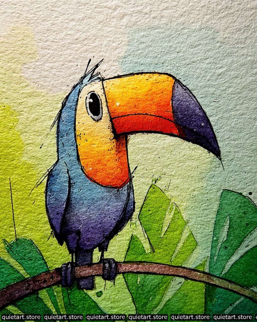
To achieve the “glowing” beak, you used a long-gradient variegated wash. Start with a bright yellow at the base of the beak (near the eye). While the paper is juicy, “charge” the middle with a saturated orange, and finish with a deep red just before the dark tip. This creates a smooth, heat-map effect that looks like light is trapped inside the beak. For the body, you used a granulating wash; notice how the blue and purple pigments settle into the paper’s texture, giving the feathers a soft, velvety appearance without needing fine pen lines.
The jungle environment is handled with negative painting and glazing. You likely painted the lighter green leaves first, let them dry, and then painted the darker shapes behind them to create depth. The sharp, black “flecking” (the tiny splatters) adds a sense of organic “jungle grit,” breaking up the clean washes. Finally, the eyes are brought to life with a specular highlight—that tiny dot of white paper left unpainted—which makes the bird look alert and intelligent.
Professional Palette
This palette focuses on high-contrast secondary colors to create a “vibrating” visual effect:
| Feature | Recommended Pigment | Why It Works |
| Beak (Base) | Hansa Yellow Deep | A sunny, transparent yellow that glows under the orange. |
| Beak (Center) | Pyrrol Orange | A punchy, opaque-leaning orange for maximum saturation. |
| Body & Tail | Ultramarine Blue | A classic granulating blue that adds natural texture to feathers. |
| Shadow Accents | Dioxazine Purple | Used on the wing-tips and lower body to provide deep, cool value. |
| Jungle Leaves | Sap Green + Phthalo Green | Provides a rich, varying range of greens for the backdrop. |
Our 60 Wild Animals Watercolor Coloring Pages (PDF Download) are made for pure enjoyment. Ready to let your creativity run wild? Download, print, and start today.
Walrus
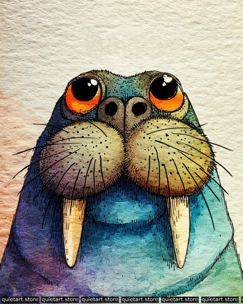
To achieve the dense, leathery look of the walrus’s skin, you’ve utilized a granulating variegated wash. Start with a light wash of Cobalt Teal on the right side of the neck. While the paper is still “damp-matt,” charge the left side with a highly concentrated Dioxazine Purple. Because these pigments have different particle weights, they settle into the grain of the paper at different rates, naturally mimicking the look of thick, wet hide.
The structural weight of the muzzle is handled with pointillism and rhythmic hatching. Once your base washes of ochre and lavender are bone-dry, use a 0.1 technical pen to add the “whisker pits” (vibrissae). By concentrating the dots toward the bottom of the muzzle “pads,” you create a 3D shadow that makes them look puffy and soft. For the tusks, use a glazing technique: apply a very thin, pale yellow wash, then add a slightly darker “drop shadow” right where the tusk meets the lip to make them look like they are truly embedded in the face.
Professional Palette
This palette focuses on “frosty” cools balanced by the intense warmth of the eyes:
| Feature | Recommended Pigment | Why It Works |
| Main Body | Cobalt Teal Blue | A granulating, opaque blue that perfectly mimics Arctic water and cold skin. |
| Shadow Side | Ultramarine Violet | A deep, transparent purple that adds “weight” to the silhouette. |
| Glow Eyes | Pyrrol Orange | Provides a high-intensity focal point that “pops” against the blue. |
| Muzzle Pads | Yellow Ochre | A soft, natural earth tone that keeps the face looking leathery and warm. |
| Tusks | Buff Titanium | An off-white pigment that creates a more realistic ivory look than pure paper white. |
Our 60 Wild Animals Watercolor Coloring Pages (PDF Download) are made for pure enjoyment. Ready to let your creativity run wild? Download, print, and start today.
Warthog
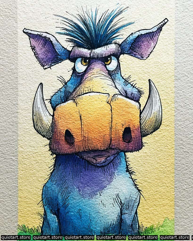
To capture the leathery, weathered texture of the warthog, you’ve utilized a granulating variegated wash. Start by pre-wetting the central bridge of the nose. While damp, “charge” the lower portion of the snout with a concentrated mix of Burnt Sienna and Dioxazine Purple. Because these pigments have heavier particles, they naturally settle into the “valleys” of your cold-pressed paper, mimicking the look of thick, mud-caked skin without requiring painstaking rendering.
The structural weight is achieved through rhythmic vertical hatching. Once the base washes are bone-dry, use a fine-liner (0.05) to add dense, downward strokes following the “sag” of the jowls and the bridge of the nose. For the tusks, you’ve employed a negative space technique, keeping them as pure paper white to emphasize their hardness. The final “pop” comes from the wet-on-wet charging in the background; by dropping a warm yellow-ochre into a damp frame around the character, you create a “golden hour” halo that makes the cool, blue body of the warthog recede and the warm snout jump forward.
Professional Palette
This selection of pigments focuses on high-contrast temperature shifts to keep the “gray” hide looking vibrant:
| Feature | Recommended Pigment | Why It Works |
| Glow Snout | Quinacridone Gold | A transparent, glowing gold that mimics sunlit skin beautifully. |
| Main Body Hide | Cobalt Teal Blue | A granulating blue that perfectly mimics thick, dusty hide. |
| Shadow Accents | Ultramarine Violet | A deep purple that adds “weight” to the folds of the neck and ears. |
| Bristly Mane | Indanthrone Blue | A dark, moody blue that creates intense depth in the hair clumps. |
| Inner Ears | Potter’s Pink | A granulating, earthy pink that gives the ears a soft, leathery feel. |
Our 60 Wild Animals Watercolor Coloring Pages (PDF Download) are made for pure enjoyment. Ready to let your creativity run wild? Download, print, and start today.
Zebra backside
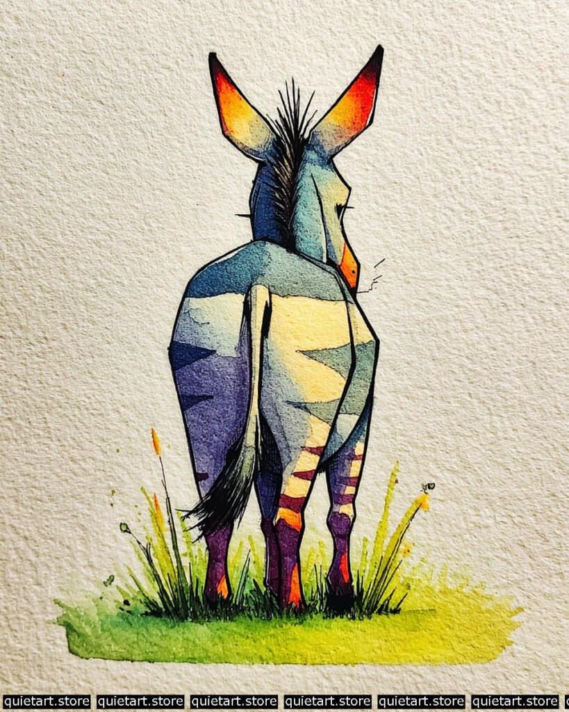
To manage the sharp, clean divisions between the stripes and the “glow” areas, you’ve employed a masking and glazing technique. Start by painting the broad, vertical “glow” down the center of the back and tail with a warm New Gamboge. While damp, “charge” the tips of the ears with a saturated Pyrrol Red. Once this base is bone-dry, use a flat-edged brush to apply the darker purple and blue wedges. By painting over a dry layer, you keep those triangular edges crisp and graphic rather than blurry.
The structural definition is handled with bold, variable-weight inking. Unlike the fine hatching used in your other animal portraits, the lines here are thicker and more “angular,” reinforcing the stylized, geometric nature of this specific piece. Notice how the ink is heaviest on the left side of the legs and the underside of the tail; this provides the “weight” needed to anchor the character to the grass. The grass itself uses a spontaneous wet-on-wet wash, where you’ve let the green bleed into the yellow base, capped off with some energetic “flicked” pen lines to suggest wild stalks.
Professional Palette
This selection utilizes a “triadic” color scheme to create maximum visual excitement:
| Feature | Recommended Pigment | Why It Works |
| Central Glow | Hansa Yellow Deep | A luminous, warm yellow that acts as the primary light source on the back. |
| Ear Tips | Pyrrol Red | A punchy, intense red that provides a “hot” counterpoint to the blue body. |
| Dark Stripes | Dioxazine Purple | A deep, transparent purple that looks much richer than plain black against yellow. |
| Upper Back | Cobalt Teal Blue | Provides a cool, sky-like transition that recedes into the distance. |
| Savanna Grass | Azo Green | A bright, acidic green that feels sun-scorched and vibrant. |
Our 60 Wild Animals Watercolor Coloring Pages (PDF Download) are made for pure enjoyment. Ready to let your creativity run wild? Download, print, and start today.
Zebra portrait
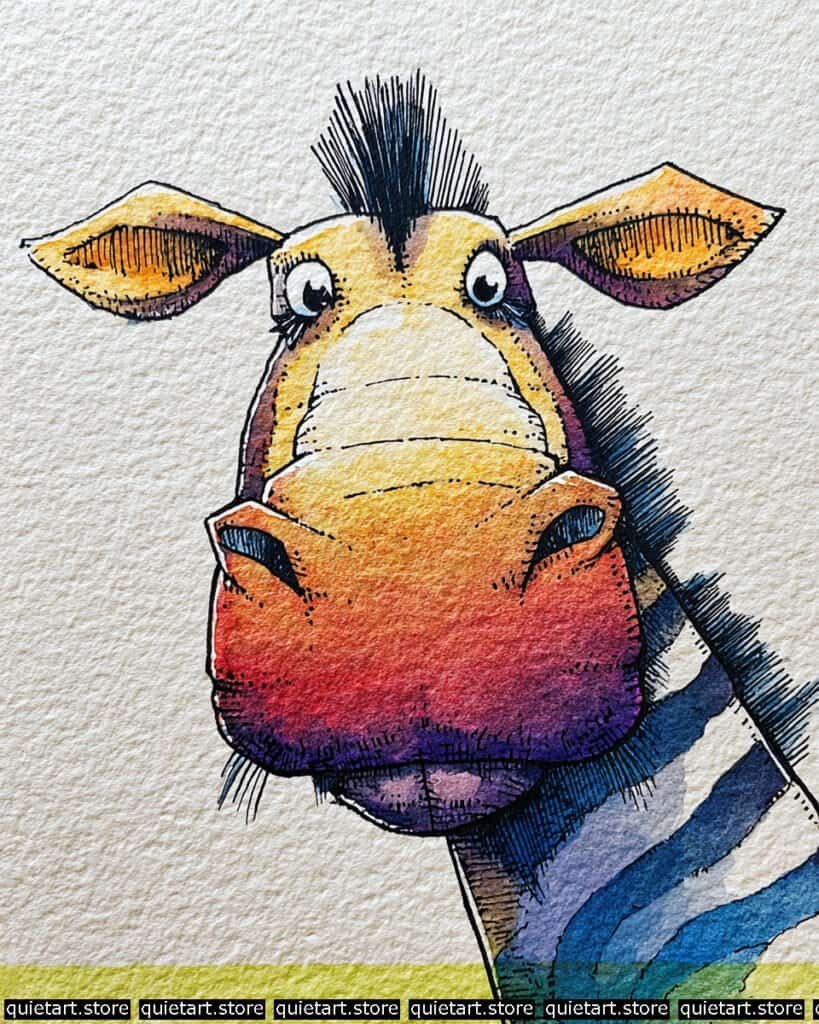
To capture the soft, rounded volume of that massive muzzle, you’ve employed a vertical variegated wash. Start by pre-wetting the bridge of the nose down to the chin. While the paper is damp, “charge” the top with a warm Yellow Ochre, transition into a saturated Pyrrol Orange in the middle, and finish with a heavy dose of Ultramarine Violet at the very bottom. This allows the colors to bleed into each other without harsh lines, creating a “heat map” effect that mimics a rounded surface catching light.
The structural definition is achieved through contour-following pen work. Once your washes are bone-dry, use a fine-liner (0.05) to add horizontal hatching. Notice how these lines curve slightly upward; this reinforces the “bulge” of the snout created by your fisheye sketch. The stripes on the neck are handled with a multi-tonal glaze—instead of using flat black, you’ve used a deep, granulating blue that lets the texture of the paper show through, keeping the dark areas from feeling like “holes” in the painting.
Professional Palette
This palette uses a “complementary vibration” between the fiery warm tones and the deep, atmospheric cools:
| Feature | Recommended Pigment | Why It Works |
| Glow Forehead | New Gamboge | A warm, transparent yellow that provides a sunny base for the head. |
| Middle Muzzle | Cadmium Red Light | A punchy, opaque-leaning red that creates a high-intensity focal point. |
| Lower Jaw | Dioxazine Purple | A deep, transparent purple that provides heavy, receding value. |
| Neck Stripes | Indanthrone Blue | A dark, moody blue that acts as a richer, more lively alternative to black. |
| Ground Accent | Azo Green | A bright, acidic green that grounds the character in a sun-scorched meadow. |
Our 60 Wild Animals Watercolor Coloring Pages (PDF Download) are made for pure enjoyment. Ready to let your creativity run wild? Download, print, and start today.
Vulture
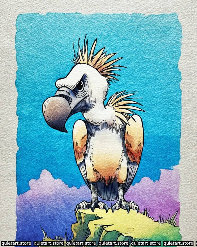
To capture the hard, weathered texture of the beak, you’ve employed a subtle earth-tone gradient. Start with a base of warm gray, then “charge” the tip with a darker Burnt Umber while the wash is still slightly damp. This creates a soft transition that suggests the beak is worn and ancient. For the body, you used negative space preservation; by keeping the chest and head mostly as the pure white of the paper, you make the sun-kissed orange on the wings and the crest feel significantly brighter.
The environmental depth is achieved through layered atmospheric glazing. The distant purple mountains were painted with a very wet, soft wash, allowing the edges to blur. In contrast, the foreground rock uses hard-edged glazing and energetic pen work to feel solid and immediate. The “scruffy” crest and ruff are finalized with variable-weight hatching. Notice how the lines on the crest are long and tapering, while the lines on the face are short and dense—this defines the transition from “skin” to “feathers” without needing a change in color.
Professional Palette
This palette emphasizes the high-altitude sunlight and deep shadows of a mountain peak:
| Feature | Recommended Pigment | Why It Works |
| Wing Glow | Quinacridone Gold | A transparent, honey-like orange that mimics warm sunlight on white feathers. |
| Rocky Perch | Green Gold | A bright, acidic yellow-green that makes the foreground feel sun-drenched. |
| Distant Peaks | Cobalt Violet | A soft, granulating purple that recedes beautifully into the background. |
| Deep Shadows | Indanthrone Blue | Used under the wings and tail to provide heavy, cool-toned value. |
| The Sky | Phthalo Blue (RS) | A rich, vibrant blue that provides a high-contrast frame for the white bird. |
Our 60 Wild Animals Watercolor Coloring Pages (PDF Download) are made for pure enjoyment. Ready to let your creativity run wild? Download, print, and start today.
Conclusion
Exploring the animal kingdom through your art is a wonderful way to sharpen your observational skills and color mixing. I’ve made sure these 30 concepts offer a balance of challenge and pure, creative fun for every skill level.
If you’re ready to paint right now, my hand-drawn coloring pages are ready for you to download and enjoy. Thank you for letting me share my passion for the wild with you—happy painting!