Why do some colored pencil drawings pop with life while others fall flat? I’ve seen it repeatedly—artists work hard, but small mistakes hold their art back.
I’ve made some of these errors myself, and I’ve learned how much they affect the final piece.
In this post, I’ll walk you through the three biggest mistakes I see and how I fix them for more realistic results.
Contents
Mistake #1: Using Only Black for Black Subjects
Let’s start with the first and most common issue I see—drawing black subjects with only a black pencil.
Why black isn’t just black
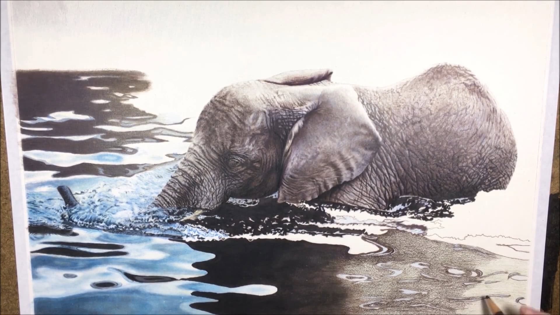
Black in real life isn’t flat. It often has hidden colors like:
- Purples
- Blues
- Reds
- Browns
- Yellows

If you just grab a black pencil and use it for the entire drawing—say, for a black dog—it will look dull and lifeless.

The problem with flat-looking drawings
When you use only black, your drawing ends up flat. There’s no depth. No richness. No realism. It just doesn’t do your subject justice.

If you’ve been looking at colored pencil art for a while, you’ll quickly spot drawings that miss this detail.
Once you start using color in your black drawings, it becomes easier to recognize when others don’t. It’s even more noticeable when the artist includes a reference photo. You can clearly see the difference in depth and vibrancy side by side.

How to fix it: Add color underneath black
Here’s how I bring a black subject to life:
- First, I look at the reference photo and spot the hidden colors.

- I apply a few light coats of those colors. Less is more here.

- Then, I blend those layers gently.
- Next, I lay down one thin layer of black, then blend again.

- After that, I judge if I need more color or another light layer of black.
- Finally, once I’m happy with the color base, I darken it to the correct value with just black.

This method gives depth. It helps your black subject look real and not flat.
Mistake #2: Choosing the Wrong Paper
Now that we’ve talked about color, let’s move on to the surface you draw on. This is just as important.
How paper affects your artwork
The type of paper you choose can make or break your drawing. Seriously.
- Too smooth? You won’t get enough layers. Your values will be off. Your colors might not look rich.

- Too textured? It’s tough to get small details like hair or fur right.

You don’t want either extreme. That’s why the paper you use matters so much.
What works best for realistic drawing
From my experience, a happy middle ground is best. Here’s what I use depending on the subject:
- Smooth paper: Great for fur. When I want a lot of fine detail, this is my go-to.
- Burnish blending works well on smooth paper. That means using firm pressure to blend colors directly with the pencil, with no solvent.
Fur is all about those thin, individual strokes and smooth paper supports that work beautifully.

When to use medium-texture paper
I use medium-texture paper for other subjects, especially those with smoother surfaces or complex textures. Why?
- You can apply more layers.
- It helps get more accurate colors.
- It holds color better for solid blending, where you fill the tooth of the paper fully and blend new layers on top after the base is dry.

Other options to consider
I’ve heard great things about Pastelmat. It works well for colored pencils, especially when using solvent for blending.
Mistake #3: Not Planning Out Your Layers
The third mistake? Not having a plan for layering. This one can mess up a drawing fast.
Why layering order matters
Color pencils are all about layers. If you put down dark colors too soon, it’s hard to fix mistakes later. You can try to add lighter colors over the top, but it never looks as good.

Example: Light green vs. dark green layering
Let me show you what I mean with an example. In one sample, I used two shades of green. When I applied the lighter green first, I got a smooth, beautiful blend.

But when I laid down the darker green first, the blend wasn’t as lovely. It looked patchy and uneven. Even though the shades weren’t that different, the order still mattered.

Imagine if I used a dark green and a very light green—the result would be even worse.
Example: Cream over brown
Another test I did was layering cream over brown. If you add the brown first, the cream pencil won’t give you a clean result.
Instead, it puts a cloudy white film over the brown. It just doesn’t look right.
That’s why you should always aim to put lighter colors down first, especially for areas with subtle color changes or highlights.
How to fix it: Plan ahead
Take a look at your reference photo early on. Try to figure out where the light and dark areas are. Then:
- Lay down your lighter colors first.
- Slowly build up the darker values.
- Use multiple thin layers so you can easily fix things if needed.
This works especially well with complex textures or fur.
Special tip: Preserving whites
White areas in colored pencil work can be tricky. The white pencil is translucent, so it won’t cover well if you try to put it over darker colors.

What I do is:
- Apply a white pencil base layer where I want to keep whites.
- Be careful, though—once that white is down, it’s harder to apply other colors on top.
Colored pencil work is precise. Once you place a stroke, it’s almost permanent. Unlike paint, you can’t just brush over a mistake. That’s why planning your color placement is so important.
Final Thoughts
Getting better with colored pencils isn’t just about talent—it’s about learning from mistakes. I’ve seen how fixing small things like color choices, paper type, and layering order makes a huge difference.
That makes me happy if these tips help you avoid those same mistakes. Try them out in your next drawing and see the change for yourself.