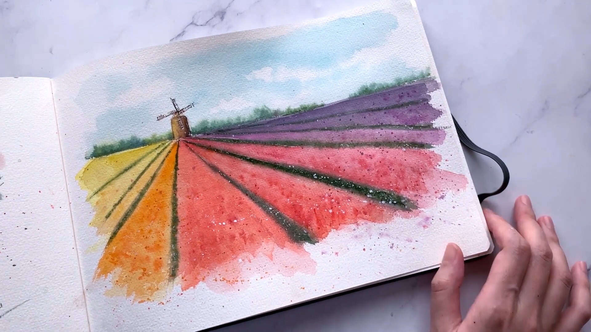
What makes a tulip field so calming and joyful at the same time? I think it’s the mix of peaceful skies, rainbow colors, and simple shapes.
In today’s tutorial, I paint tulip fields in watercolor—directly in my sketchbook. I share every step, from the first sketch to the final touch of white gouache.
If you want to paint along, grab your brushes and let’s get started.
Contents
- 1 Step 1: Planning and Sketching the Composition
- 2 Step 2: Painting the Sky and Clouds
- 3 Step 3: Painting the Tulip Fields
- 4 Step 4: Painting the Green Stems and Perspective Lines
- 5 Step 5: Adding Layers and Enhancing Texture
- 6 Step 6: Creating the Distant Background
- 7 Step 7: Painting the Windmill
- 8 Step 8: Adding Highlights and Finishing Touches
- 9 Wrapping Up
Step 1: Planning and Sketching the Composition
Before I begin painting, I like to plan out the scene with a simple pencil sketch. I divide my paper using the rule of thirds for this tulip field.
About two-thirds of the paper is for the tulip farm and floral rows, while the top third is reserved for the sky and a small windmill in the distance.
I sketch out the horizon line first. If you like neat borders, you can tape down all four edges of your paper, but I prefer to leave rough edges—just a personal choice.
I place the vanishing point at one-third of the paper and draw tulip rows that narrow as they move into the distance. This creates depth and keeps the layout simple yet effective.

Step 2: Painting the Sky and Clouds
Let’s begin the painting with the sky. Since the tulip fields will be filled with vibrant colors, I want to keep the sky light and simple to balance the composition.
I use a size 12 brush and start with a light blue wash for the sky. I leave some white spaces—these will become our clouds.
Then, I rewet the paper to create a soft, wet-on-wet effect for the cloud shapes.

Next, I apply a light blue wash. Feel free to tape all four edges if you’re more comfortable working with taped paper. This can help reduce paper warping, especially with heavy washes.

Now, I grab a soft tissue to dab and lift some paint gently. This creates soft, natural-looking clouds.
I add a few smaller clouds toward the bottom of the sky to give a sense of distance.

I darken a few areas slightly for contrast. It’s important to use soft tissue, not paper towels, to avoid harsh, dry edges.

And that finishes our sky!

Step 3: Painting the Tulip Fields
Now, it’s time to dive into painting the tulips. I start with some rainbow colors—yellow first, followed by orange.
This part of the painting is loose, so don’t worry too much about the details. The goal is to have fun and play with the vibrant, summery colors.

As I work, I add in some darker orange to create depth and texture. I enjoy how these dry brush strokes give the painting more texture and movement.
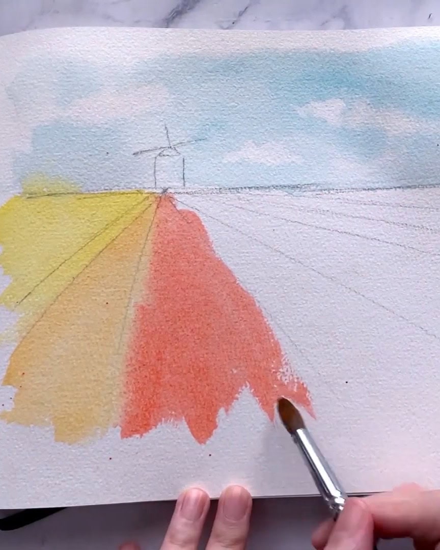
Next, I move on to red, layering it on top of the oranges for variety.

Feel free to get creative with your colors! You don’t have to stick exactly to what I’ve used. I also add a touch of lavender and darker purple to bring more color to the composition. Play around, and let the colors flow!

Step 4: Painting the Green Stems and Perspective Lines
Now, I switch to a smaller size 6 brush to add greens. I mix sap green with greenish umber to create a rich, dark green.
I apply the mixture carefully, ensuring it’s thick enough to avoid watery blooms. You’ll notice the paper starts to warp as I add the colors—this is normal.

I take a dry brush and gently lift off excess paint in some areas as I paint. This creates a nice contrast, especially when the paper is already dry in certain spots, giving harsher lines. These little details help to shape the stems and establish depth in the painting.

Step 5: Adding Layers and Enhancing Texture
As we move on, it’s time to add more depth to the tulips by layering additional colors. Once the paper dries, you’ll notice that the colors in the green stems appear lighter, sometimes even more than 30% lighter.
Don’t worry; this is entirely normal, and we can bring back that vibrancy by applying another layer of paint.

I go in and darken areas that need more pigment. Adding more color is essential, but remember, if your paper holds the vibrancy well after drying, you can skip this step.
I go ahead and quickly cover any areas that need more color.

While the paint is still wet, I like adding some texture by splattering in water. This gives the painting a unique effect.

I do the same for the other sections, reapplying layers where necessary to add richness.

To create more texture, I use a brushstroke technique. I apply brushstrokes to the stems, especially in areas closer to the bottom of the page. I make these strokes bigger as I move downward.

Next, I apply a layer of water over the tulip field. Using a size 8 brush, I lay down some vertical strokes in the field, creating a more dynamic feel.
As I continue, I layer vertical strokes and small dots to add busyness to the florals. This breaks up the flatness and gives the painting life.
These little details create the illusion of texture and depth, especially where the flowers are more defined.
If the paper is dry, I lightly wet the areas before adding the paint. This helps blend the colors smoothly, making the tulips stand out and the composition more realistic.
The further the tulips go back in the painting, the less defined they become.

Once I’ve completed the foreground, I may add more splatters to give it an extra pop. With the added layers and texture, the tulips come to life!

Step 6: Creating the Distant Background
Now, let’s move on to creating the distant background, which adds depth and perspective to your painting. I begin by painting the sky and trees in the background.
First, I rewet the area near the horizon to ensure a smooth and soft transition. Then, I lift the paper slightly to prevent the color from bleeding too much upwards.

I mix Sap Green with a bit of Cobalt Blue for the grass. This cooler mix helps create the illusion of distance in your painting, making the background feel far away.
By lifting the page, I control how the green bleeds, ensuring it doesn’t spread too far up the paper. This controlled technique gives the landscape a soft, distant feel.
Next, I like to experiment with my greens. I start with the Sap Green base and then add cooler colors like blues or warmer colors like reds. This variation in greens helps create a more dynamic background.

As I work closer to the horizon, I darken the green by adding more pigments to the mixture. The darker green at the bottom of the paper helps bring depth to the scene, as it mimics the natural gradient you see in real landscapes.
This technique helps keep the background soft while giving it a sense of space.

With the background set, I’ll quickly dry this layer before moving on to the next step: painting the windmill.
Step 7: Painting the Windmill
Now that my paper is dry and flat again, I’m ready to paint the windmill. For this, I mix a bit of burnt umber and burnt sepia. I start by focusing on the lighting.
With the sun coming from the left, I keep the right side of the windmill darker to create a shadow effect. I add a little yellow on the left side to make it warmer.

To deepen the shadows, I use sepia mixed with a touch of neutral tint.

With a fine-tip brush, I carefully draw the lines of the windmill, making sure to use broken lines to give it character.
I switch to warmer tones on the side closer to the sun, using burnt sienna and yellow ochre instead of the darker sepia.

Once done, I quickly dry the windmill to prepare it for the final touches. This adds great depth to the piece, making the windmill stand out against the vibrant tulip fields.
Step 8: Adding Highlights and Finishing Touches
It’s time to bring our painting to life with highlights and final touches. This step makes everything pop and adds that extra bit of charm.
I start by using a white ink pen to bring back some of the highlights, especially in the darker areas of the painting.
If you don’t have a white ink pen, no worries! You can use white gouache instead—it works just as well. I go with the ink pen here simply because it’s more convenient.
Next, I move to the grass areas. I add small dots of white to brighten parts that look a bit flat. These little touches help lift the whole area.
But I’m careful not to overdo it. I add highlights where it’s pretty dark, like near the shadows. I skip the color areas this time, because the white doesn’t appear well there.

Once the highlights are in place, I move on to dry splatters. My paper is completely dry at this stage, so the splatters come out sharp and clear, unlike earlier when we had soft splatters on wet paper. I mix in a bit of orange and a little more purple to add variety.

Still, I feel the painting could use more brightness. So I grab some white gouache and add more splatter. It instantly looks better. To finish off, I manually add more tiny white dots to enhance the glow.

And that’s it—our final painting! I love how peaceful the scene feels. The rainbow tulips look vibrant, and those last white highlights unite the whole piece.

Wrapping Up
Painting tulip fields in watercolor is easier than it looks—and incredibly rewarding. You can create a peaceful and colorful scene in your sketchbook with a few simple steps. Why not give it a try and make it your own? Grab your brushes and let your imagination bloom with every stroke!