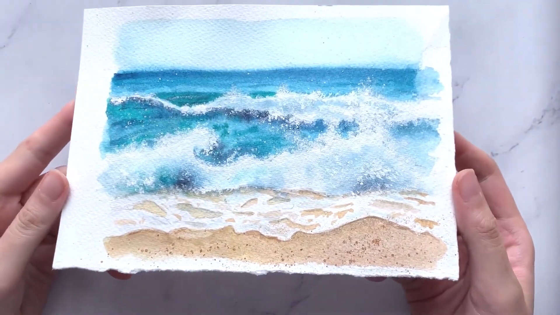
Do you love the calming beauty of ocean waves and sandy shores?
In today’s tutorial, I’ll guide you through painting a breathtaking beachscape using watercolors.
This step-by-step guide is perfect for beginners, with simple techniques that create a realistic and vibrant seascape.
Get your materials ready, and let’s paint together!
Materials You’ll Need
Before we start, let’s make sure you have the right materials. Don’t worry if you don’t have the exact same ones—I’ll suggest alternatives too!
Paints
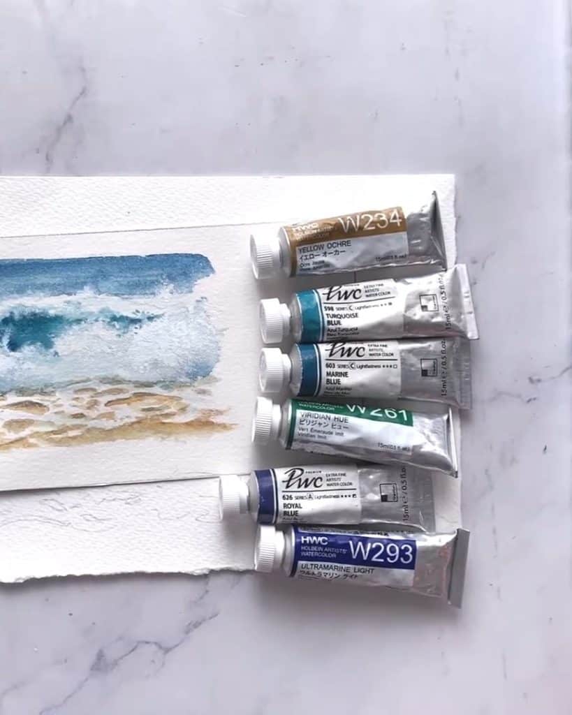
We’ll be using a mix of blues and greens to create realistic water and a soft sandy shore. Here are the main colors:
- Yellow Ochre: for the sand
- Turquoise Blue: for the ocean’s lighter tones
- Viridian Hue: a bright green to add depth
- Marine Blue: to mix with turquoise for deeper blues
- Royal Blue & Ultramarine Green Light: for variations in the water
- French Ultramarine Blue: for the deeper areas of the ocean
- White Gouache: to add foam and highlights
If you don’t have all these shades, no problem! The essentials are a turquoise blue, a green like viridian hue, and an ultramarine blue.
Brushes
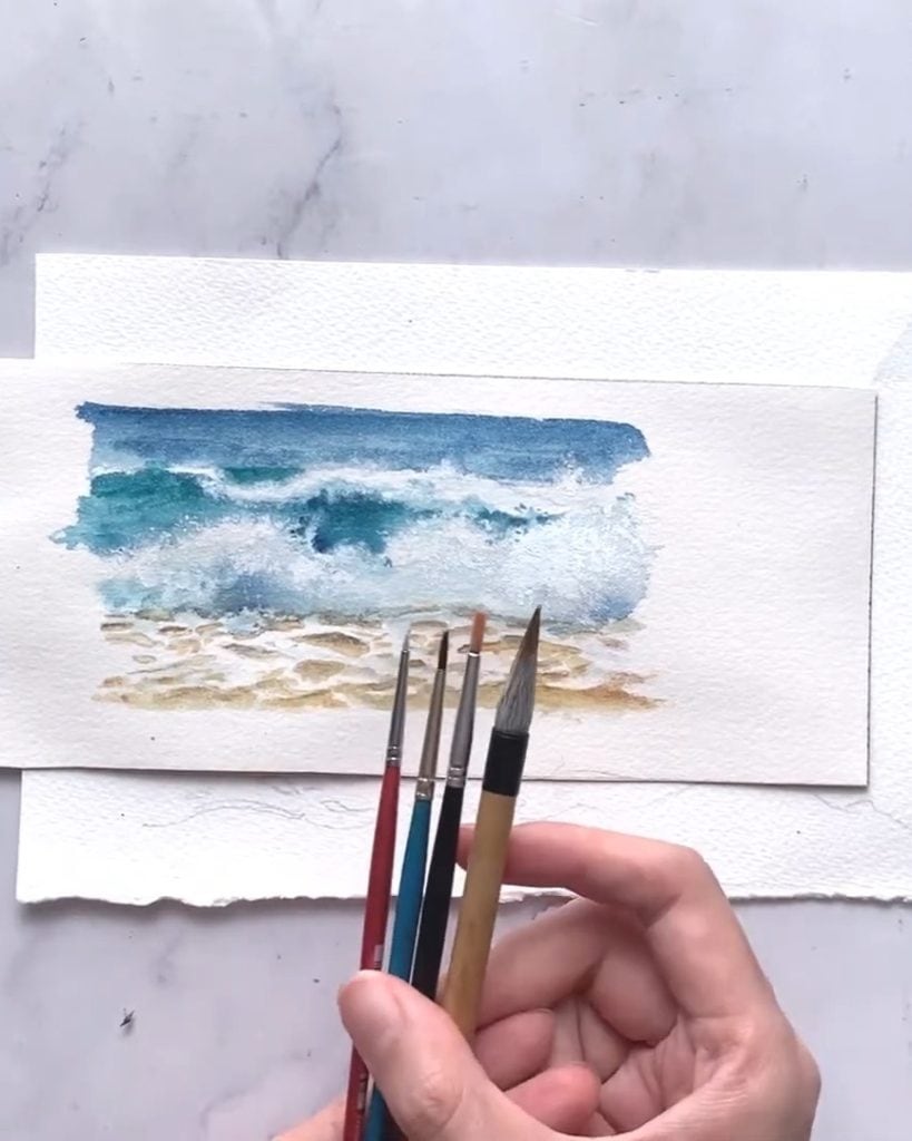
Different brushes will help us achieve different effects. Here’s what I’m using:
- Size 8 natural hair brush: for large areas and smooth blending
- Size 8 synthetic brush: for detailed work
- Smaller synthetic brushes (Size 3/0, 0, and 2): for adding fine details and splatter effects
- Old brush (size 6 or 8): for creating foam textures (avoid using a new brush since this technique can damage the bristles)
Paper
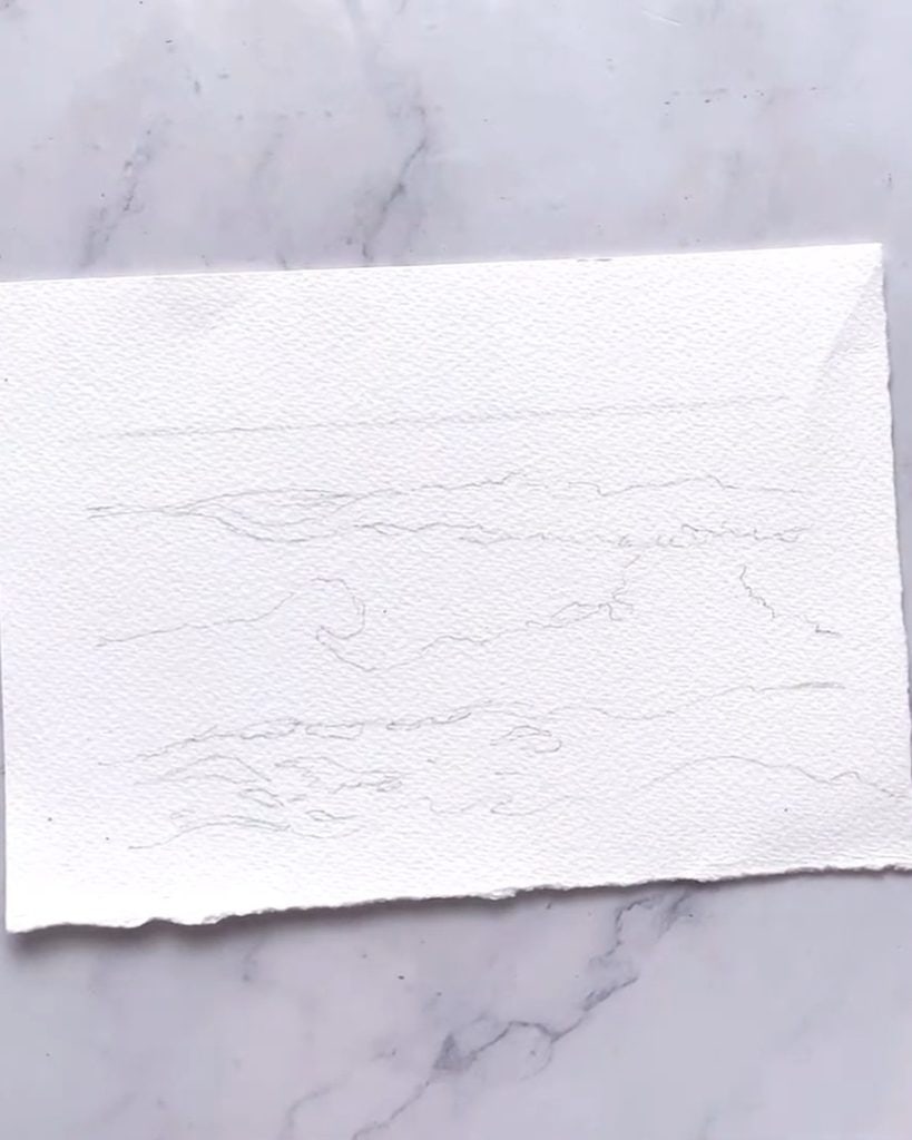
For the best results, I’m using 300 gsm compressed Arches watercolor paper.
It’s thick enough to handle multiple layers of paint and water.
Before starting, I’ve already pre-sketched the outline of the beach scene to make the painting process smoother.
Step-by-Step Painting Process
Now that we have everything ready, it’s time to start painting! Follow along as I guide you through each stage, from the sky to the final details.
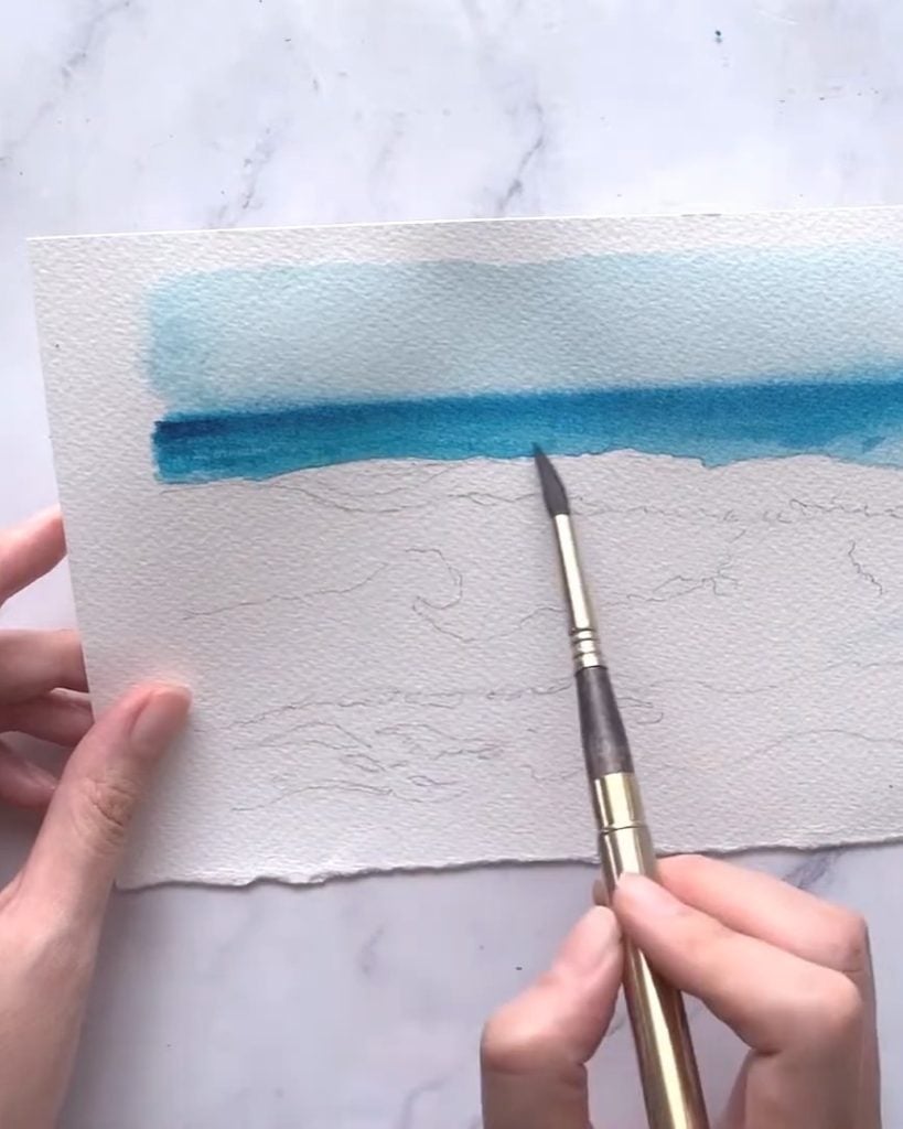
Step 1: Painting the Sky
Let’s begin by painting the sky, keeping it light and airy to set the mood for the entire piece.
I start by loading my size 8 brush with a diluted wash of turquoise blue, ensuring it’s nice and watery for a soft transition.

As I apply the first layer, I make sure to build up the depth gradually, blending in marine blue and royal blue near the horizon.
This creates a natural gradient that mimics the sky’s subtle shifts in tone.

Since watercolor has a mind of its own, I carefully tilt my paper to control the flow of paint, preventing unwanted blooms from spreading too far.
For added realism, I check the reference image to spot any hints of green undertones near the horizon.
A tiny mix of green into the blue brings out those subtle variations, making the sky look even more natural.
If any paint strays into areas meant for the foam, I don’t stress—it’ll all be covered with white gouache later on!
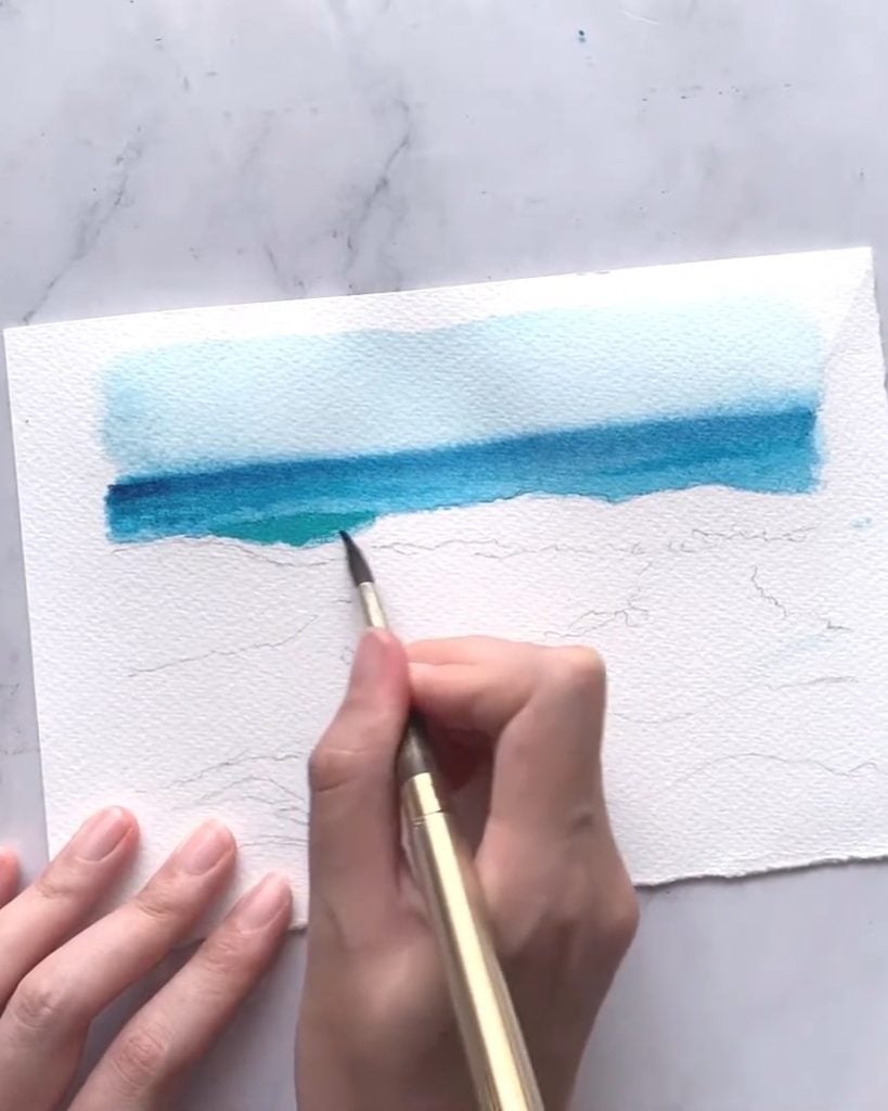
Step 2: Creating the Ocean Waves
Now, let’s bring the waves to life!
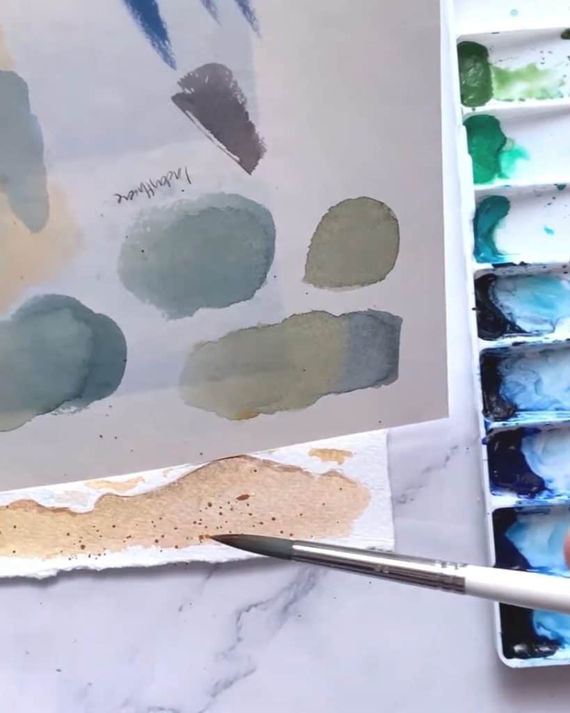
The ocean is never just one flat color, so I love playing with different blue and green hues to give it depth.
I start by mixing viridian hue, turquoise blue, and royal blue, then carefully brush it onto the paper in smooth, flowing strokes.
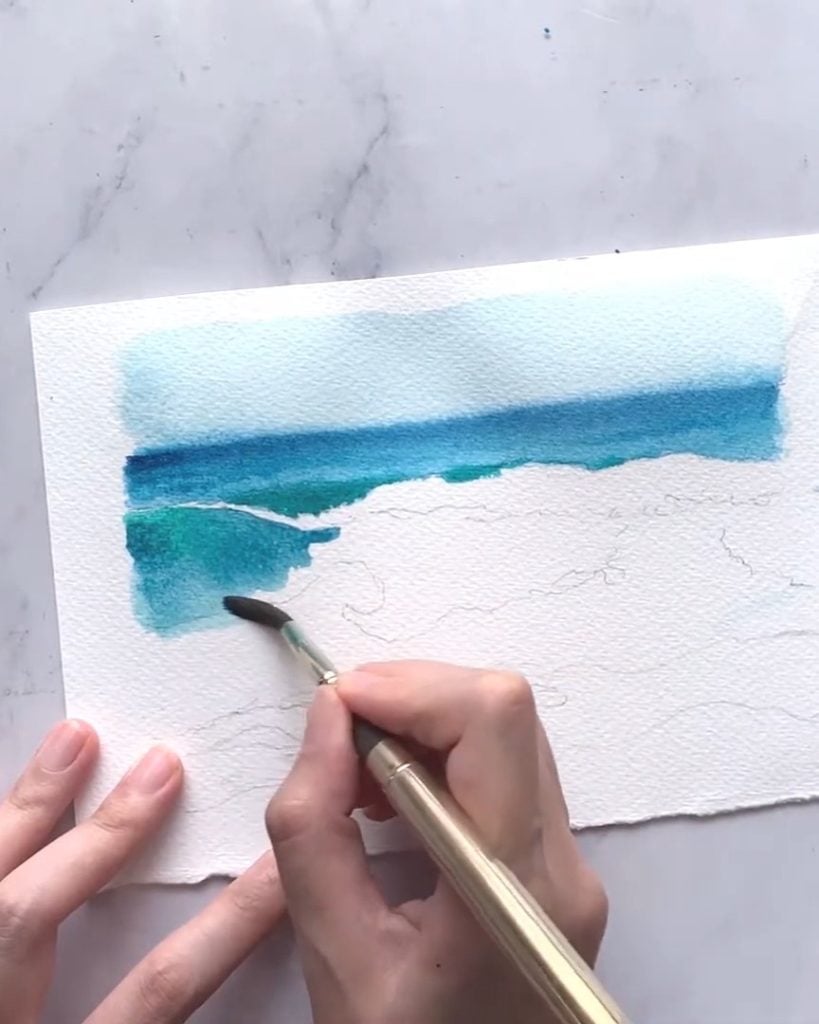
Rather than using a single shade, I experiment by layering various tones to add dimension.
Near the foam, I introduce deeper blues and greens to create shadows, making the waves feel dynamic and realistic.
Since water is always in motion, I take advantage of the wet-on-wet technique, allowing colors to naturally blend and flow together.
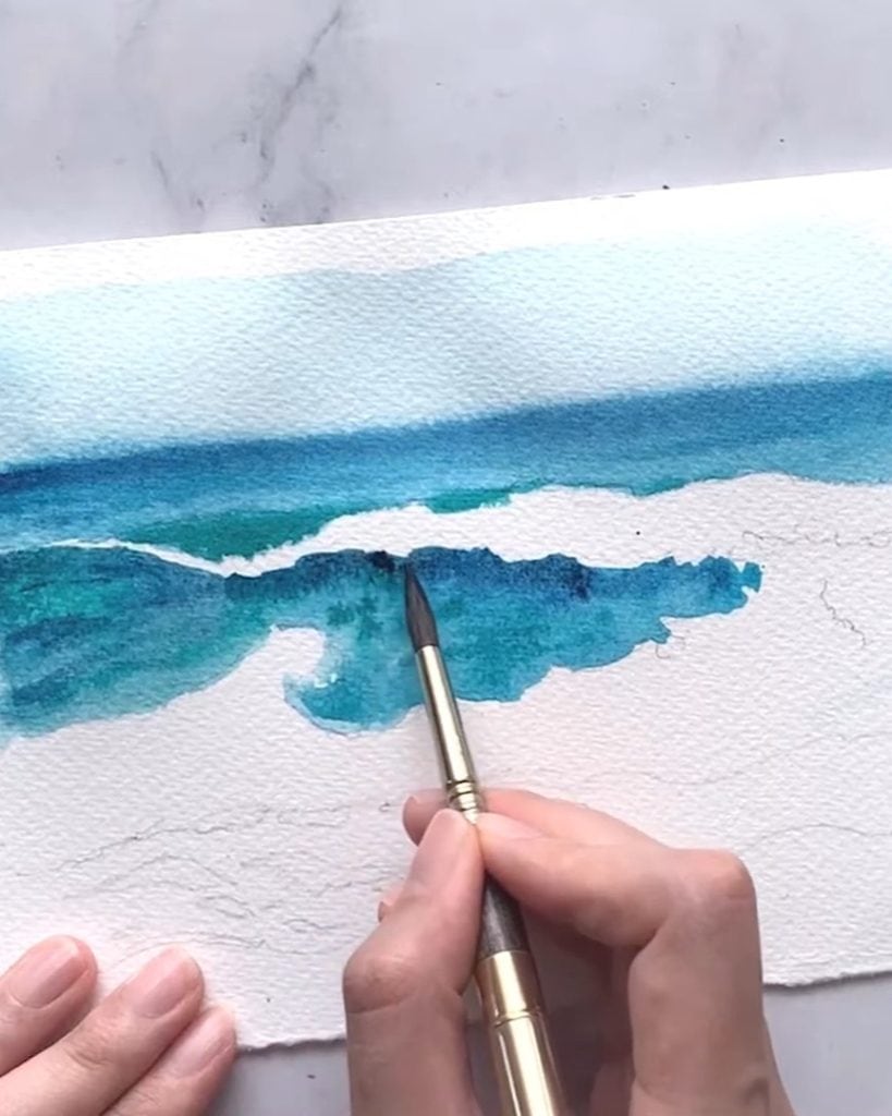
If I notice any sharp, unnatural edges, I soften them with a clean, damp brush, letting the paint melt into the surrounding hues.
Adding a few delicate curved strokes helps define the movement of the waves, and for extra depth, I introduce a hint of neutral tint in the darkest shadow areas.
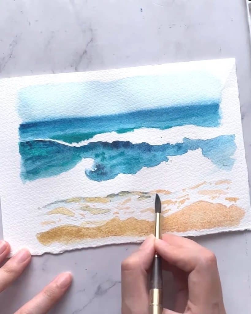
Step 3: Painting the Sandy Shore
The shoreline is where the warmth of the sand meets the coolness of the water, so it’s important to get the balance just right.
I begin by applying a light wash of yellow ochre, carefully following the natural shape of the shoreline.
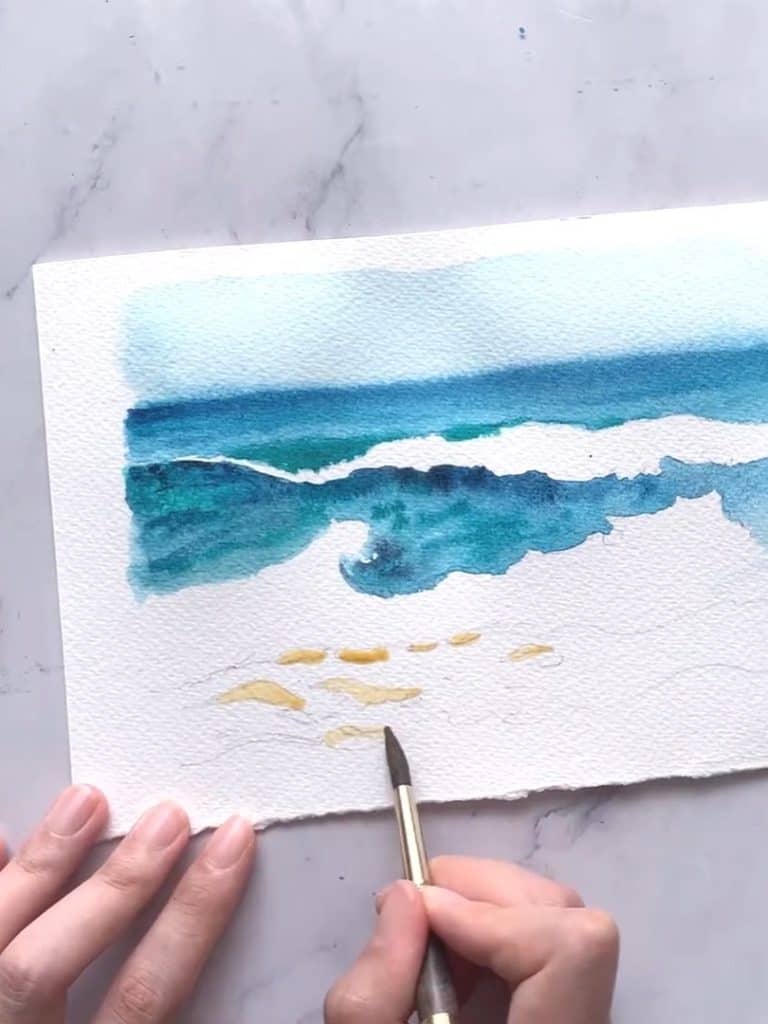
Since sand isn’t a single solid color, I create variety by mixing yellow ochre with a small amount of blue, forming subtle shadows that make the wet and dry areas distinguishable.
These shadows are key to capturing the softness of the beach while also making it look more natural.
Another trick I love using is incorporating a delicate blue tint into certain areas of the sand—this mimics the effect of reflected light from the sky, adding an extra layer of realism.
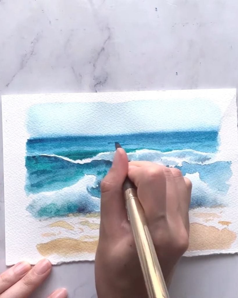
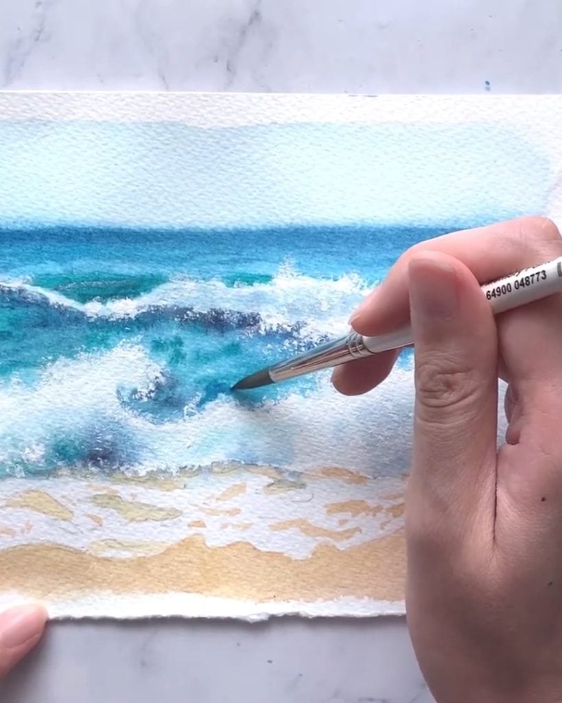
Step 4: Adding the Foam and Wave Details
Foam may seem pure white at first glance, but in reality, it has soft undertones of blue, green, and gray.
To bring out these details, I always convert my reference image to black and white, helping me pinpoint where the shadows naturally fall.
To achieve a smooth and realistic look, I start by pre-wetting the foam areas with clean water, then gently drop in hints of green, soft blue, and a touch of neutral tint.
Letting these colors blend seamlessly helps create that frothy, airy effect.

For extra definition, I use a fine brush to paint delicate ripples and curves where the foam meets the waves.
These small touches make a huge difference, adding depth and realism to the painting.
Step 5: Enhancing the Foam with White Gouache
Now, it’s time to use white gouache to make the foam really pop!
I’ll take a size 0 brush, dip it lightly in water, and then press and twist the bristles to open them up. This creates a unique texture, perfect for painting foam splashes.

Starting along the edges of the foam, I’ll tap the brush onto the paper, allowing the bristles to create tiny, irregular splatters. The more open the bristles, the finer the splatter effect.

If the brush doesn’t open up properly, I’ll switch to my size 2 brush. Remember—this technique damages the bristles, so make sure to use an old brush!
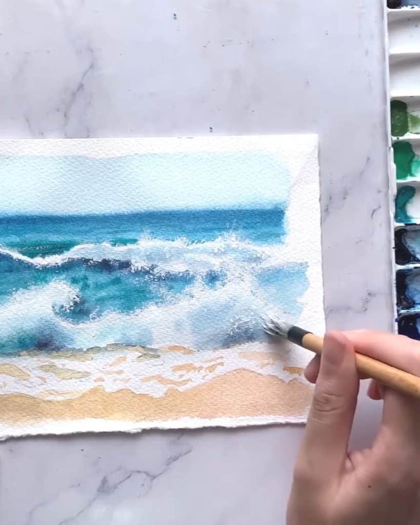
Once I’ve added the foam texture, I’ll take a synthetic brush, mix in a little water with gouache, and soften the center of the foam to create a more natural look.
If I end up with too many splatters, I’ll blend them out with clean water.

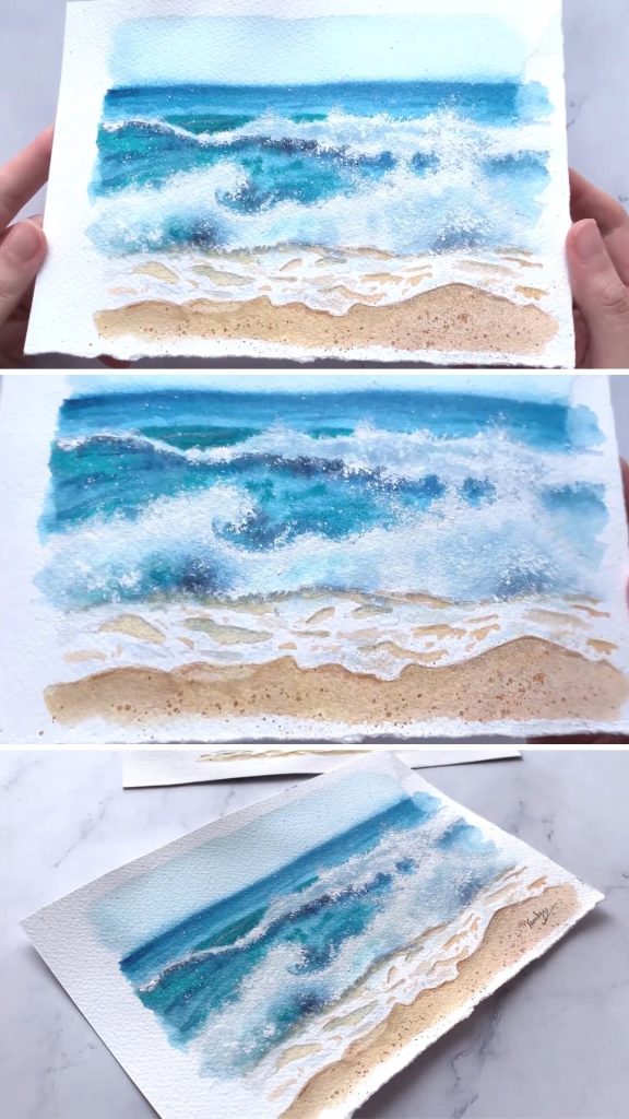
Step 6: Final Touches and Adjustments
Now comes my favorite part—stepping back and seeing the whole painting come to life!
I always take a moment to look at the painting from a distance.
This helps me spot areas that might need a little more depth or adjustment.
If I see any sections that feel too flat, I go back in with darker blue shadows just beneath the foam.
This creates a strong contrast and makes the painting feel more three-dimensional.
To make the wet sand look even more realistic, I mix a tiny bit of blue, yellow ochre, and neutral tint to add subtle shadows along the shore.
This step ties everything together beautifully!

For the final finishing touch, I grab a separate brush, dip it into white gouache, and lightly flick small splatters across the water and sand. I also fill some dots in the waves.
This creates a natural, textured effect that mimics the tiny water droplets and grains of sand catching the light.

After that, I lightly flick small splatters using yellow ochre in the sandy areas. Use a paper to cover the top to avoid unwanted effects.
For tiny splatters, I use another brush and tap the yellow brush lightly.
And that’s it! The painting is now complete, capturing the beauty of rolling waves, foamy shores, and sunlit sand.
In A Nutshell
Painting a beachscape with watercolors is such a rewarding experience, and I hope you enjoyed the process as much as I did!
With just a few techniques, you can create a scene that feels full of movement and light.
Ready to bring more stunning landscapes to life?
Grab your brushes, experiment with new color combinations, and let your creativity flow onto the paper!