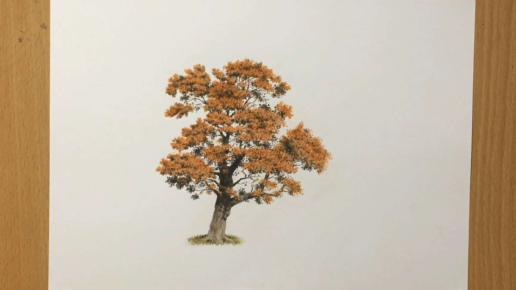
What makes autumn colors so comforting to draw? For me, it’s the mix of warm reds, oranges, and golden browns—like holding a cozy scene in your hands.
In this tutorial, I will walk you through how to draw an autumn tree using colored pencils.
I’ll show you every layer, color, and blending technique I use, and you’ll see just how much depth and glow we can bring into a simple tree drawing.
Contents
- 1 Materials and Tools You’ll Need
- 2 Understanding the Structure of a Realistic Tree
- 3 Drawing Autumn Tree with Colored Pencils: Step-by-Step
- 3.1 Step 1: Sketch the Tree’s General Shape
- 3.2 Step 2: Start with the Texture of the Upper Left Leaves
- 3.3 Step 3: Apply the Same Layering Process Across the Top Canopy
- 3.4 Step 4: Add More Branches and Break Up the Canopy
- 3.5 Step 5: Focus on Canopy Shape and Color Variation
- 3.6 Step 6: Add More Branches and Thicken the Tree Trunk
- 3.7 Step 7: Add Detached Leaf Clusters and Deep Shadows for Realism
- 3.8 Step 8: Adding Dark Shadows and Highlights On the Left Side
- 3.9 Step 9: Finalizing the Tree with Details and Texture
- 4 Final Thoughts
Materials and Tools You’ll Need
Let me quickly show you what I use to draw this autumn tree with colored pencils. I keep it simple with just a few shades from Faber-Castell Polychromos. You can use any brand, though. It doesn’t have to be this exact one.
Here’s my color list:
- Orange
- Burnt Ochre
- Walnut Brown
- Olive Green
- Black
The paper I’m using is 9×12 inches, a good size for a detailed drawing, though not too large.

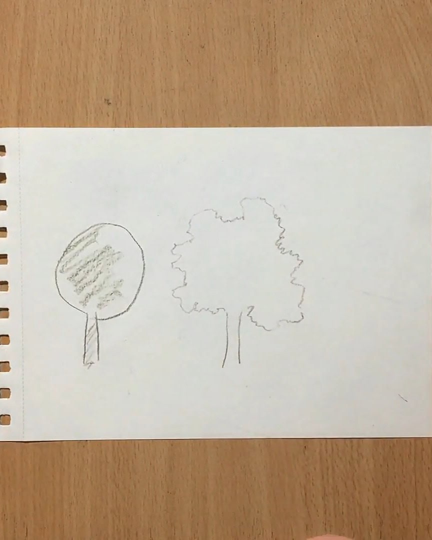
Understanding the Structure of a Realistic Tree
I like to start with the basic idea of a canopy and a tree trunk when I draw a tree.
This is how many people imagine a tree—something simple with a round top and a straight, brown trunk. But to make it more realistic, I focus on adding complexity.
The Tree Trunk and Canopy
Instead of drawing a straight trunk, I curve it slightly to give it more natural movement.
The canopy also isn’t just a simple shape—it should have irregular edges, mimicking the randomness of nature.
The leaves don’t grow perfectly uniformly but in clusters around larger branches or boughs.
Adding Shadows and Texture
Between these leaf clusters, there are gaps where light doesn’t reach, creating areas of shadow.
The tree trunk also has shadow areas, especially where the canopy overlaps it. I pay attention to these details to make the tree feel three-dimensional.
The texture of the leaves is key, too, so I make sure to add enough layers to show they form a thick, full canopy.

Drawing Realistic Tree Branches
As for the branches and trunk, they should taper as they grow, getting thinner toward the top. I also make them twist and curve since that’s how trees naturally grow.
Not all branches will be visible—some are hidden behind the leaves. I always remember this to create a tree that feels more lifelike.

Drawing Autumn Tree with Colored Pencils: Step-by-Step
Now that I’ve mapped out the tree’s structure, it’s time to bring this autumn scene to life with color.
Let me walk you through every step I took to create this tree’s rich texture, vibrant foliage, and natural depth using colored pencils.
Step 1: Sketch the Tree’s General Shape
Let’s start with the base of our autumn tree drawing — a simple sketch to guide where everything will go.
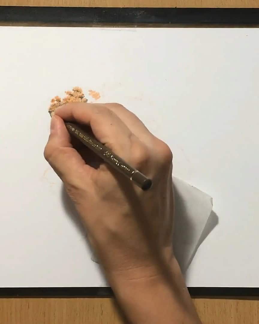
First, I sharpen my pencils. That helps me make cleaner lines.
Next, I grab my orange pencil. I want to give the tree that warm, orangey feel of autumn leaves. I start sketching light, rough shapes that look like the canopy of a deciduous tree.

To make the tree look real, I avoid perfect or round shapes. Instead, I draw a rough, uneven outline. I break this shape into different sections.
These are the leaf clusters — groups of leaves that grow around the bigger branches.
I also draw the trunk and some main branches. But I keep in mind that not all the branches will show. In real trees, thick leaf clusters often hide parts of the branches.
So, I leave some branches out on purpose — they’re behind the leaves, making the tree look more natural.

Step 2: Start with the Texture of the Upper Left Leaves
I begin by working on the top left part of the tree canopy. I grab my orange pencil first and start laying down the base color.
I use short, irregular strokes—almost like scribbles. Some of them go back and forth, some are circular.
The key here is to vary the pressure and direction. I don’t want it to look too uniform; instead, I like that natural, organic look.

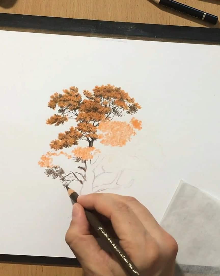
Next, I insert a few thin branches in between the leaves. I use a dark brown pencil for this, and I keep the lines broken because the leaves naturally obscure parts of the branches.
I make sure the branches get thicker as they get closer to the tree trunk, following the natural tapering structure of a real tree.

After laying the orange base, I go over parts of it with ochre. I’m not trying to cover everything—just adjusting the tone and adding variation.

Then, I touch the area lightly with some yellowish green to introduce more color depth.

Finally, I use a black pencil to emphasize the darkest details. I focus on areas with deep shadows—places where light doesn’t penetrate the canopy.

I also darken some brown areas and enhance the shadows on the branches.
Step 3: Apply the Same Layering Process Across the Top Canopy
I repeat this technique for the next cluster of leaves. Like before, I use orange as a base, then layer it with ochre and brown, and add darker areas with black.

In between lighter clusters, I insert some darker ones to create the illusion of depth.
This contrast helps certain parts of the canopy look like they’re sticking out into the light while others appear deeper inside and shaded.
Even though I loosely reference a photo of an autumn tree, I allow myself to improvise.
I don’t try to replicate every single leaf. Instead, I focus on capturing the texture and overall illusion of foliage.
Step 4: Add More Branches and Break Up the Canopy
To make the canopy more interesting, I break it up intentionally. I leave white spaces between orange clusters and fill some of these gaps with thin branches.
This gives the impression that branches are weaving through the canopy, partially hidden behind the leaves.

Again, I add ochre and brown on top of the orange and use black for deeper shadows.

I aim to keep the canopy less dense than in summer trees. Since it’s autumn, it should look like it’s starting to thin out, revealing more of the structure underneath.
Still, I want the canopy to feel full and lively with warm autumn colors.

Step 5: Focus on Canopy Shape and Color Variation
In each cluster, I darken the lower areas more to show where shadows naturally fall. I also add small, irregular clumps of leaves detached from the main body.
These little offshoots help make the canopy look real and irregular, like leaves are dangling loosely on the edges.

To enhance the illusion of leaf texture, I mix darker dots and patches of brown and black.

I also add a touch of yellowish-green to the clusters. of It’s impossible to draw every leaf, so I create a believable impression of a full canopy seen from a distance.

Step 6: Add More Branches and Thicken the Tree Trunk
Now, I use the white spaces I left earlier to add a few more branches. It’s important to fill in these gaps to make the tree feel fuller and more natural.
As I add these branches, I notice that they’re getting thicker as I approach the main part of the tree trunk.
This is because, just like the boughs, the branches taper as they grow. They start thinner at the top and get thicker as they move down toward the trunk.
So, as I continue, the branches gradually get thicker, and so does the tree trunk. This tapering effect helps give the tree that organic, lifelike feel.
It’s all about capturing the natural growth of the tree!

Step 7: Add Detached Leaf Clusters and Deep Shadows for Realism
Now I move to the left side and draw a few more clusters of leaves. I use the same method as before—light scribbling with an orange pencil comes first.

Then, I go over those shapes using ochre and brown. I also add some yellowish green in a few spots to make the color more interesting.

I can’t draw every leaf, so I use darker dots and patches of brown and black to build texture. This gives the illusion of a full, leafy canopy.
Step 8: Adding Dark Shadows and Highlights On the Left Side
As I work on the left side of the tree, I focus on adding deep shadows and highlights to make the tree trunk and branches come to life.
This section is important for creating depth, as the shadows and lighter areas help define the tree’s structure.
I start by focusing on the branches deeper inside the canopy. Since these areas are shadowed, I use a black colored pencil to darken the branches and the parts of the trunk that are less exposed to light.
I want this area to be almost completely black. There’s a lot of shadow here, so it’s important to exaggerate it to create contrast with the lighter parts of the tree.

Next, I move on to the trunk, specifically the portion that is lower down and less hidden by the canopy.
Since it gets more light, I leave this area much lighter compared to the parts in the shadow. This variation in lightness helps the tree feel more realistic.
Now, I begin drawing the branches near the bottom of the canopy. I make sure to twist their shapes, making them curve and taper towards the end to make them look more organic.
I want these branches to feel natural, not too stiff or uniform. The more variation I add, the more realistic the branches will look.
While doing this, I also add some darker areas between the branches, just like I did earlier at the top of the tree.
These darker spots help to create a sense of depth in the canopy, making it feel more three-dimensional.
At this point, you may notice that I’m also using a pencil eraser to refine the shapes of the branches and tree trunk.
Though it’s tricky to erase with colored pencils, it’s not impossible. You have to be careful and work gradually, as mistakes are harder to fix in this medium.

With colored pencils, it’s crucial to layer colors slowly. If you rush, it’s hard to get the desired effect.
I’ve also started working on some small orange leaves in front of the tree trunk.
These leaves are in front, so I need them to look lighter than the trunk and branches behind them.

To achieve this, I carefully work around them with darker colors like black and brown.
This technique helps the leaves appear as though they’re popping out from the trunk, creating a sense of depth and layering.
To make the tree trunk look more 3D, I add some lighter areas on the branch that seem to be sticking out towards us.
I’ll go over it with black and dark brown to contrast with the light branch, making it stand out more.
The goal is for the branches and trunk to appear as though they’re extending out of the paper, like they are reaching toward the viewer.

Additionally, I add smaller dots of darker tones throughout the canopy. These dots represent groups of leaves in the background, creating depth in the shadowed areas.
These small details make the tree feel more intricate and realistic.

I focus on the lower part of the tree trunk, which I keep lighter to show that it’s more exposed to light.
The upper part of the trunk, deeper in the canopy, remains darker. I use more black here to create that shadowed effect.
For the trunk, I mainly use brown but add a touch of olive green for depth.

Next, I draw some grass at the bottom, using yellowish tones to make it look dry. I add some black for shadow, giving the grass a more natural, grounded look.

Finally, I add shadows to the trunk, making the scene feel realistic.

Step 9: Finalizing the Tree with Details and Texture
As I finish up the tree, I focus on the large cluster of leaves on the right side. I add smaller branches and groups of leaves that are in shadow, nestled between the lighter areas.
This gives the canopy more depth and texture. I wanted the tree to have a less dense canopy. Here, I aim to make the branches more visible, which I think adds character to the tree.

I keep adding touches of black and dark brown between the lighter leaves, deepening the shadows and making the leaves stand out. This adds extra texture and realism.

I also add some shadows to some areas.

I could continue refining the details indefinitely, but eventually, I have to stop and call it done. The tree already looks highly detailed, and I’m happy with the result.

Final Thoughts
And that’s how I draw a glowing autumn tree with colored pencils—step by step, from sketch to final details.
Isn’t it amazing how a few careful layers and simple tools can create such warmth and depth?
I hope this walkthrough helps you feel more confident about drawing trees, too. Ready to grab your pencils and give it a go?
I’d love to hear how your autumn tree turns out—feel free to share it with me!