Do you want to bring more life and depth into your watercolor trees?
Let me show you how I paint a pine tree by focusing on light direction and using only four colors.
This simple approach makes it easier to create realistic effects without a huge color palette. Ready to see how sunlight transforms a painting? Let’s get started!
Contents
Setting the Scene: Imagining the Sunlight

Before I start painting, I always take a moment to think about the light. It changes everything in a watercolor painting.
Light brings life to your painting. It helps you show shape, form, and depth. By thinking carefully about where the light is coming from, you can make your tree feel real and full of dimension.
For this pine tree painting, I imagine the sunlight coming from the top left corner. That means the top left of the tree will catch the light first.
Everything else will follow based on that light direction. Once I have this in mind, I know where to place my highlights and shadows. This one small step makes a big difference.
Choosing Your Palette: The Four Essential Colors
You don’t need a huge set of paints to make something beautiful. Let’s keep it simple.
Why Only Four Colors?
Limiting your palette makes things easier. It helps you focus on the values, shapes, and light, not just the color.
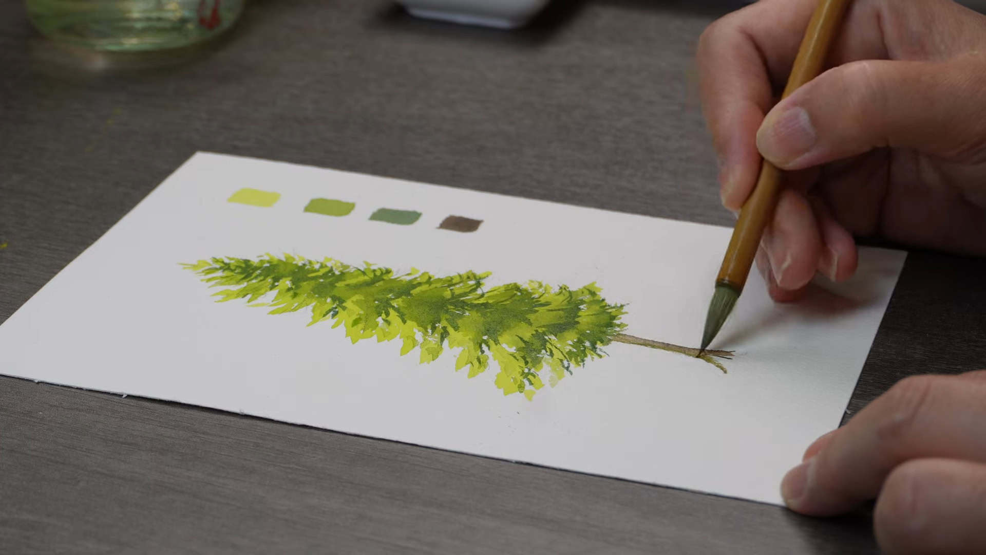
Today, I’m only using four colors, more than enough to bring this pine tree to life.
The Four Colors You’ll Need

Here’s what I’m using:
- Yellow Green: for the fresh, bright areas of the tree
- Mid Green: for the parts touched by softer light
- Dark Green: for the shaded areas
- Vandyke Brown: for the trunk
Each one has a specific role. From capturing brightness to adding deep shadows, these colors are all you need to paint a beautiful pine tree.
Step-by-Step Guide to Painting the Pine Tree
Now that we’ve set the light direction and picked our colors, let’s jump into painting!
Shaping the Tree with Yellow Green

We start with the lightest and brightest color. I begin by using yellow-green to shape the pine tree. This color gives the tree a fresh and lively look.
Since the light comes from the top left, this color goes directly on the parts where the light hits. Just imagine the sunlight touching the tree, and paint those areas yellow-green.
It’s not just about filling the shape. You’re giving the tree its first spark of life.
Adding Depth with Mid-Tone Green

Now let’s give the tree some structure and softness. Next, I use the mid-tone green. This goes on in areas where the light is present but not as strong.
It still looks green, but it feels calmer than the yellow-green. These parts are slightly more shaded and add that in-between feeling, neither too bright nor too dark.
Applying mid-tone green helps transition between light and shadow smoothly. It also builds a bit more depth into the pine tree.
Creating Shadows with Dark Green

Here’s the fun part: adding those bold, shadowy areas. Now it’s time to use the dark green. I apply this to the tree parts on the opposite side of the light source.
Since the sun is coming from the top left, the bottom right side of the tree will be more shaded.
Don’t worry if it feels dark; that’s what we want! The shadow creates contrast. And that contrast makes the tree feel three-dimensional and more realistic.
It pops when you balance light and dark just right. After adding dark green, I use an eraser to remove any excess strokes.
Painting the Trunk with Brown

Now that the leaves are done, let’s focus on the trunk. I paint the tree trunk using brown. Like the rest of the tree, I also think about where the light comes from.
So I add a little shadow on the side of the trunk opposite the light. That means more shading on the bottom right side of the trunk.
This small detail adds so much depth. Just like with the leaves, light and shadow on the trunk help bring the whole tree together and make it feel solid and lifelike.
Bringing the Painting to Life: The Power of Light and Shadow

This is where everything comes together. Understanding how to place shadows and highlights is the secret to depth.
Throughout the painting, I keep asking myself: Where is the light falling? Wherever it doesn’t fall, that’s where the shadows go.
This idea helps me guide my brush and decide where to put each color. The result is a painting that feels alive and full of form.
I review the whole painting as I finish to ensure the shadows and highlights are balanced. Sometimes I add a bit more shadow or soften some edges.
These small final touches help tie everything together. It’s all about light and shadow: where it falls, where it hides, and how it helps your tree feel three-dimensional.

In A Nutshell
Isn’t it amazing what just four colors and smart lighting can do? With a bit of planning and a focus on where the sunlight hits, your watercolor pine trees can truly come to life.
So next time you paint, think light first, then let the colors follow. Want to try this method with other trees? Stay tuned for more watercolor tutorials, and let’s keep growing your skills together!